The network for creativity
Join 1.25M professional creatives like you
Connect with clients, get discovered, and run your business 100% commission-free
Creatives on Contra have earned over $150M and we are just getting started
Back to feedPost

If you need a rocket beat any type of beat you mean come here I can help you for it and we can share our feelings together also if you need a Bala editor

The network for creativity
Join 1.25M professional creatives like you
Connect with clients, get discovered, and run your business 100% commission-free
Creatives on Contra have earned over $150M and we are just getting started





Related posts

made another cozy video of slow mornings, hope you like it .. and what should I make next?🌿🍂


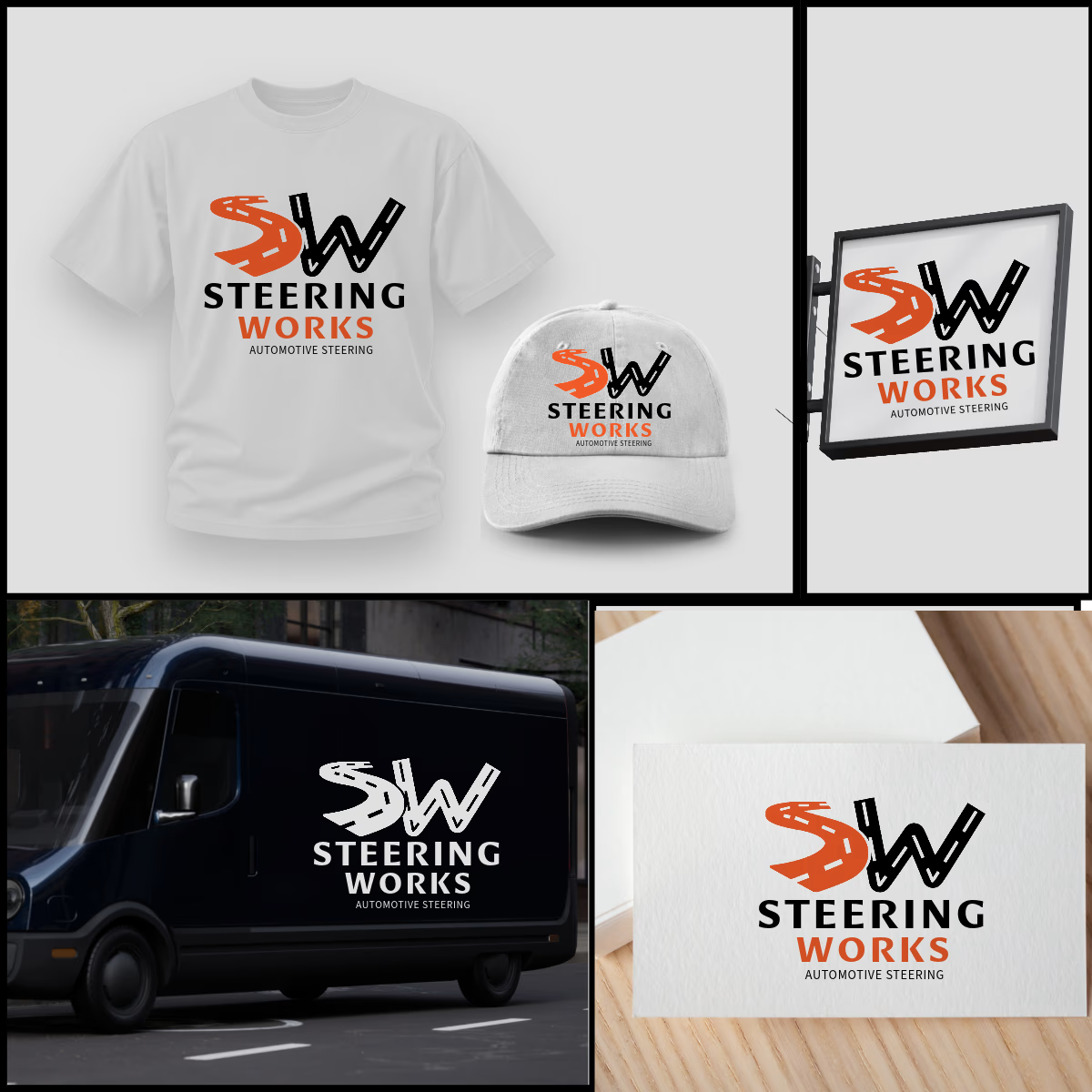
SW logo where S and W are winding roads, inspired by windy road sign idea. The orange S adds energy, black W adds strength. As shown, the design is highly adaptable and works perfectly on t-shirts, caps, van graphics, shop signage, and business cards in both color and single-color white. Strong, memorable, and built for automotive enthusiasts.


That's very attractive great job bro 🎉🎉🔥🔥

Flowlane 2.0, a launch video for a concept ops automation tool. Ops that run themselves.
The dashboard UI comes apart into layers to show each feature: live metrics, self-building reports and AI that drafts for you. It was built in Remotion and finished in After Effects.


Building the scenes in Remotion and hand-keying the light sweeps in After Effects is an interesting split. When a client asks for a late copy or colour change, which side ends up costing you more time?