The network for creativity
Join 1.25M professional creatives like you
Connect with clients, get discovered, and run your business 100% commission-free
Creatives on Contra have earned over $150M and we are just getting started
Back to feedPost
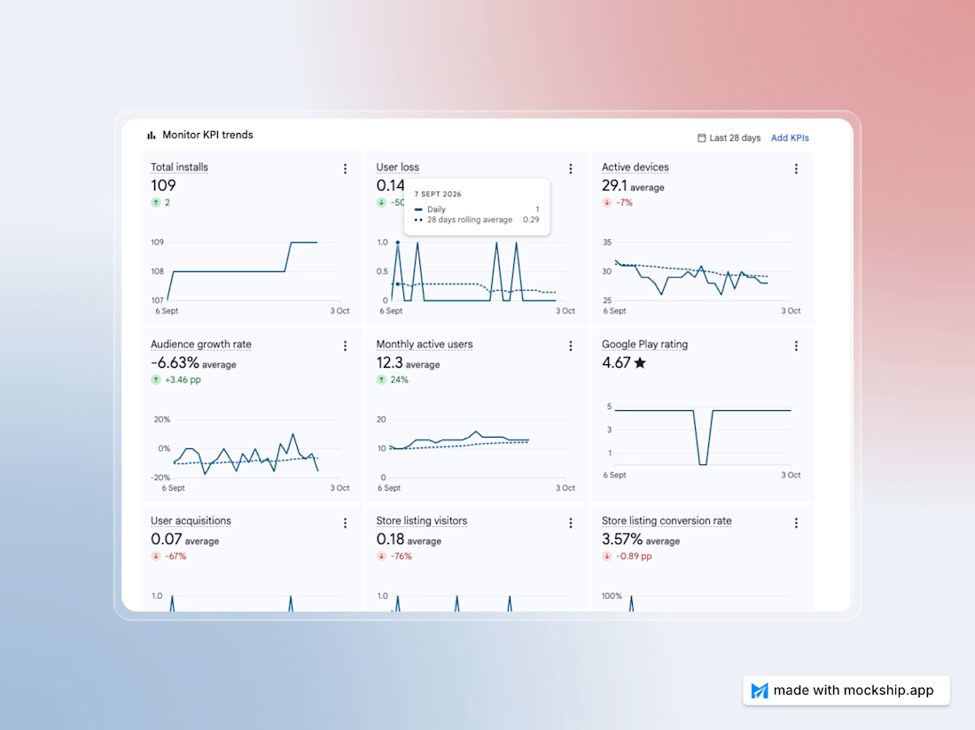
Now that the Mockship work is done, I’m thinking of working on my old mobile app and improving its Play Store ranking.
The network for creativity
Join 1.25M professional creatives like you
Connect with clients, get discovered, and run your business 100% commission-free
Creatives on Contra have earned over $150M and we are just getting started





Related posts

Fun fact: the longest feature to build in a mobile app is the one nobody drew in Figma, what happens when there's no internet. Nobody praises you for handling it well, they just don't leave a 1-star review :))

Create mobile mockups in seconds.
Drop in your app screens, pick one of the 3 new phones, use one or two in a frame, tilt it, export.
Made with Mockship.
try it now at mockship.app

🛒 Flipkart App — UI/UX Mistakes & Solutions
I explored the Flipkart app from a UI/UX perspective and identified several areas where the user experience could be improved.
From information overload and banner clutter to visual hierarchy, notifications, filters, product cards and checkout flow — small design decisions can have a big impact on how easily users browse and shop.
For each mistake, I explored a practical UX solution focused on clarity, simplicity and a smoother user journey.
4 explored — 3 more coming next. 🚀
Good UI gets attention. Great UX makes things easier.
#UIUX #UIDesign #UXDesign #Flipkart #UXCaseStudy #ProductDesign #UXDesigner #UIUXDesign #DesignProcess #ContraDesigner
