The network for creativity
Join 1.25M professional creatives like you
Connect with clients, get discovered, and run your business 100% commission-free
Creatives on Contra have earned over $150M and we are just getting started


The network for creativity
Join 1.25M professional creatives like you
Connect with clients, get discovered, and run your business 100% commission-free
Creatives on Contra have earned over $150M and we are just getting started







Related posts

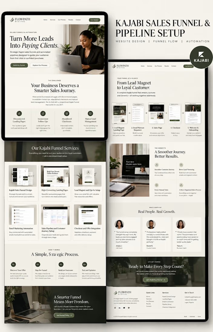
Kajabi Sales Funnel & Pipeline Setup | FLOWPATH DIGITAL



Minimal carousel design about the quite side of failure.Clean,modren typography with a soft beige accent to create a clam,professional look for linkedln personal branding content.

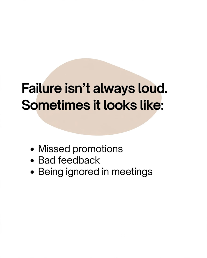

The specific choice of a soft beige accent helps shift the tone away from the usual high energy LinkedIn aesthetic. That visual calm actually makes the message about failure feel more serious and less like a generic motivational graphic.

Designed a modern minimal logo for JM - Cheese Cake Shop 🍰
Concept: Letter J + M merged with a cheese cube icon to make it premium, memorable and tasty.
Tools: Adobe Illustrator
Let me know your thoughts!
#logodesign #branding #cheesecake #minimalogo #graphicdesigner #contra