The network for creativity
Join 1.25M professional creatives like you
Connect with clients, get discovered, and run your business 100% commission-free
Creatives on Contra have earned over $150M and we are just getting started
Back to feedPost

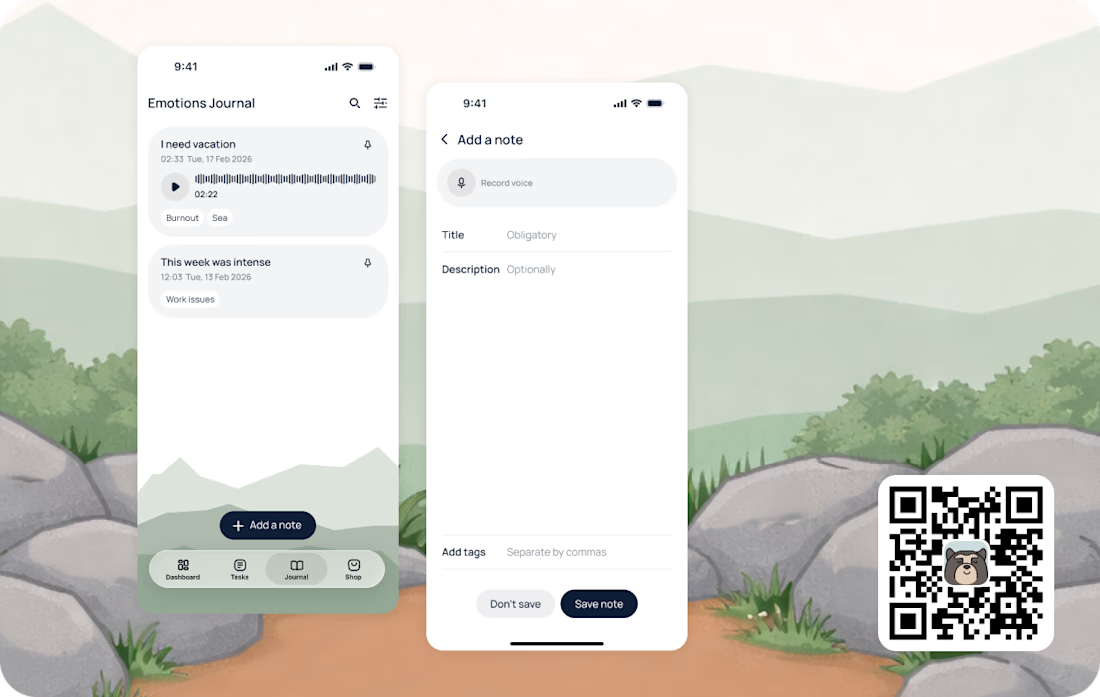
Harmony: Daily Balance on the App Store – https://apps.apple.com/es/app/harmony-daily-balance/id6740060964?l=en-GB
Every day you’ll get 3 simple tasks
designed to shift your perspective and bring more awareness into everyday moments.
Emotional Journal
for your thoughts and feelings with voice dictation also! No need to send long voices to your friends (ha-ha)
The network for creativity
Join 1.25M professional creatives like you
Connect with clients, get discovered, and run your business 100% commission-free
Creatives on Contra have earned over $150M and we are just getting started





Related posts

Calmer days. Brighter tomorrows.
Designed a modern AI wellness website concept for Innerly, focused on making mental wellness feel calm, approachable, and personal.
• Custom UI/UX design
• AI wellness coach experience
• Meditation and wellness sections
• Calm, editorial visual direction
• Interactive journey and habit tracking
• Glassmorphism UI elements
• Responsive landing page structure
• Custom typography and visual system
Designed from scratch with a softer approach to AI, combining technology with a more human wellness experience.
#WebDesign #UIUX #AI #Wellness #Figma #Framer #LandingPage #ProductDesign #WebsiteDesign




FBY Security App
A smart workforce management app built to simplify team scheduling, real-time coordination, and day-to-day security operations.
Available on iOS & Android:
iOS: https://apps.apple.com/us/app/fby-team-schedule/id6472708910
Android: https://play.google.com/store/apps/details?id=com.fby_security.app&pcampaignid=web_share

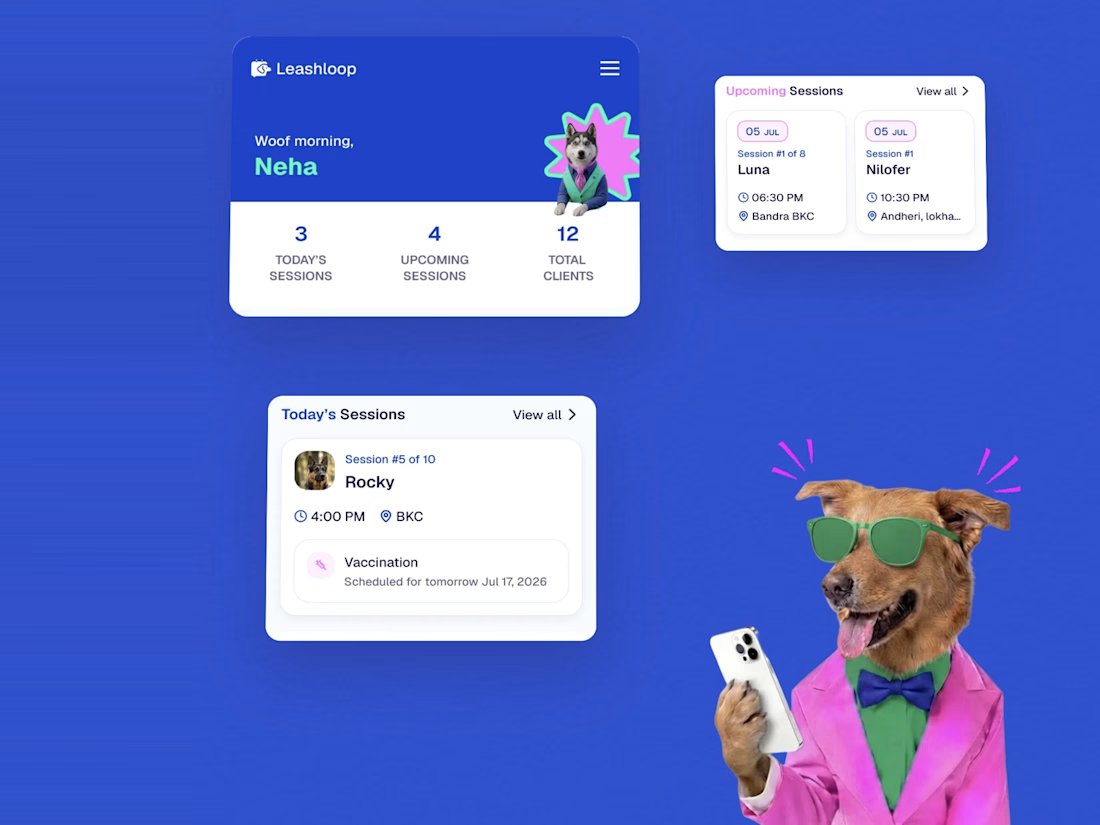
Leashloop: a mobile-first app for dog trainers, designed and built end to end. Bookings, client and dog profiles, calendar sync, and shareable session summaries that clients open without an app or sign-in.
Live: https://leashloop.app