The network for creativity
Join 1.25M professional creatives like you
Connect with clients, get discovered, and run your business 100% commission-free
Creatives on Contra have earned over $150M and we are just getting started
Back to feedPost

The network for creativity
Join 1.25M professional creatives like you
Connect with clients, get discovered, and run your business 100% commission-free
Creatives on Contra have earned over $150M and we are just getting started

Challenges
View all


Related posts



Super clean work!

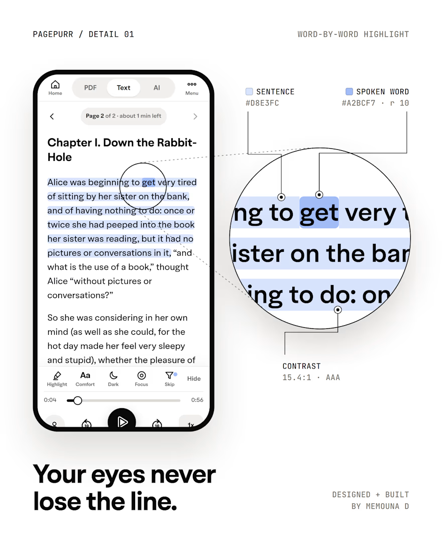
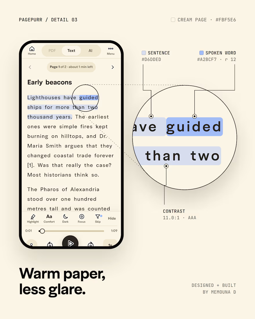
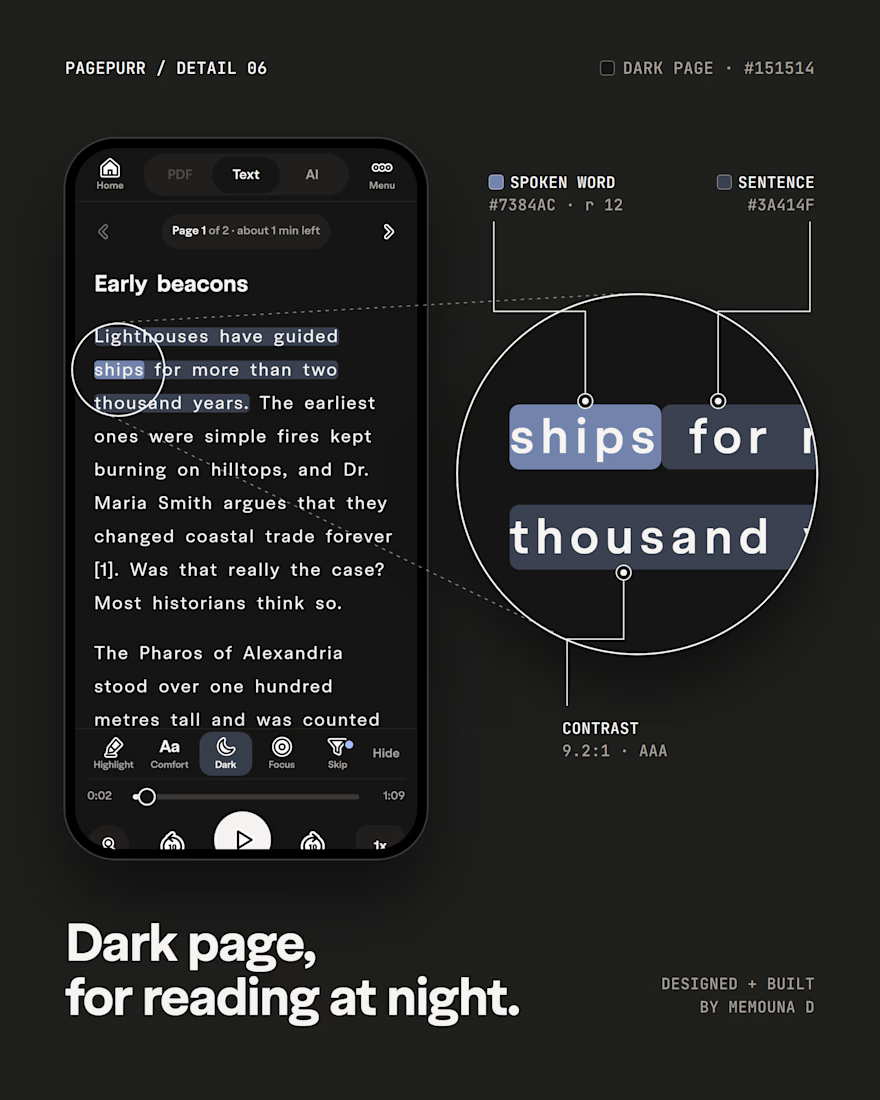
Just a reading screen. Doesn't mean it has to be boring.
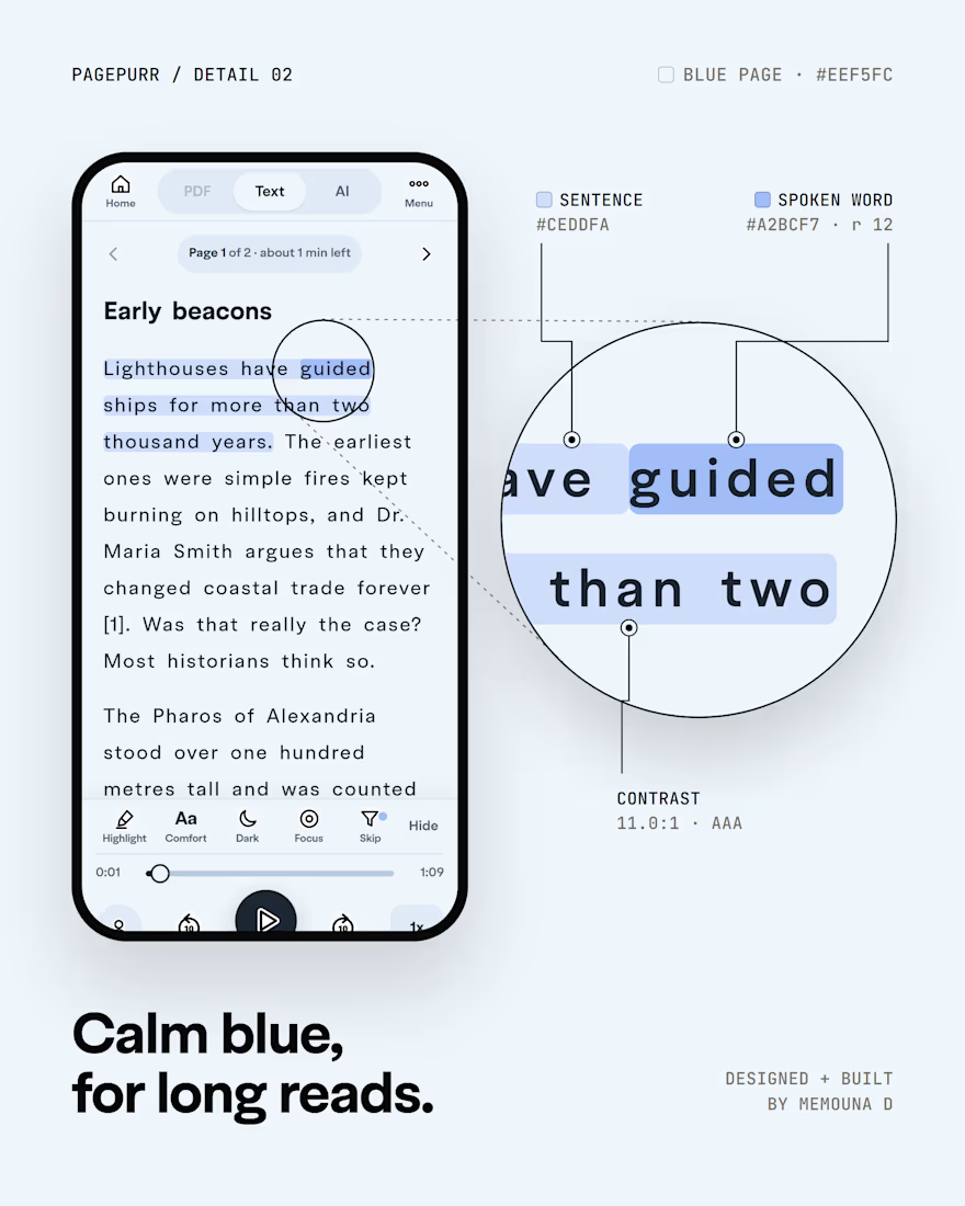
In Pagepurr, the sentence stays tinted and the spoken word lights up, so your eyes never lose the line.
I designed it, built it and shipped it on six page colors, because one white page doesn't suit every reader. Every version keeps the text above 9:1 contrast.
Which page would you read on?


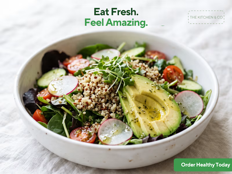
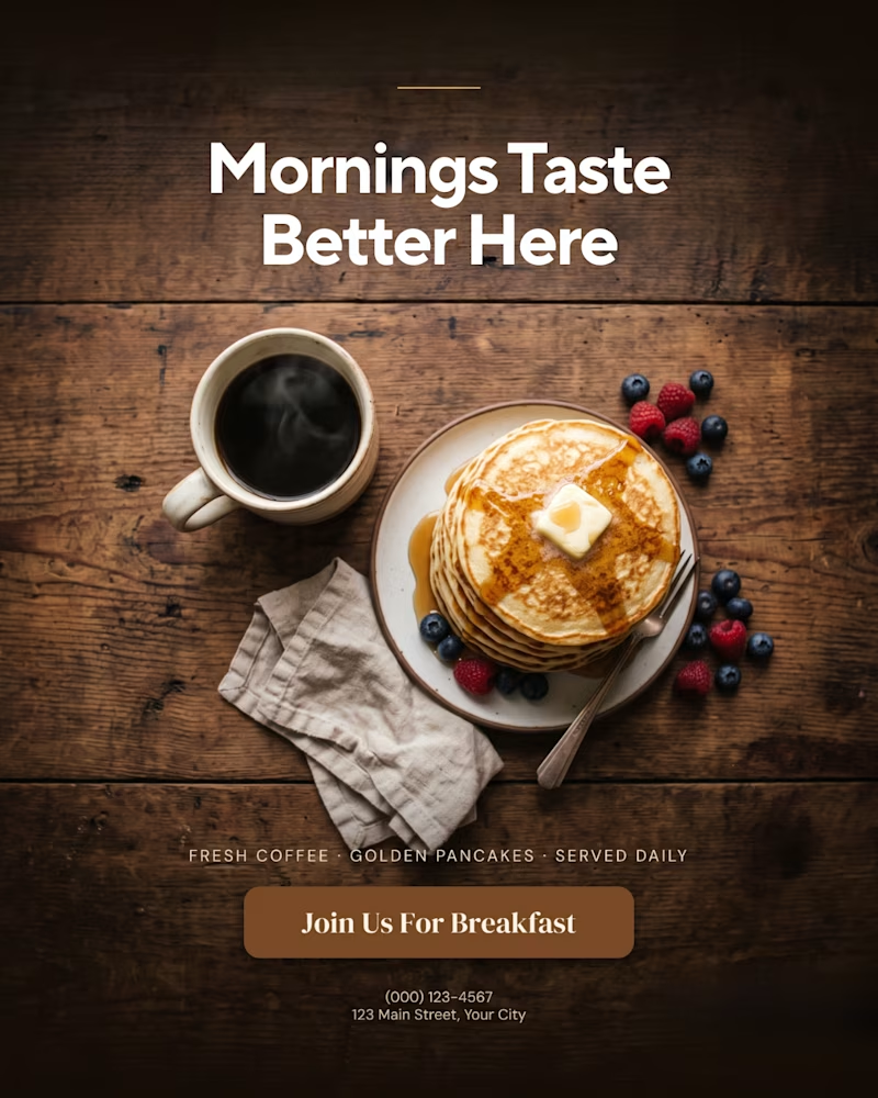
A creative food advertising design series focused on bold typography, visual hierarchy, and appetizing food photography.
The first design uses warm, rustic tones and expressive typography to create a cozy breakfast feel, while the second combines fresh green typography with a clean, modern layout for a healthy food concept.
Both designs explore how typography, color, and composition can communicate different food brand identities.
Which design do you prefer, the warm breakfast aesthetic or the fresh, minimal look?

9 votes
Ends in 3h

That is more attractive to me great job Malaika🎉🎉🎉