The network for creativity
Join 1.25M professional creatives like you
Connect with clients, get discovered, and run your business 100% commission-free
Creatives on Contra have earned over $150M and we are just getting started
Back to feedPost
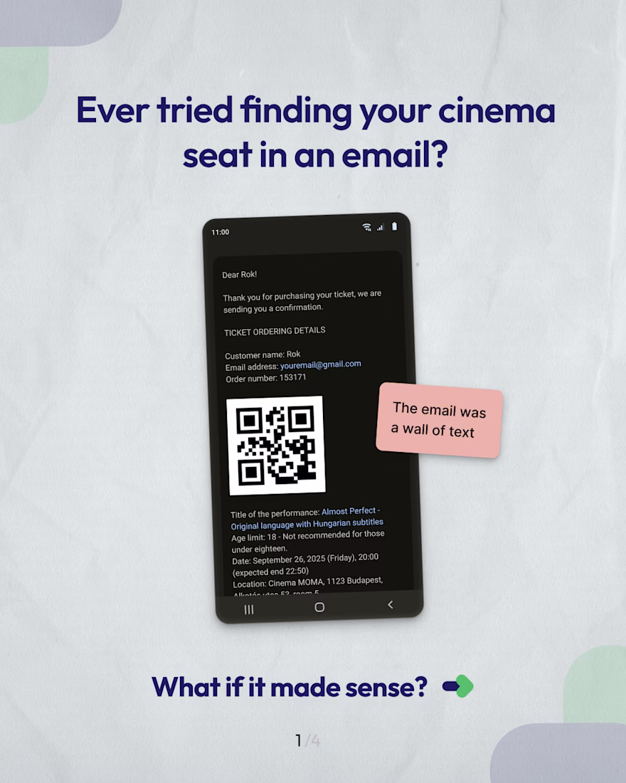
Last week I went to the cinema here in Budapest.
Got the confirmation email, opened it, and all I saw was the QR code.
Everything else: time, room, seats… lost in a grey wall of text.
It wasn’t broken; it just wasn’t built for how people actually read.
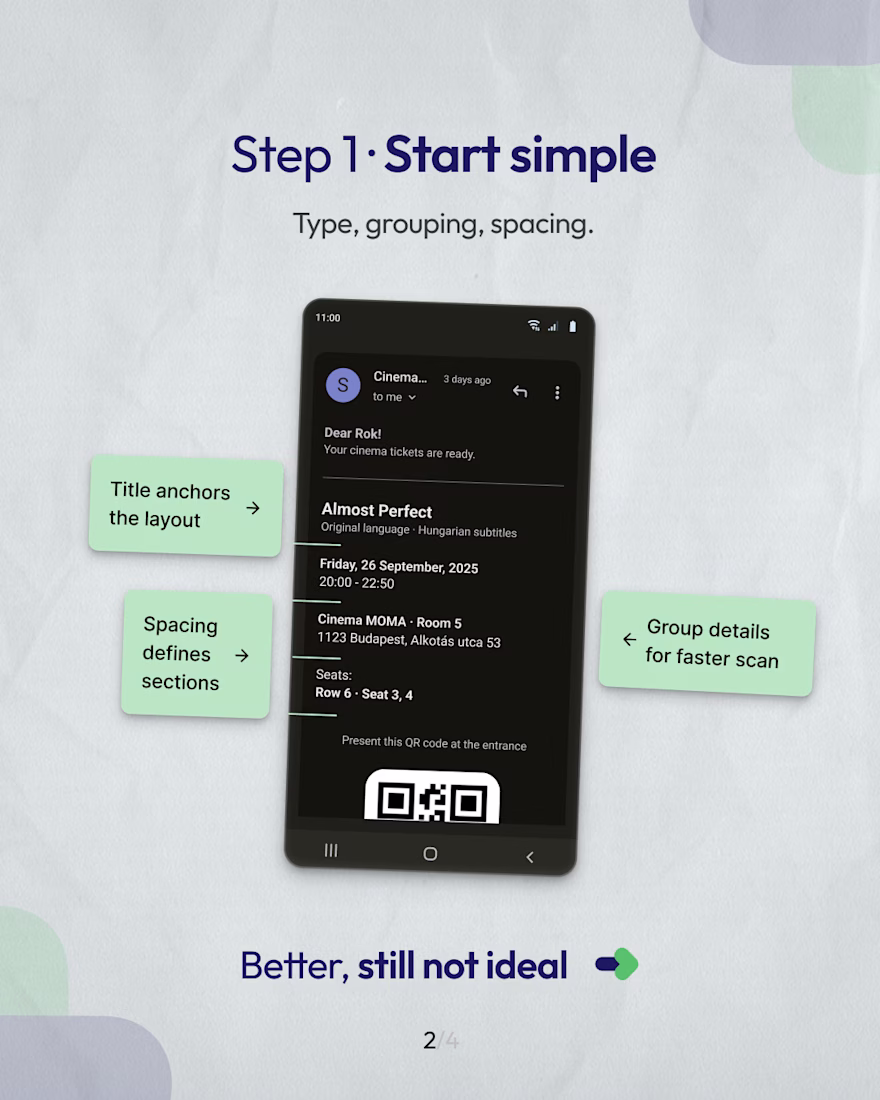
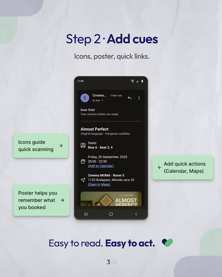
So I redesigned it.
Didn’t change much, just added structure and a bit of care.
Same info, but this time it actually guides you.
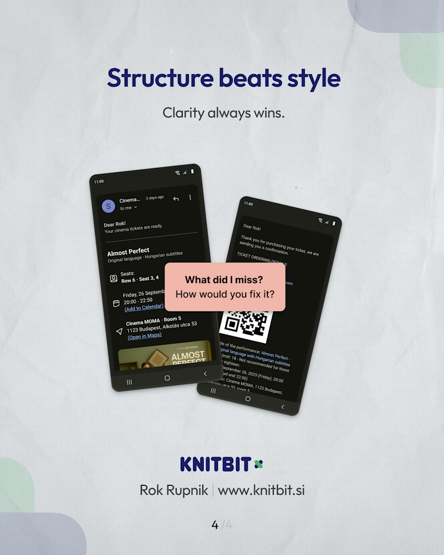
Little moments like this remind me why design matters.
We use things like this every day… we just stop noticing when they make no sense.
What’s one small thing you wish worked a bit better?
Good additions in the redesign, structurally makes it much clearer and should definitely be possible in email HTML (which is normally a limiting factor). I think maybe the grey wall of text in the first email is because they haven't properly set up for dark mode potentially...
The network for creativity
Join 1.25M professional creatives like you
Connect with clients, get discovered, and run your business 100% commission-free
Creatives on Contra have earned over $150M and we are just getting started
Trending
Claude
Claude has entered the design space. How are you using Claude Design?
Contra University
Learn from expert creatives how to earn more using next-gen AI tools.
MagicPath
The canvas is infinite, and exploration is becoming the workflow. How are you using MagicPath?
creativeaiflow
Creative AI workflows are evolving. What tools do you use, and what are their strengths and weaknesses?
freelancerlife
Freelancer life is wins, pivots, and everything in between. What’s yours right now?