The network for creativity
Join 1.25M professional creatives like you
Connect with clients, get discovered, and run your business 100% commission-free
Creatives on Contra have earned over $150M and we are just getting started
Back to feedPost




The network for creativity
Join 1.25M professional creatives like you
Connect with clients, get discovered, and run your business 100% commission-free
Creatives on Contra have earned over $150M and we are just getting started







Related posts

Hole Story, a bagel brand concept with a pun you can’t unsee. Lilac backdrop, flying bagels and visuals good enough to eat.


Amazing

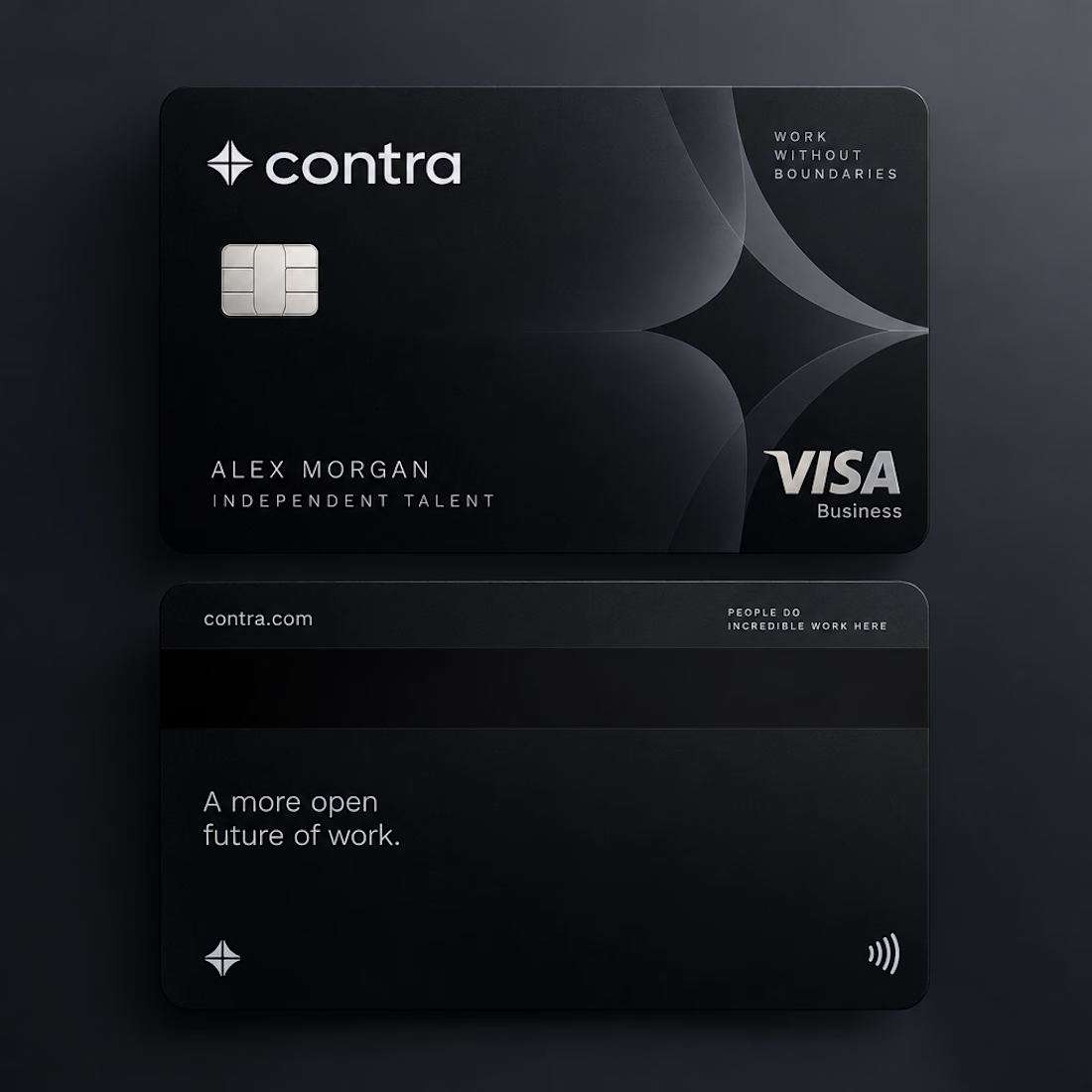
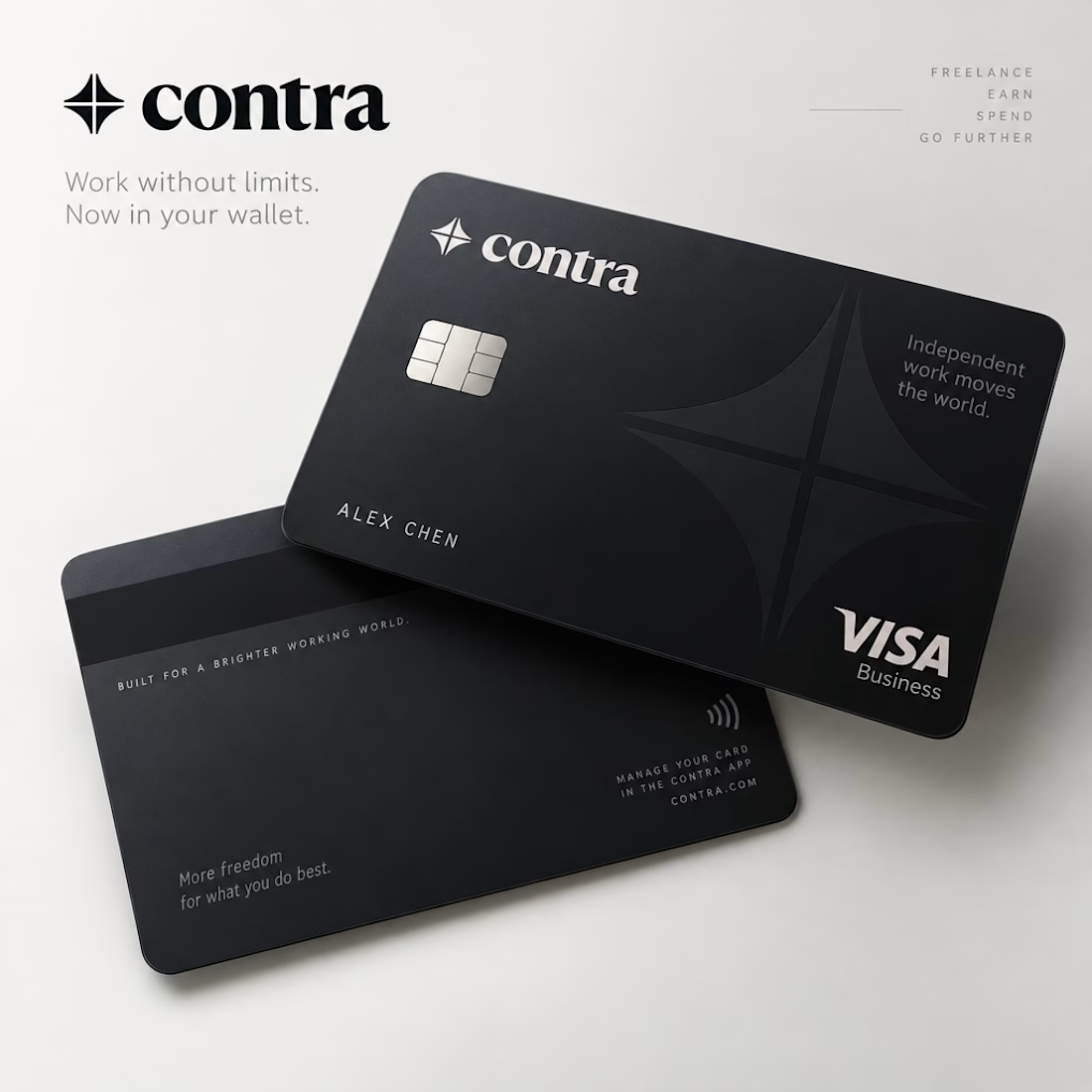
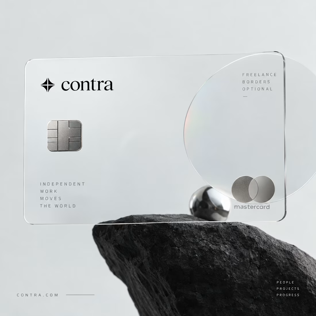
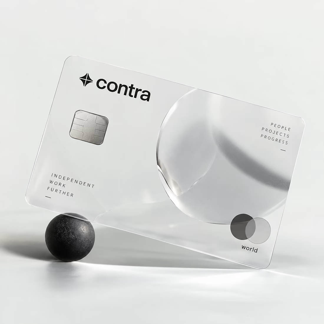

I’d definitely go with black. 🖤 It feels sharper, more premium, and timeless. The transparent concept is creative, but the black version has a stronger visual identity.

Sharing my my retro futuristic packaging design for @scentramotors car perfumes and diffusers :) Created using: @Figma @Adobe @Pacdora PTE. LTD. @ChatGpt @claude (help with text).


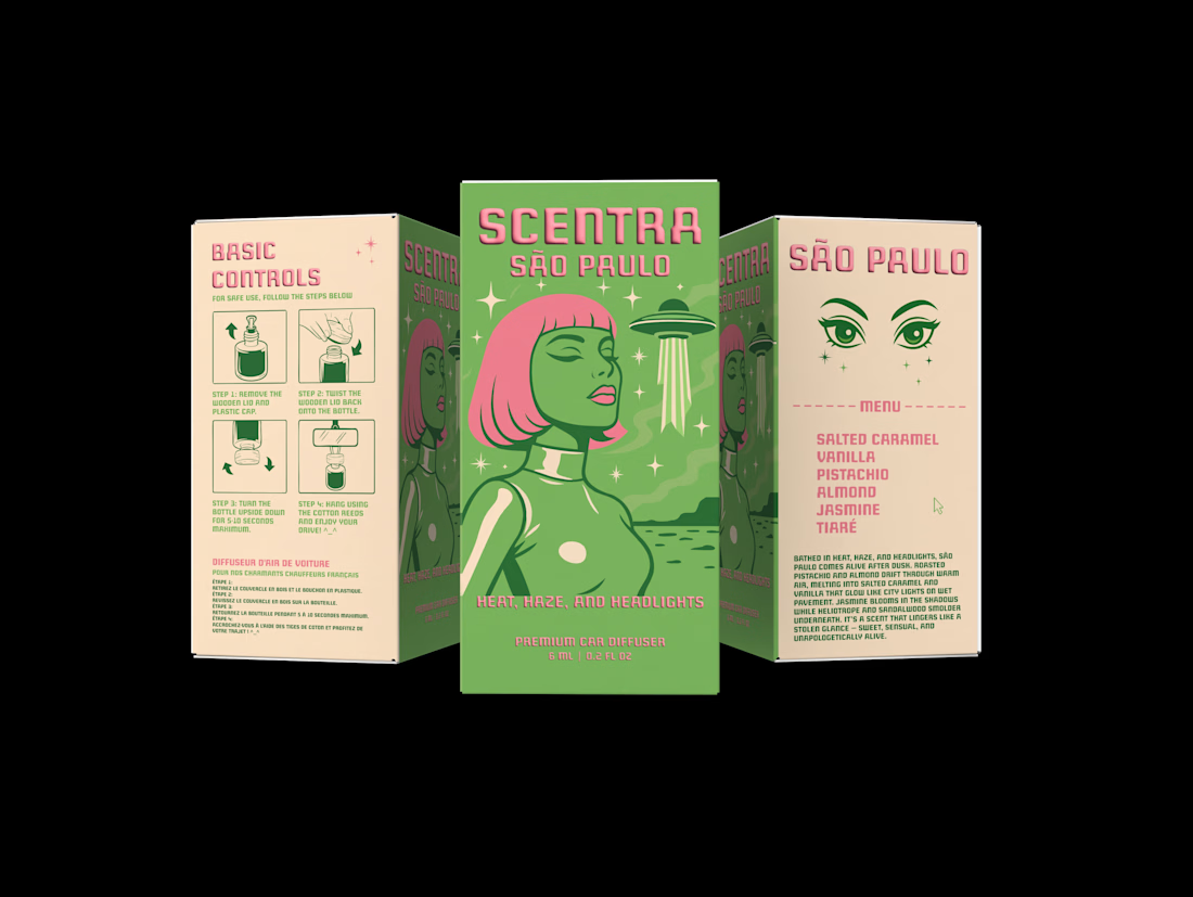

Cool! Love the illustration and typography. Did you use a custom font for “Scentra”?


