The network for creativity
Join 1.25M professional creatives like you
Connect with clients, get discovered, and run your business 100% commission-free
Creatives on Contra have earned over $150M and we are just getting started
Back to feedPost

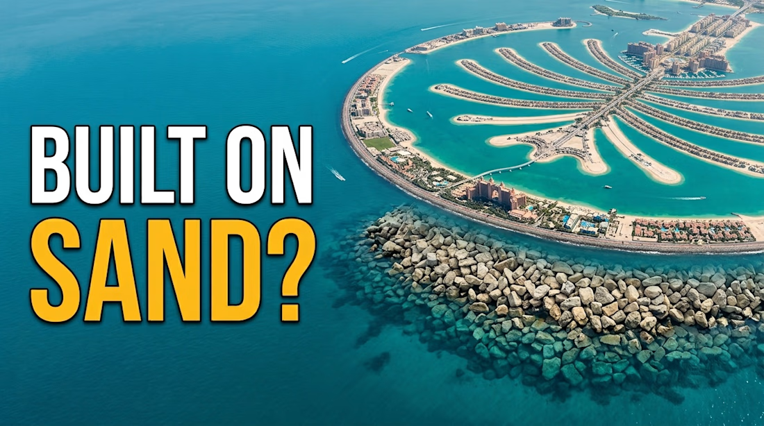
Title: Palm Jumeirah - Built on Sand? | Dubai Documentary Thumbnail
About this work:Clean, high-stakes thumbnail for mega-project documentary.
Strategy:Aerial view of Palm Island for wow factor
• Bold 2-word hook "BUILT ON SAND?"with yellow highlight for danger/curiosity
• Minimal text, maximum visual impact
• Ideal for: Architecture, Engineering, Geography channels.
Tools: Photoshop, Lightroom
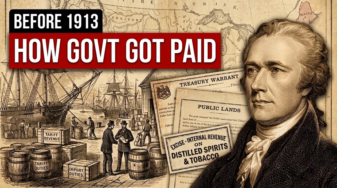
Title: How Govt Got Paid Before 1913 - Vintage History Thumbnail
About this work:Created vintage collage thumbnail for finance history channel.
Strategy:Authentic 1800s elements:
• Old maps, Treasury Warrant, Public Lands documents, Tariff Duties barrels
• Sepia texture for historical trust
• Hamilton portrait to target US audience search
• This thumbnail style works best for Finance History & Educational channels.
Tools: Photoshop
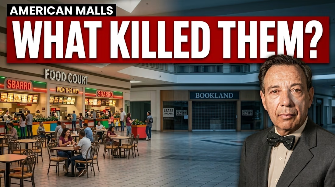
Title: American Malls - What Killed Them? | High CTR Thumbnail
About this work:Designed a curiosity-driven thumbnail for a documentary video about the death of American malls.
Strategy:
• Split contrast: Crowded food court vs empty closed stores(BOOKLAND, LEASE AVAILABLE)
• Big red text "WHAT KILLED THEM?" creates open loop
• Human face for emotional connection
• Result:This style typically achieves 6-8% CTR on history/economy channels.
Tools: Photoshop, Figma
Niche: Documentary, US Economy, Retail History


The network for creativity
Join 1.25M professional creatives like you
Connect with clients, get discovered, and run your business 100% commission-free
Creatives on Contra have earned over $150M and we are just getting started



Related posts

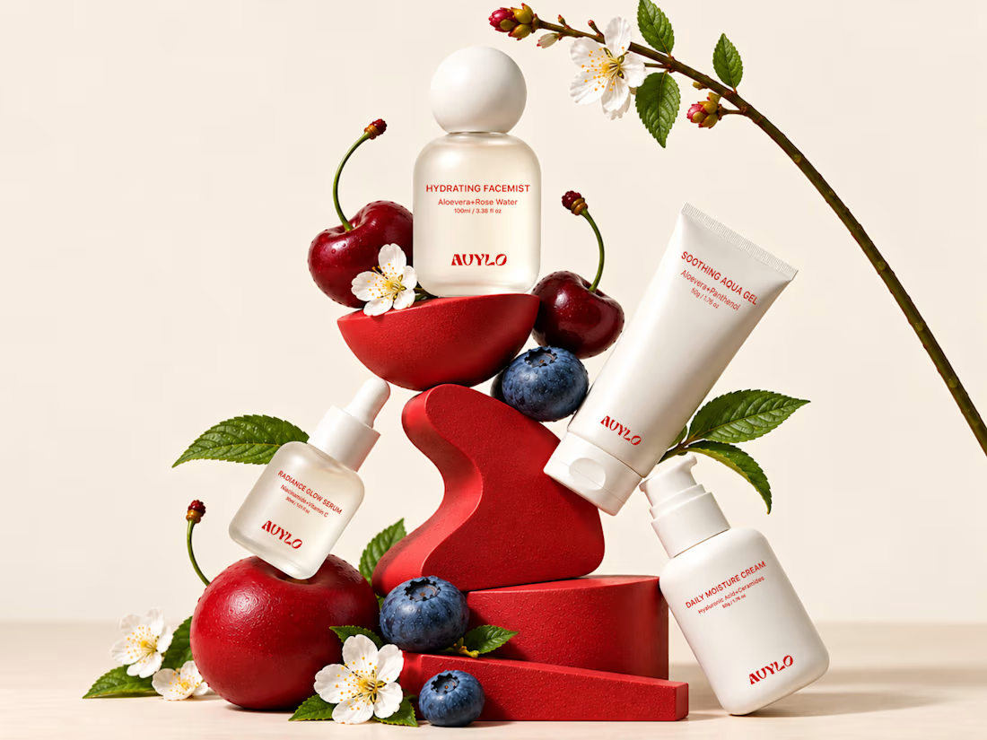
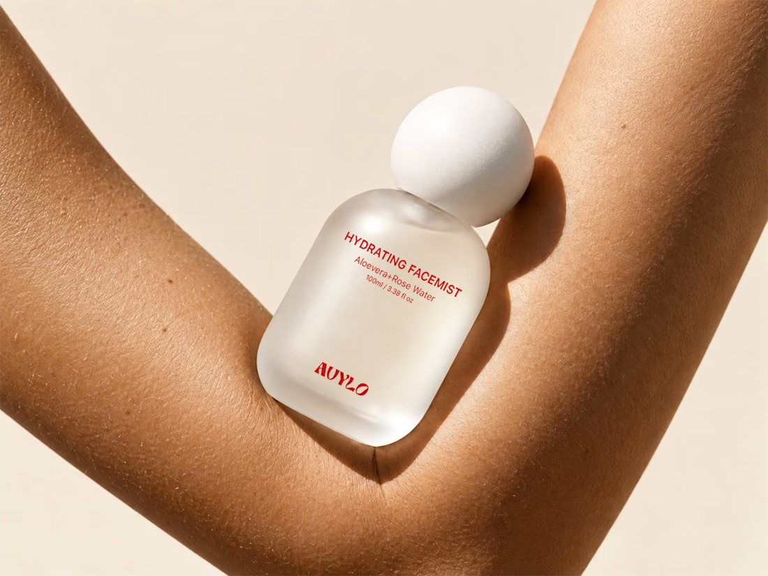
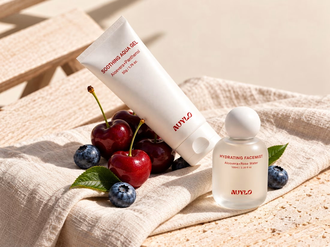
AVYLO Skin Care Packaging Design


Good job

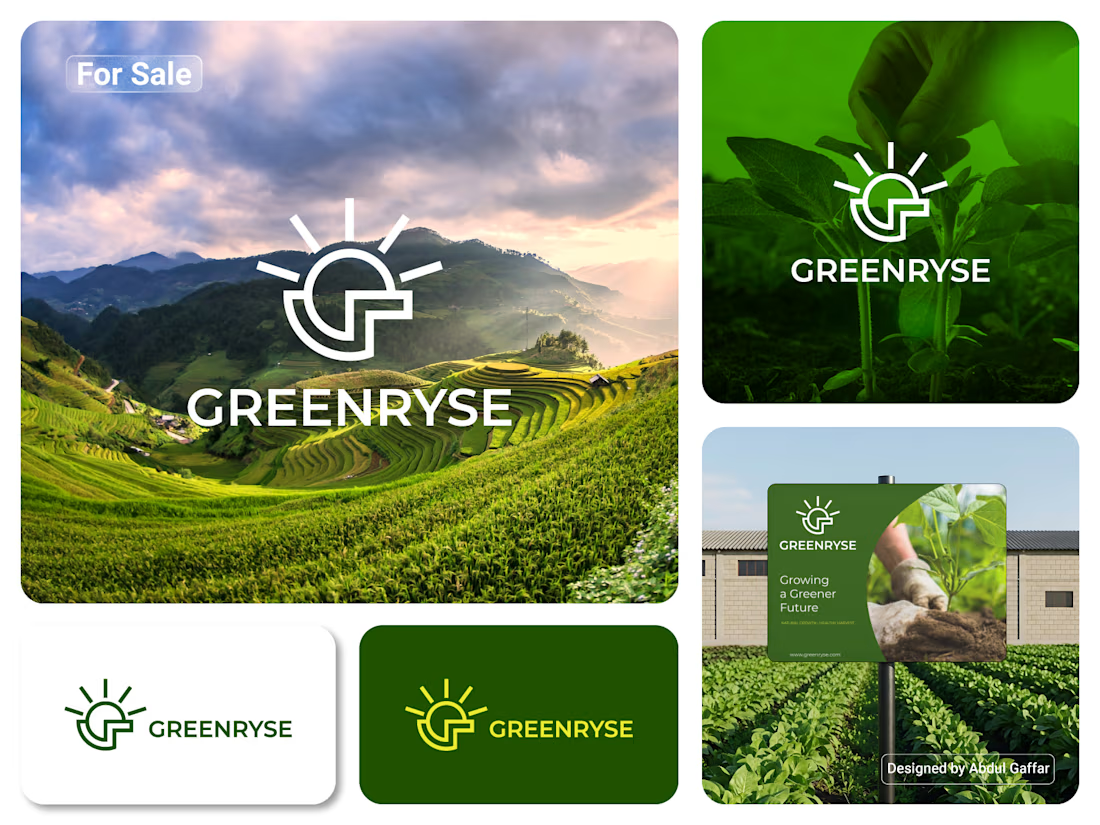
GREENRYSE – G Lettermark, Sun Logo Design, Sustainable Agriculture.
Introducing GREENRYSE, a modern logo concept inspired by nature, agriculture, and the power of growth. The symbol combines a geometric letter G with a rising sun, representing new beginnings, natural energy, and a brighter future for agriculture.
The presentation explores how the logo works across different backgrounds and applications, including agricultural landscapes, product imagery, and outdoor signage. Its clean geometric structure and fresh green color direction create a natural yet professional look.
Designed for agricultural companies, organic farming businesses, crop production, sustainable agriculture, and modern agritech ventures.
Stunning!

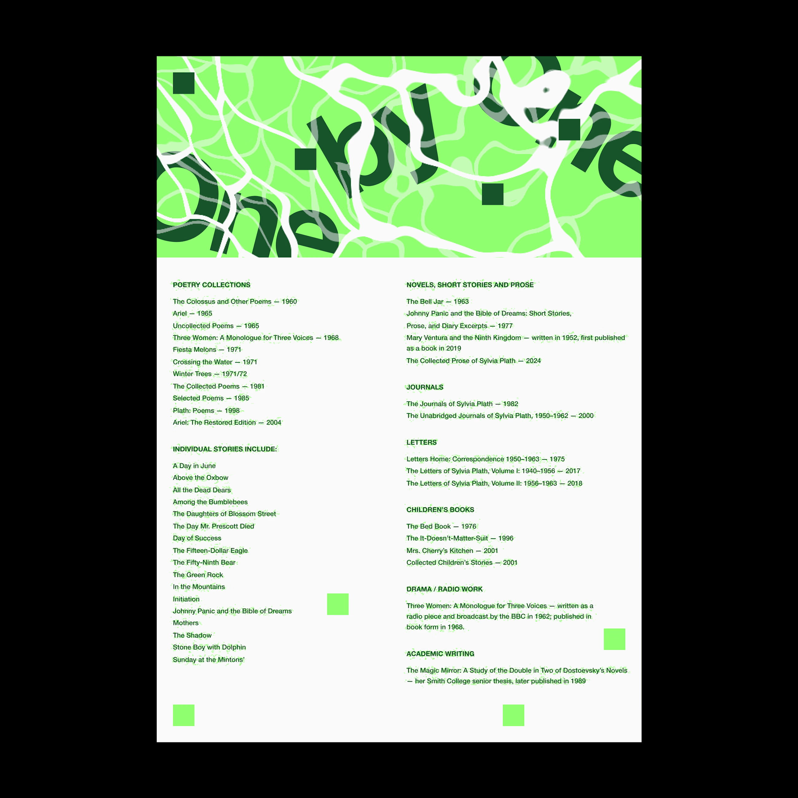
Was playing around with Rogie King's Noise & Texture plugin in Figma and thought it’d be fun to throw in a few excerpts from Sylvia Plath’s The Bell Jar.
One thing led to another, and I ended up with these experiments in typography and texture.
It got me thinking about how texture and typography can do more than just look interesting. They can help communicate the mood and meaning behind the words.
What do you think? Does the chaos add to the story, or get in the way of it?
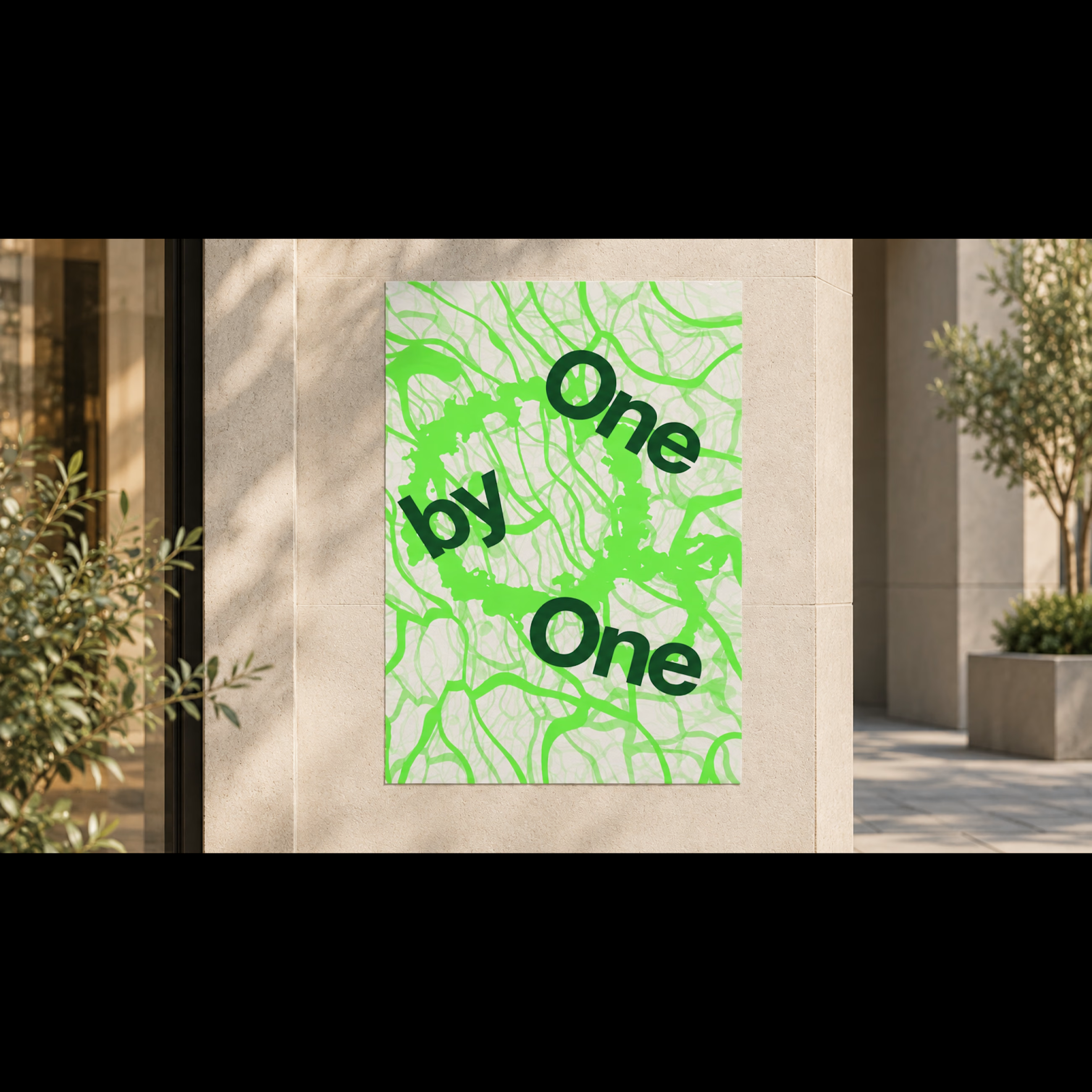
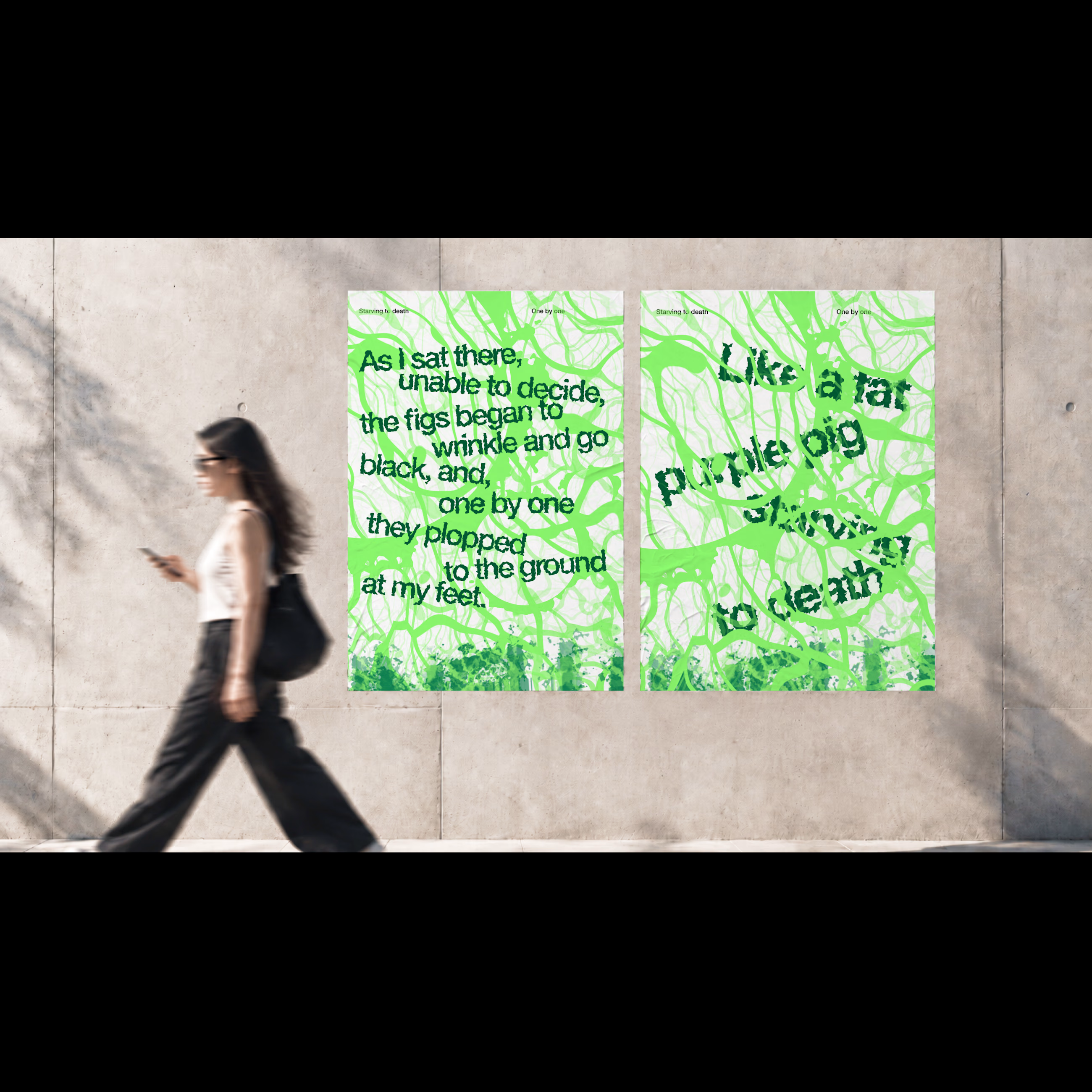
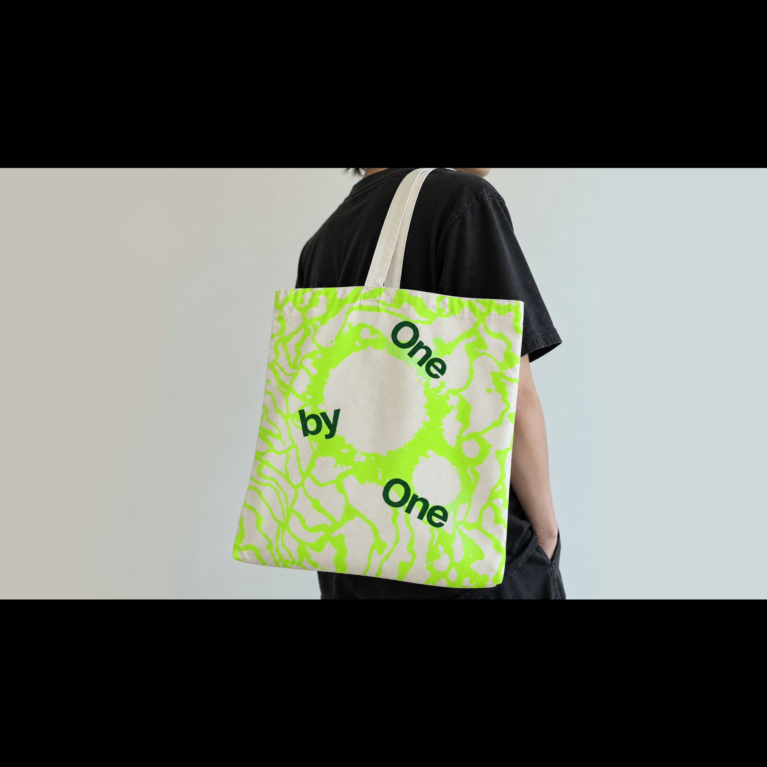

For me the chaos works when it stays tied to the words, like the tangle looping around "One by One". On the dense excerpt layouts legibility starts to eat the story, so I'd keep the noise away from the lines you want read first.