The network for creativity
Join 1.25M professional creatives like you
Connect with clients, get discovered, and run your business 100% commission-free
Creatives on Contra have earned over $150M and we are just getting started
Back to feedPost
Designed an Onboarding flow for an app with a long onboarding data (Concept work).
I'll break it down on in the coming days on how I went about planning and designing it to keep the users engaged and reduce drops off. Stay tuned✌️
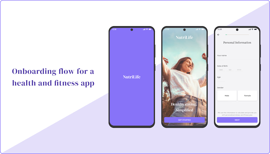

Looks really clean. The onboarding flow seems simple and focused, which is great for keeping users engaged.

Thanks man!
The network for creativity
Join 1.25M professional creatives like you
Connect with clients, get discovered, and run your business 100% commission-free
Creatives on Contra have earned over $150M and we are just getting started

Challenges
View all


Related posts

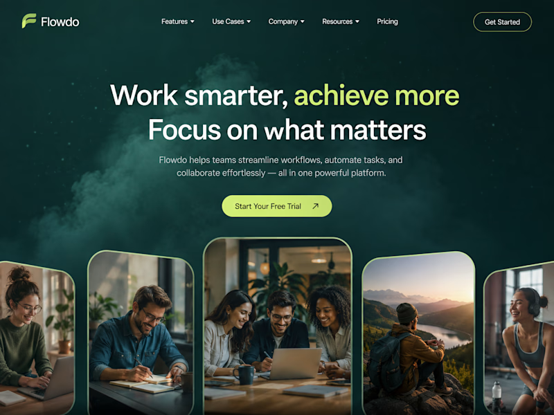
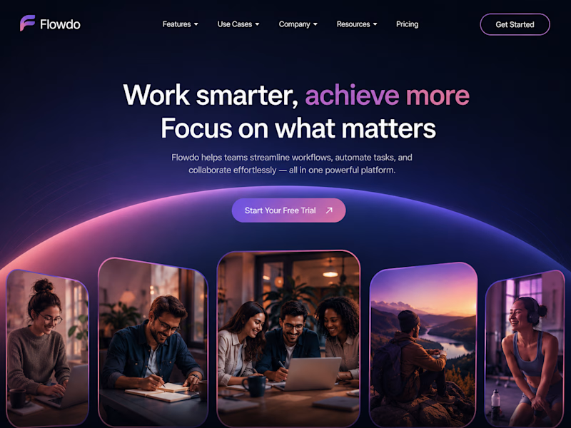
One header, two color stories.
Green: cool tones, feels productive and safe
Purple: gradient glow, feels modern and premium
Same words. Different first impression.
Which one would make you click "Get Started"?

26 voted
59%
18 voted
41%
44 votes
Closed

Went with calm and focused. The copy is literally asking people to focus on what matters, so a header that competes for attention with a glow works against its own message.

An experiment exploring how to visually communicate design impact through a draggable before/after slider. Built to test the interaction and motion feel of scrubbing between two states of a design, it uses a small format to show transformation at a glance 😊


The compact format is doing a lot of work—the draggable reveal makes the improvement immediately legible, while the consistent card rhythm keeps the comparison easy to scan.

Onboarding is more than pretty slides.
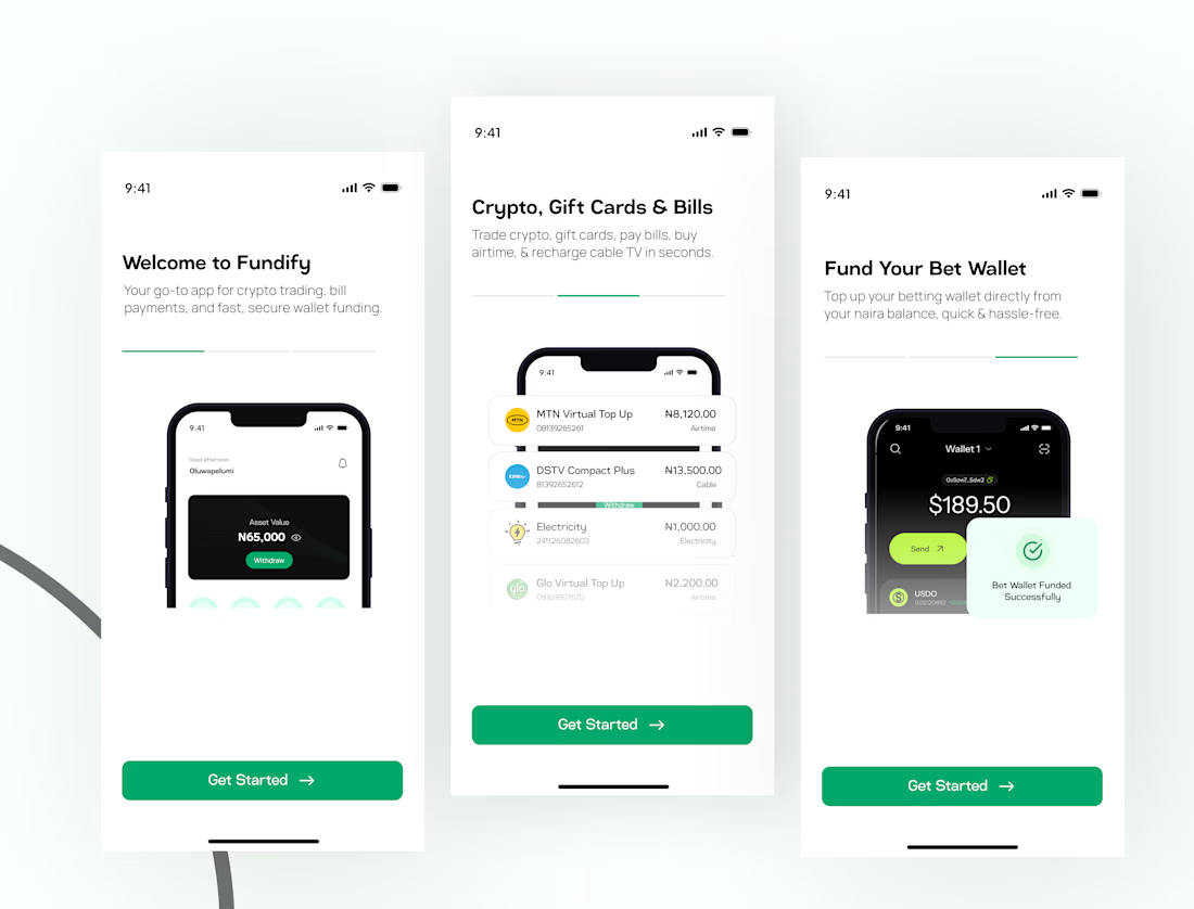
I designed this onboarding experience for Fundify about two years ago, and looking at it today, the thinking still holds up.
The goal was simple: help users understand what the product does before asking them to explore it.
Fundify brings crypto, gift cards, bill payments, and betting wallet funding into one experience, so the onboarding needed to communicate those core values quickly and clearly.
Each screen tells part of that story without overwhelming the user.
Because good onboarding isn't just about showing features.
It's about creating clarity, trust, and enough curiosity to keep going.
Two years later, and I still stand by the decisions behind this one.
What do you think?

PRO Design 😍