The network for creativity
Join 1.25M professional creatives like you
Connect with clients, get discovered, and run your business 100% commission-free
Creatives on Contra have earned over $150M and we are just getting started
Back to feedPost

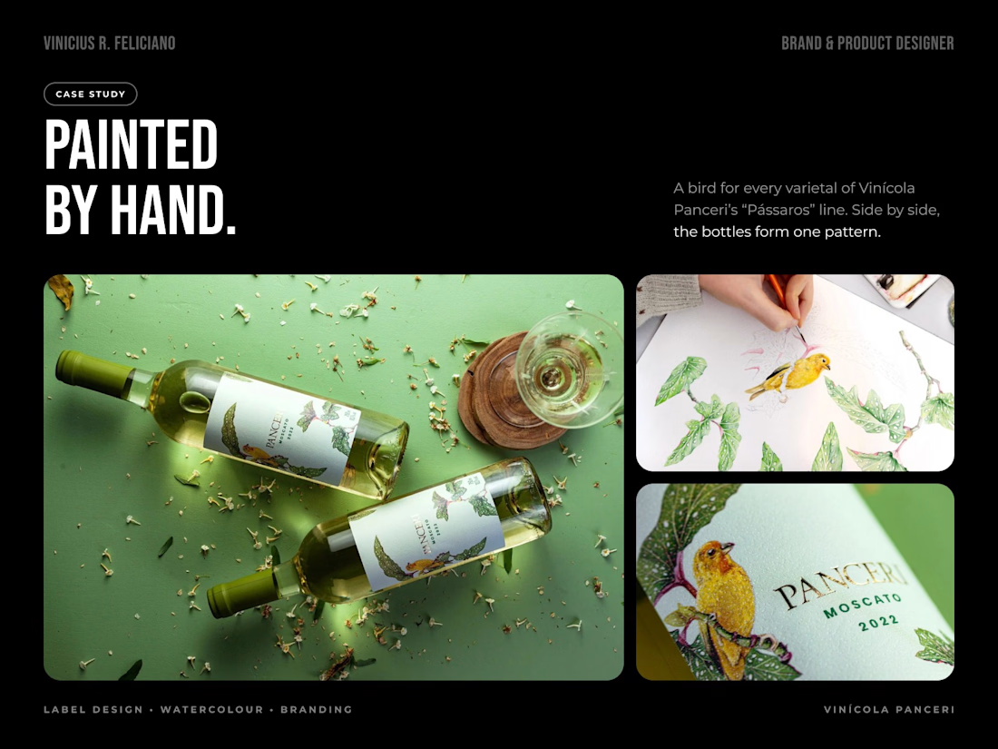
Not every label should be generated. This one was painted.
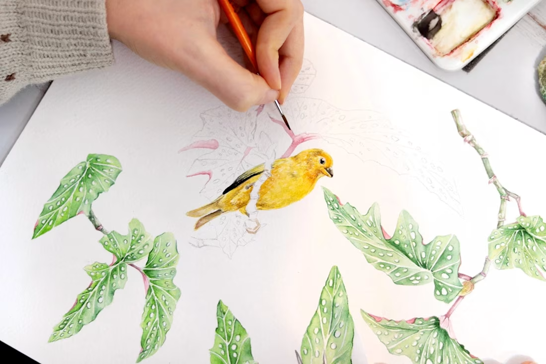
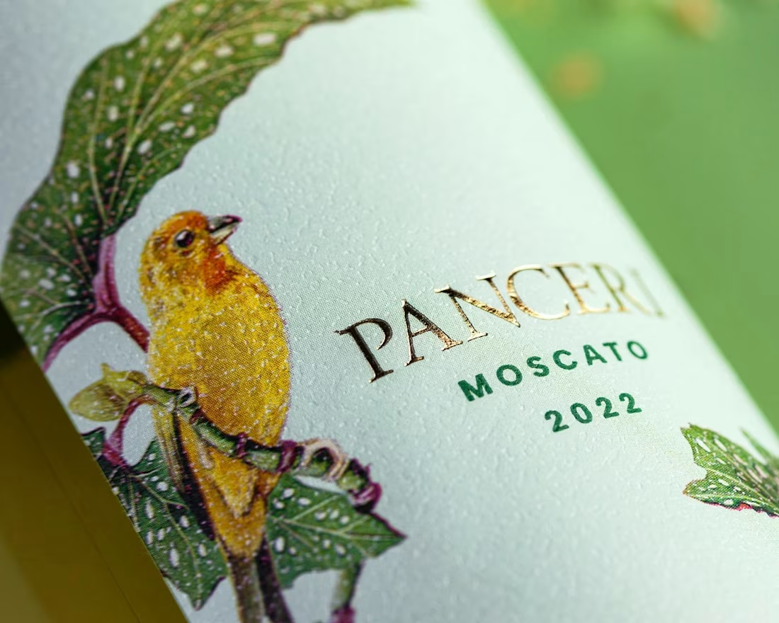
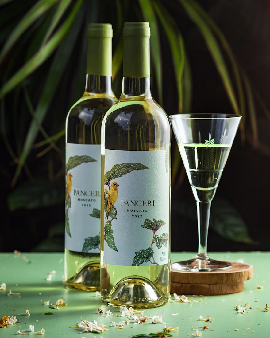
For Vinícola Panceri's “Pássaros” line, every varietal gets its own bird. On the Moscato it's the Saffron Finch, common in the winery's region, perched on a Begonia aconitifolia whose green and red play against the colour of the wine and the yellow of the bird.
The illustration is watercolour, painted by hand, then carried into the label system: typography, print specification and a layout that makes the bottles connect. Side by side on the shelf, the whole line reads as one pattern.
The watercolour carries the same softness and delicacy as the wine.
The network for creativity
Join 1.25M professional creatives like you
Connect with clients, get discovered, and run your business 100% commission-free
Creatives on Contra have earned over $150M and we are just getting started







Related posts

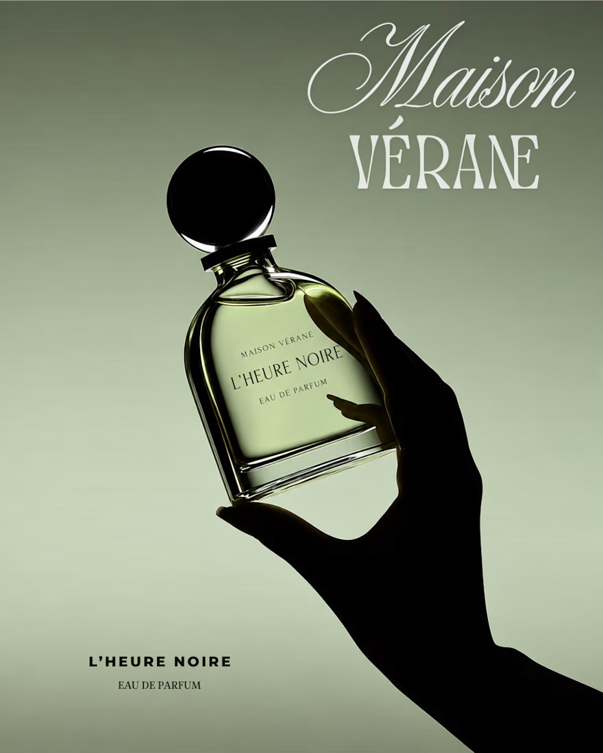
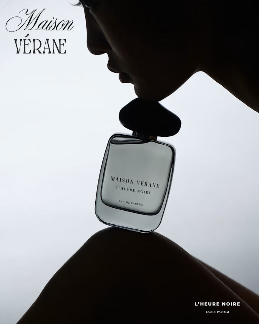
My latest perfume poster series for Maison Vérane. Muted olive tones, cool monochromes, and dramatic silhouettes bring out the mysterious mood of L’Heure Noire. Designed in Canva with elegant typography and minimal layouts that keep the fragrance in focus.
Looking for visuals that reflect your brand’s personality? Let’s connect.



Caffeine & Cranks — Brand Identity & Creative Direction
A complete visual identity concept created for Caffeine & Cranks (C&C), a cycling-inspired brand that combines the energy of coffee culture with the performance and lifestyle of cycling.
The project explores a bold, contemporary visual language through a combination of brand identity, typography, color direction, apparel graphics, packaging design, and campaign art direction.
The visual system was designed to feel energetic, youthful, and performance-driven while maintaining a distinctive lifestyle aesthetic. The identity is applied across cycling apparel, packaging, promotional graphics, and brand communication to create a cohesive visual experience.
Scope of work:
Brand Identity & Logo Development
Art Direction
Typography & Visual Language
Color Palette Development
Cycling Apparel Design
Packaging Design
Marketing & Campaign Visuals
Brand Application & Mockups
The overall direction focuses on creating a recognizable identity that connects cycling performance, caffeine culture, and modern streetwear aesthetics.


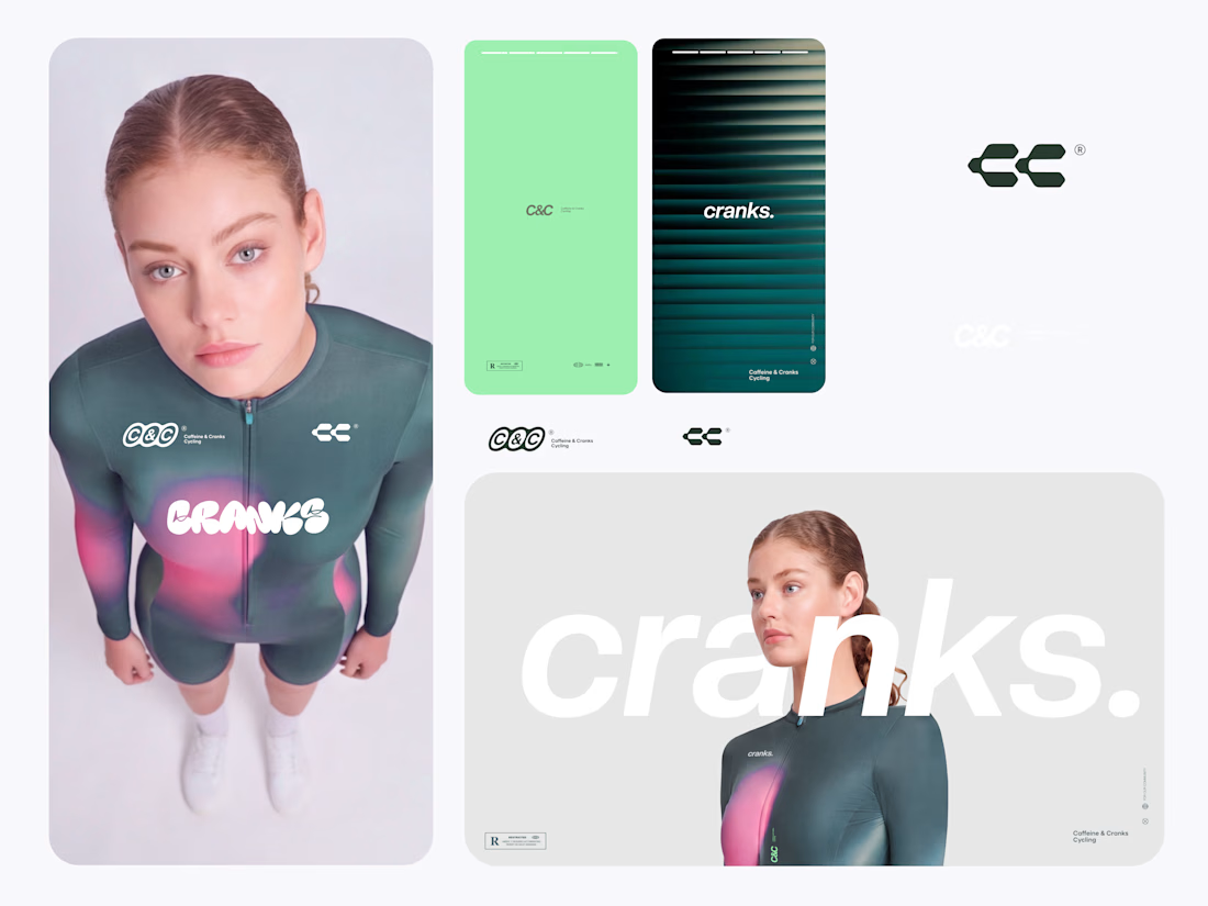

Two-world brands usually end up with one side eating the other, and here the cycling half owns the forms while the coffee half only really survives in the palette and the name. Was that deliberate, or did the caffeine cues get pushed out once the apparel application took over?

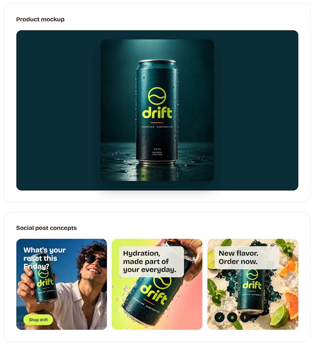
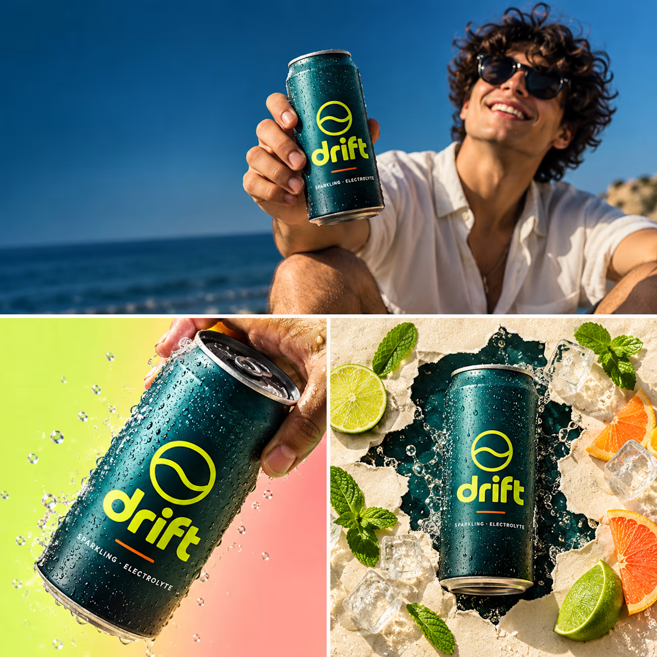
Just wrapped a full brand identity for DRIFT, a functional beverage brand.
logo suite, palette, type system, packaging and a social content set, all built around one bold visual language. 🌊

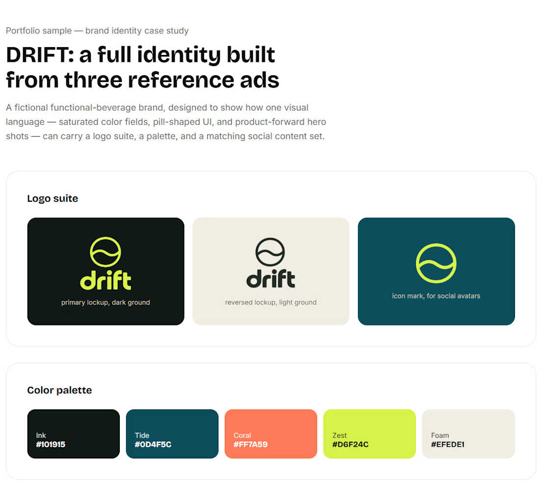

Really Nice Visual Direction.