The network for creativity
Join 1.25M professional creatives like you
Connect with clients, get discovered, and run your business 100% commission-free
Creatives on Contra have earned over $150M and we are just getting started
Back to feedPost

🎬 Title: “Luxury You Can Feel Through the Screen
"Can you feel it? Even through your screen, you can almost smell the luxury!
"This isn't just perfume. It's confidence, elegance, and an unforgettable impression."
The network for creativity
Join 1.25M professional creatives like you
Connect with clients, get discovered, and run your business 100% commission-free
Creatives on Contra have earned over $150M and we are just getting started



Related posts

Working on a advert for a perfume brand

🛥️ LUXURY CRUISE POSTER - Premium $5000+ Ticket Design!
Designed this premium Ocean Luxury Cruise poster - golden hour sunset + luxury yacht - sells high-ticket $5000+ voyages!
Why this luxury design sells:
✅ Golden hour sunset + luxury yacht = $5000+ feeling instantly
✅ Gold UP TO 40% OFF - elegant gold, premium not cheap
✅ Top line - EXPLORE THE MEDITERRANEAN • CARIBBEAN • BEYOND - dream destinations
✅ Luxury badges - ALL-INCLUSIVE 7-14 DAY VOYAGES • PRIVATE SUITES & SPA • GOURMET DINING
✅ Gold border + navy blue - luxury cruise brand colors
✅ Two CTAs - BOOK NOW • LIMITED CABINS + RESERVE YOUR VOYAGE - urgency
Previous version: 146 views, 3 likes - luxury niche performs best for high-ticket!
Perfect for luxury travel brands, yacht charters, cruise agencies.
Tools: Photoshop, Lightroom, Illustrator - 8K Ultra HD


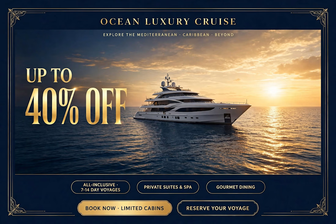

Gold type on deep navy with the sunset glow makes "40% OFF" the first thing I read. The two CTAs at the bottom compete a bit, would you test a single Book Now?

Speculative Campaign — Luxury Fragrance Teaser
A quick visual experiment exploring pre-launch teaser aesthetics for premium perfume brands. Focuses on spatial composition, dramatic lighting, and high-end typography to create immediate visual desire.
Role: Concept, Art Direction, Visual Design
Tools: Photoshop / Illustrator / Figma
Open for freelance projects and retainer contracts for visual identity & social campaign assets.
Available for freelance projects, Let's collaborate..
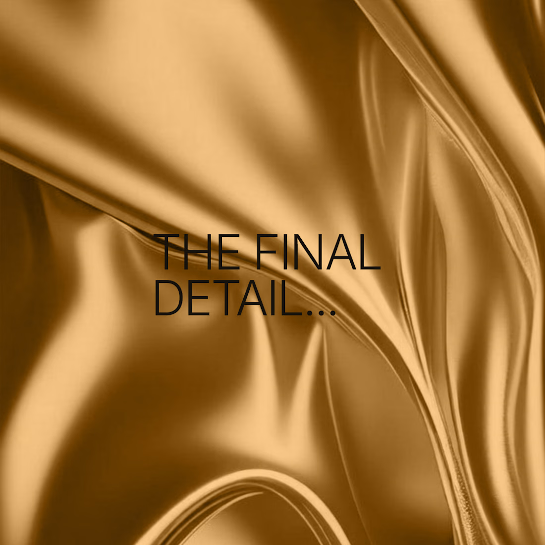
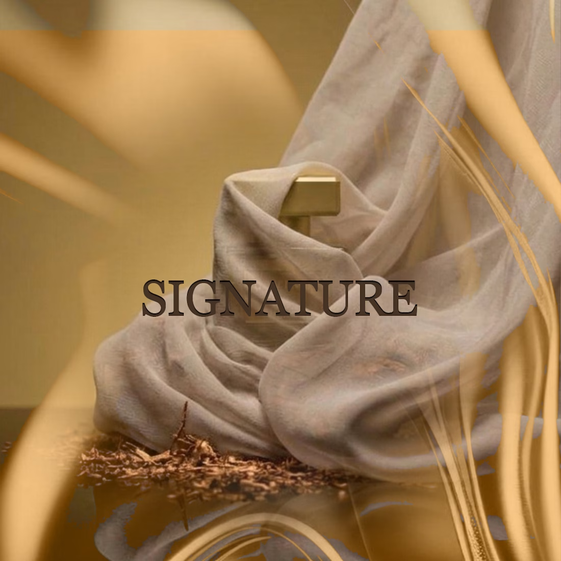
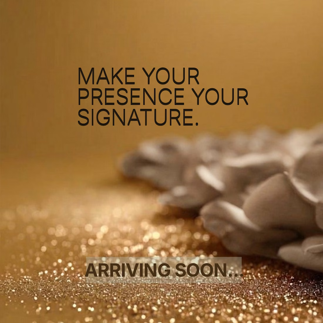
The gold silk with "The final detail..." builds a nice pause before the reveal. The thin dark type on gold is a bit low in contrast on a phone, a heavier weight would help. Does the bottle land in the last frame?