The network for creativity
Join 1.25M professional creatives like you
Connect with clients, get discovered, and run your business 100% commission-free
Creatives on Contra have earned over $150M and we are just getting started
Back to feedPost

Waste Management Platform
A smart waste management system that uses IoT sensors to monitor bin levels in real time and make waste collection more efficient. It connects smart bins, collectors, and administrators on one platform so everyone stays updated. The system sends alerts when bins are full, helps plan better collection routes, and provides simple insights to improve overall waste handling and reduce manual effort.


The network for creativity
Join 1.25M professional creatives like you
Connect with clients, get discovered, and run your business 100% commission-free
Creatives on Contra have earned over $150M and we are just getting started



Related posts


I do my best work when I'm excited about it. This took me under 2h from start to finish. Might have to get more selective about the projects I take on from now on.


Looks so cool🔥I really wonder how you make all the characters and animations.


What makes a website feel cohesive?
It’s not just the colors.
It’s not just the typography.
And it’s definitely not about making every section look the same.
A cohesive website is built when every visual decision feels like part of the same story, from typography and imagery to spacing, buttons, cards, and even the smallest details.
The goal isn’t repetition.
It’s creating a visual language that people recognize and remember.
That’s when a website starts to feel like a brand, not just a collection of sections.
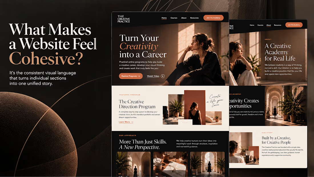

Well put, Serge. Consistent spacing, buttons and cards do more for that feeling than making sections match, and they are usually the first things to drift as a site grows.

45 colours, 5 ramps, 2 typefaces, 0 bold weights 🎨
That's the whole of Penwave's design system. Every colour is read from the app's Tailwind config, and each ramp has one job: cream for the page, beige for badges, tea green for avatars, celadon for every border, muted teal for all the text.
Instrument Serif sets the headings and the post body. Inter runs the interface, 300 to 600.
In the clip the palette builds a story card, colour by colour.
Do you give every colour in your system a job, or keep a few spare? 👇


To your question: one job per colour, with a single spare accent kept for promos. Cream for the page and celadon for borders is easy to hand over to a team. Why zero bold weights?