The network for creativity
Join 1.25M professional creatives like you
Connect with clients, get discovered, and run your business 100% commission-free
Creatives on Contra have earned over $150M and we are just getting started
Back to feedPost

I used to chase speed as a sign of progress. Lately I’ve learned that clarity upfront creates way more momentum than rushing ever did. Work’s been smoother because of it.


The network for creativity
Join 1.25M professional creatives like you
Connect with clients, get discovered, and run your business 100% commission-free
Creatives on Contra have earned over $150M and we are just getting started











Related posts

Congratulations @Ayomide Olagunju
This is genuinely motivating for me. ❤️
As an accountant, I hope to reach this level one day — continuously learning, growing, and using AI to make my work smarter and more valuable.
One day at a time. One skill at a time. One step closer to the goal. 🚀
#Accounting #AI #ContinuousLearning #FutureOfFinance #CareerGrowth

A milestone worth Celebrating

You can do fatimaa .. be consistentt


serif on that roma details card is a nice surprise in a dev tool shot. what did you end up fixing first?

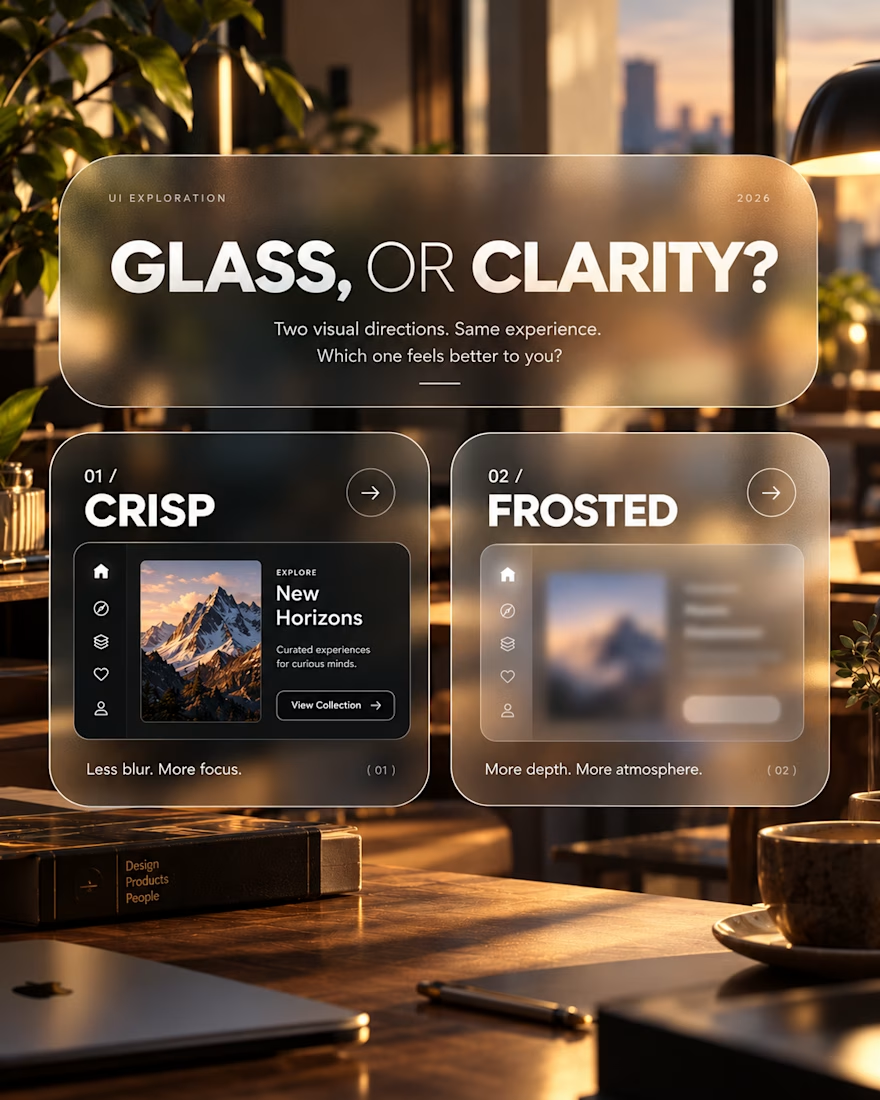
Glass, or Clarity?
An exploration of visual depth, contrast and interface clarity.
This concept explores two approaches to presenting the same interface: a crisp, sharply defined layout and a frosted-glass treatment.
The intention was to examine how surface treatments influence the overall character of a digital product, and where visual atmosphere begins to compete with usability.
Design considerations
Visual hierarchy and content legibility
Transparency, blur and depth
Contrast across layered surfaces
Choosing visual treatments that serve the product
The takeaway
Visual effects are most effective when they have a purpose. Aesthetic refinement matters, but it should never come at the expense of understanding or usability.
An ongoing exploration of the relationship between visual expression and functional design.
Which direction would you explore further, and why?