The network for creativity
Join 1.25M professional creatives like you
Connect with clients, get discovered, and run your business 100% commission-free
Creatives on Contra have earned over $150M and we are just getting started
Back to feedPost
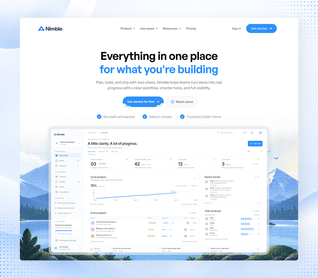
Been refining this SaaS hero for a while.
Finally landed on a direction I’m happy with.
Nimble.


hahah thanks bro 😅 took me a while honestly, kept changing small things until the hero felt right to me

The hero screenshot shows a mid-cycle state - 42 of 60 done, cycle ends in 3 days - rather than an empty workspace. That's what makes "less chaos" legible.
🔥 🙌
The network for creativity
Join 1.25M professional creatives like you
Connect with clients, get discovered, and run your business 100% commission-free
Creatives on Contra have earned over $150M and we are just getting started

Challenges
View all


Related posts

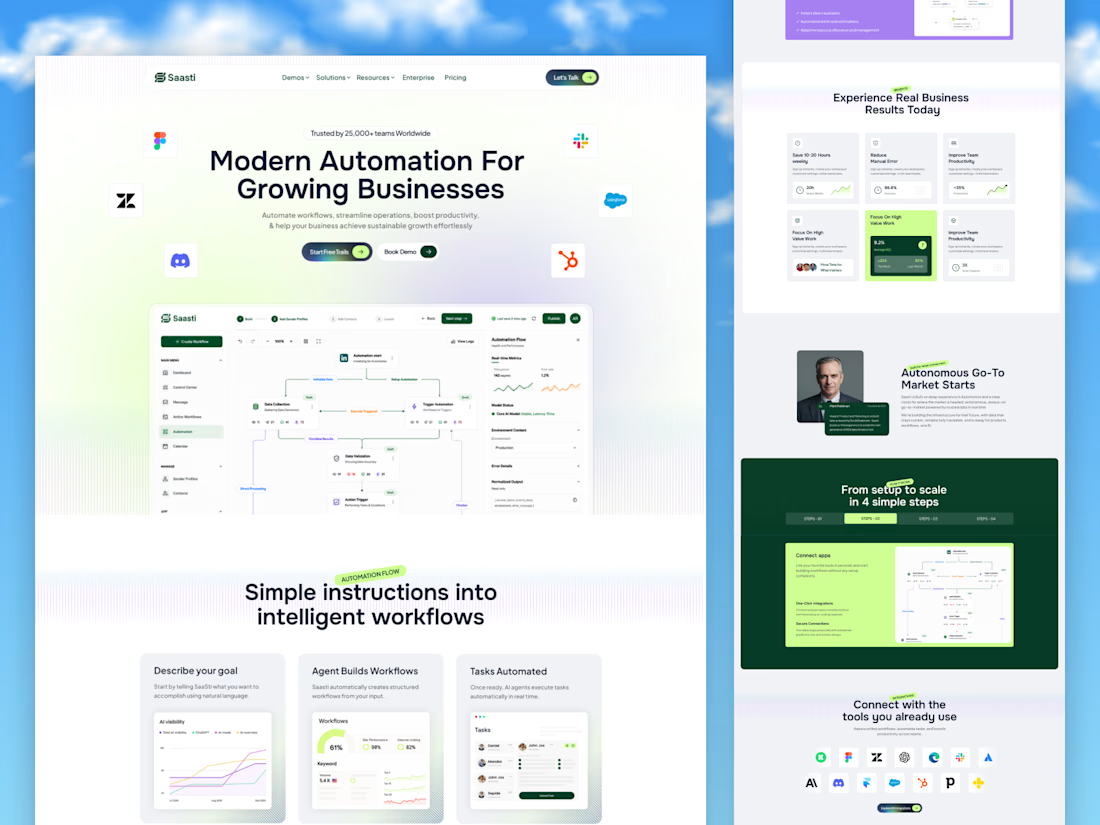
🚀 Saasti — Smart Automation for Growing Businesses
A modern SaaS website concept designed to turn complex automation into a simple, intuitive experience. With clean layouts, interactive workflow dashboards, vibrant accents, and clear messaging, every section highlights the power of smarter business operations.
✨ Modern SaaS UI/UX Design
⚡ AI-Powered Automation Experience
📊 Intuitive Workflow Dashboards
🎨 Clean, Conversion-Focused Layout
Designed by OrdainIT to bring innovation and usability together.
#SaaSDesign #UIDesign #UXDesign #AI #WebDesign #DashboardDesign #OrdainIT



Brilliant execution!

Portfolio note: Shakehand, my AI cold-email platform.
The feature I thought would sell it: AI-personalized sequences. The feature that actually mattered: deliverability. SPF/DKIM/DMARC monitoring, warmup, inbox placement. Nobody cared how smart the emails were until they reliably landed in Primary.
Lesson I keep re-learning: the unglamorous infrastructure IS the product. AI is the demo. Reliability is the sale.


Agree. The best sequence is worth nothing if it lands in Promotions or spam. Gmail and Yahoo made it harder in 2024: bulk senders now need DMARC and one-click unsubscribe. Curious how Shakehand handles a brand new domain: does it cap daily sends during warmup automatically, or leave that to the user?


Every element feels perfectly placed! 👏