The network for creativity
Join 1.25M professional creatives like you
Connect with clients, get discovered, and run your business 100% commission-free
Creatives on Contra have earned over $150M and we are just getting started
Back to feedPost

The Norden Trucking redesign was focused on transforming the company’s digital presence into a stronger and more modern B2B experience.
The project included a complete visual redesign, improved content structure, motion design, responsive development in Framer, and a clearer communication strategy aligned with Norden’s scale, technology, and logistics operations.
The goal was not only to improve aesthetics, but to build a website that communicates trust, professionalism, and operational strength from the very first interaction.


great work
The network for creativity
Join 1.25M professional creatives like you
Connect with clients, get discovered, and run your business 100% commission-free
Creatives on Contra have earned over $150M and we are just getting started



Related posts

Solar Energy Website
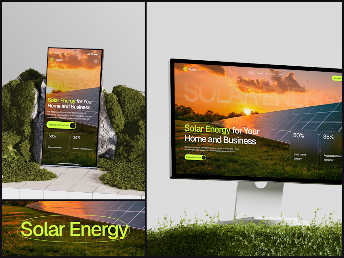
A thin lime circle tells you which two words this page is about.
The headline sits over a sunset photo of a panel field. The "Get started" and "Explore innovations" buttons share the circle's lime, so the eye moves from the circled words straight to the next step.
Large faded capitals repeat those two words across the sky, faint enough to stay inside the photo. On mobile they break onto two lines, and the headline and button stack above two frosted cards.
Only two words of "Solar Energy for Your Home and Business" are lime, and the whole page follows them.
Designed by the Hue & Machine team.
#SolarEnergy #RenewableEnergy #CleanTech #WebDesign #LandingPage #HeroSection #UIDesign #ResponsiveDesign #MobileDesign #FigmaDesign


This is really cool, Nice job Dmytro

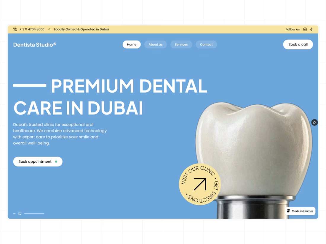
A clean hero section for a modern dental clinic, designed and built with Figma and Framer.

That blue works nicely.

Absolutely goated


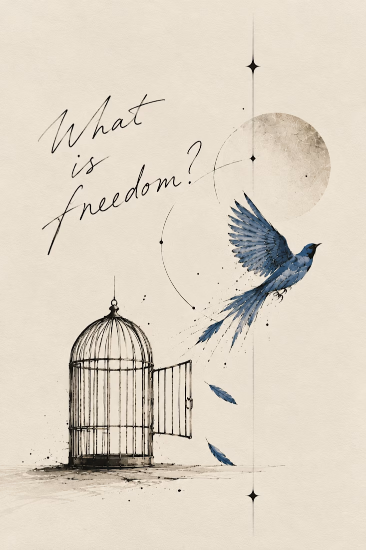
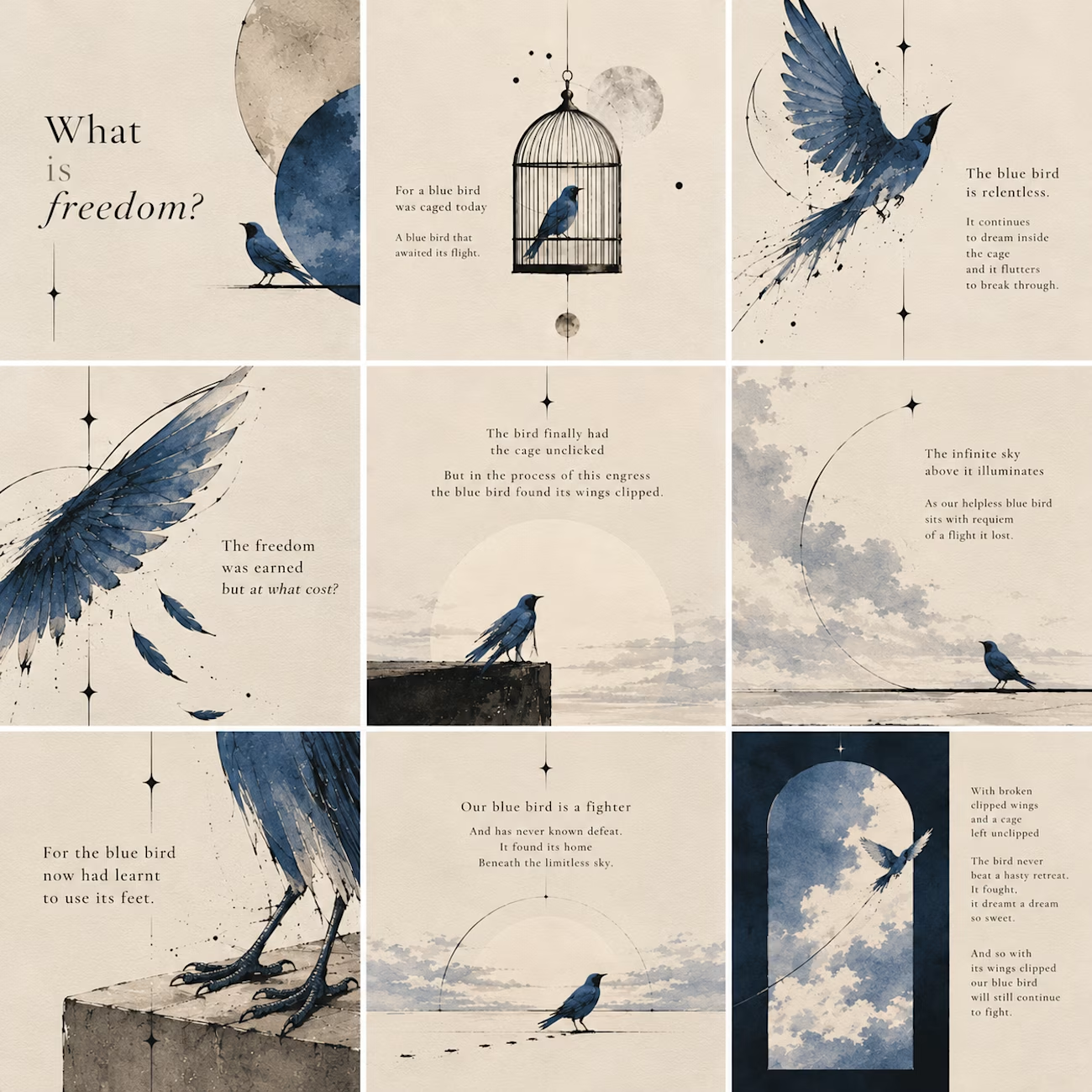
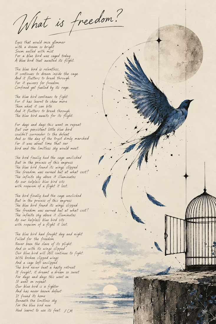
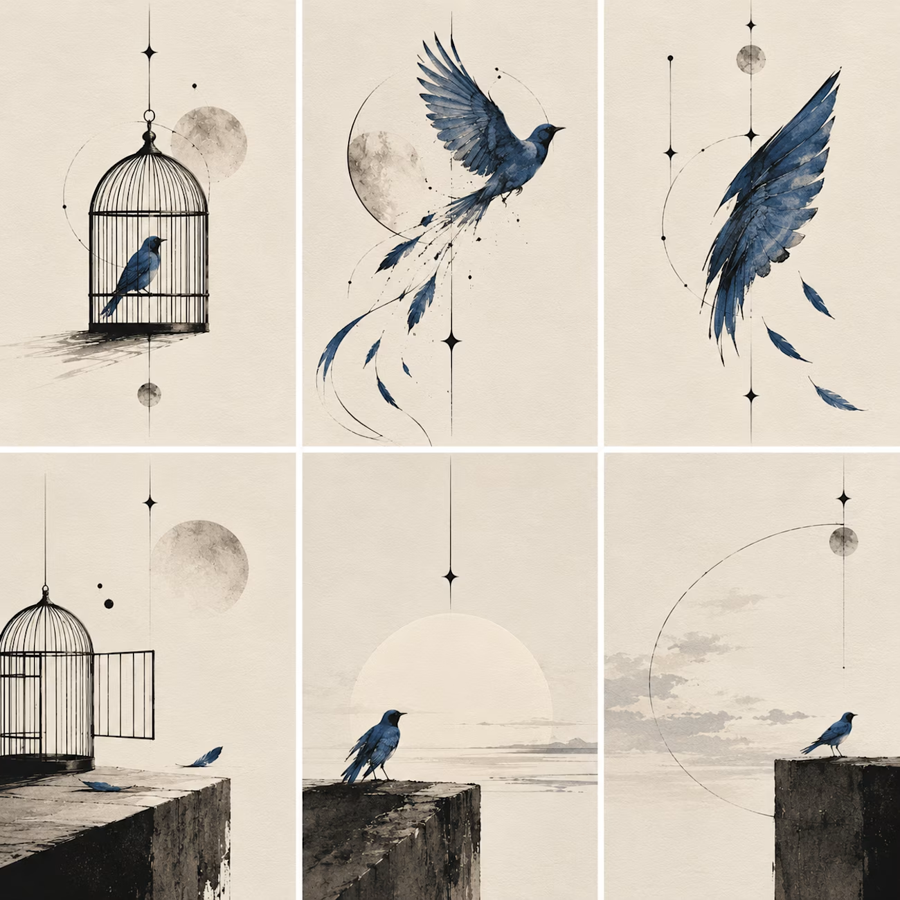
What happens when a poet picks up a pen and remembers she likes to sketch too:)
I write poetry over at @words.bycm on IG and since Inktober is here, I thought it was time to let that side of me out of its little corner of Instagram.
This is 'What Is Freedom?', a poem I wrote...

Kudos to you, you've really done a great work.