The network for creativity
Join 1.25M professional creatives like you
Connect with clients, get discovered, and run your business 100% commission-free
Creatives on Contra have earned over $150M and we are just getting started
Back to feedPost

Landing Pages and UI / UX for Web Sites



The network for creativity
Join 1.25M professional creatives like you
Connect with clients, get discovered, and run your business 100% commission-free
Creatives on Contra have earned over $150M and we are just getting started





Related posts

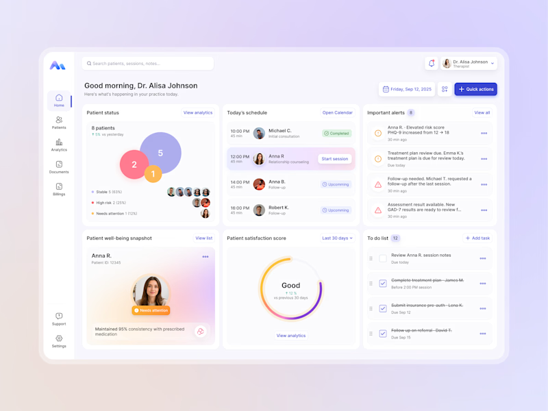
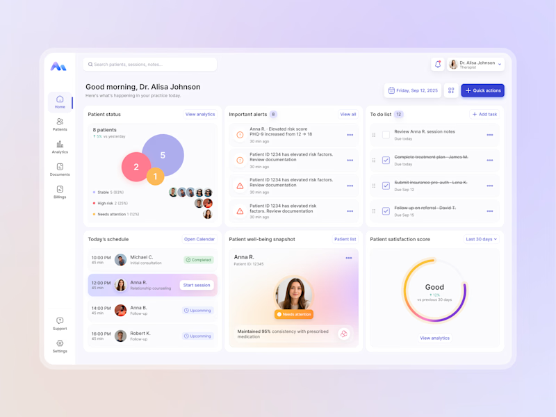
Designing for therapists means prioritizing what matters in the next few minutes, not just what looks good on a dashboard.
I explored two layout directions for a mental health practice management web app that helps psychologists manage sessions, patients, documentation, tasks, and follow-ups.
Both concepts use the same core widgets, but with different positioning and visual hierarchy. The goal was to make daily priorities easier to scan and act on.
Which option feels more intuitive - A or B? 🤔
17 voted
68%
8 voted
32%
25 votes
Closed


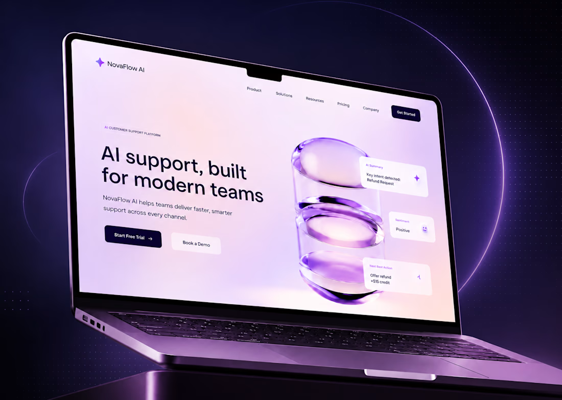

The product flow stays clear across the web and motion elements.


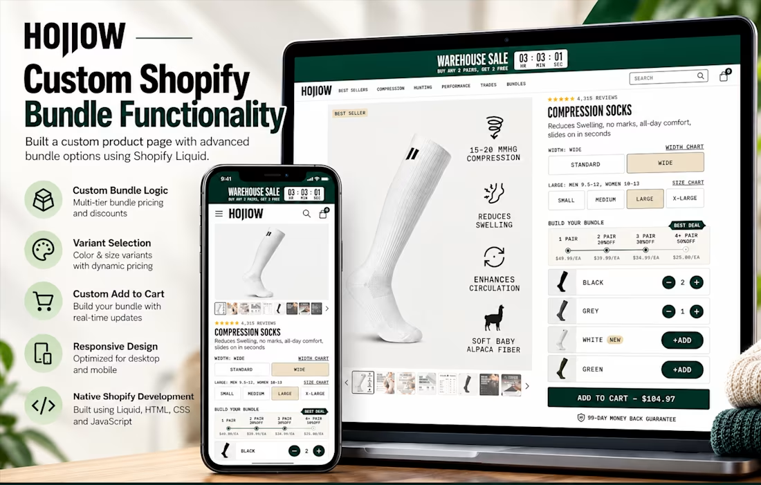

Multi-tier pricing that updates live as you add pairs is the hard part to get right in native Liquid, most builds either hardcode the tiers or end up calling an app API on every quantity change. Curious whether the discount math runs client-side off a price map or you're hitting a line-item script/function on the backend for it.