The network for creativity
Join 1.25M professional creatives like you
Connect with clients, get discovered, and run your business 100% commission-free
Creatives on Contra have earned over $150M and we are just getting started
Back to feedPost

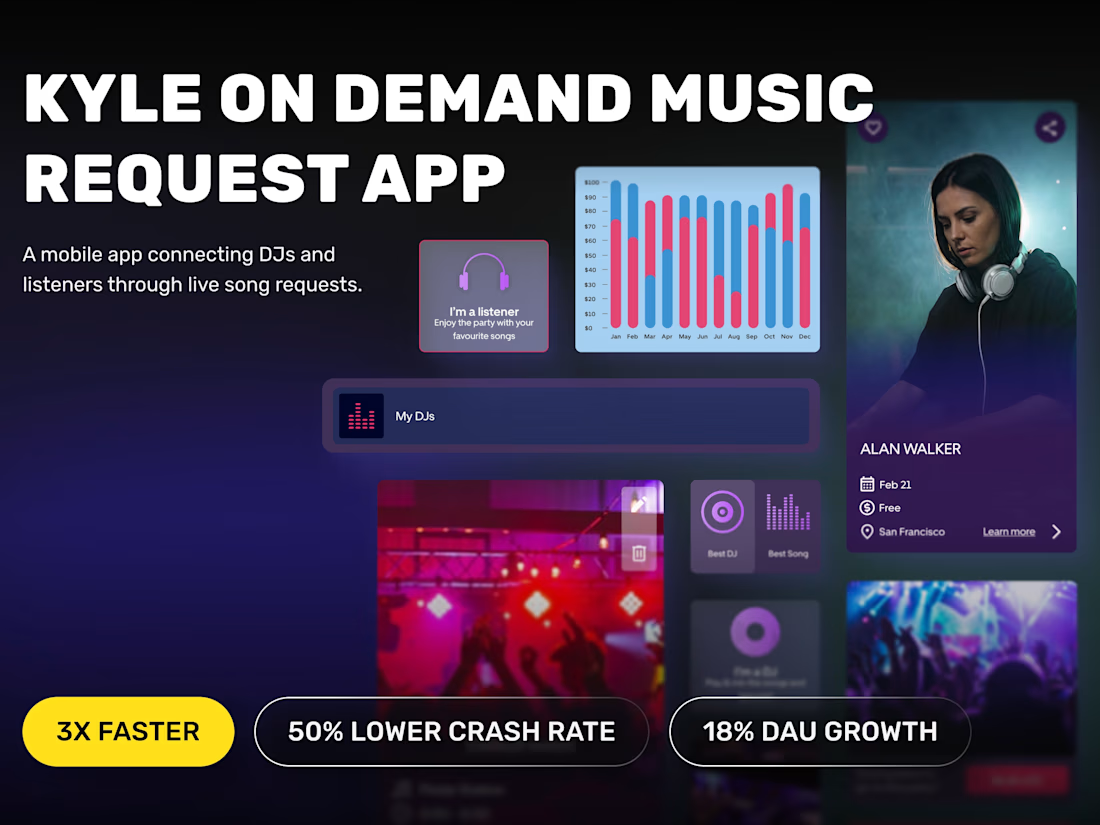
Sometimes the hardest projects aren't the ones you start. They're the ones you inherit.
We helped transform an unstable app into a scalable product with 3x better performance.
Have you ever joined a project halfway through?


The network for creativity
Join 1.25M professional creatives like you
Connect with clients, get discovered, and run your business 100% commission-free
Creatives on Contra have earned over $150M and we are just getting started





Related posts


A bold, modern landing page for a creative agency, built around immersive visuals and strong typography. We’d love to hear your thoughts!


What should a beekeeping website explain before asking someone to choose a hive?
For Bee Girl, I designed and built a complete Shopify website around a clear journey: meet the colony, understand what’s inside a nucleus hive, compare the options, and connect with the beekeeper.
Honey yellow, hive black, warm cream, and bold typography bring the same visual language across desktop and mobile layouts.
One design decision that ties it together: the page explains the colony and its five frames before introducing the hive-quantity choices. Education gives the product selection context.
I handled the complete website project for the client through Fiverr, using Shopify. This video walks through the homepage.
Which would you explore first—the hive options, field classes, or the beekeeper’s story?
Explore the full Bee Girl case study: https://contra.com/p/WqNFR67b-bee-girl-shopify-website-design-for-beekeeping
If you’re building a Shopify website for a specialist business, I’m available for website design and development projects.


I'd open the hive options first, but only because the colony section already told me what I'm buying. Explaining the five frames before the quantity choice is a smart order. Teaching before asking someone to choose is so underrated in Shopify stores.

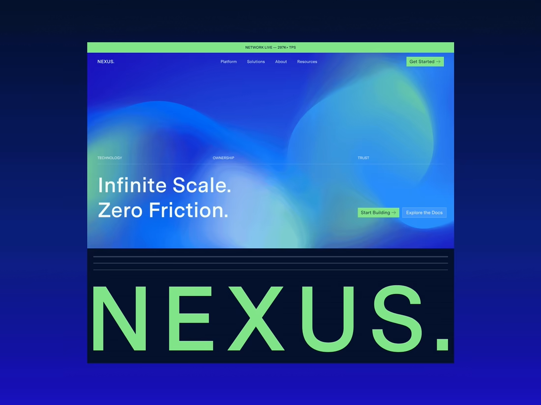
Happy to finally share the full NEXUS project 🙌
A few days ago I posted a small motion teaser. Now the whole thing is live on my profile: 12 pages designed in Figma, a design system, and a homepage I built in HTML, CSS and JS with every interaction working.


12 pages in Figma plus a design system, then hand coding the homepage with every interaction working is a great way to show the concept holds up, Sofiia. Nice to see the teaser turn into the full project.