The network for creativity
Join 1.25M professional creatives like you
Connect with clients, get discovered, and run your business 100% commission-free
Creatives on Contra have earned over $150M and we are just getting started
Back to feedPost

Why Designers Must Understand Marketing
Great design that doesn’t convert is just decoration.
If you want real impact as a designer, you need to understand marketing.
Conversion
Design isn’t just about how it looks , it’s about what it does.
Can users take action? Sign up? Buy? Engage?
That’s where design meets results.
Messaging
Design carries meaning.
If the message is weak, the design will struggle.
Clear positioning + strong storytelling = better design decisions.
User Psychology
Why do users click?
Why do they hesitate?
Why do they trust?
Understanding behavior helps you design experiences that actually work.
The best designers don’t just design interfaces.
They design decisions.
That’s the difference between good design, and design that drives business.

The network for creativity
Join 1.25M professional creatives like you
Connect with clients, get discovered, and run your business 100% commission-free
Creatives on Contra have earned over $150M and we are just getting started



Related posts

Web design is not that important.
I mean - it is, but ultimately all it can do is to present your content in the best way. Put emphasis on your messaging first, then design around it.

You are Right. I completely agree with you, @Roman Avshalumov

Ever wondered what a 1974 record shop would look like if it had a brand system?
Kodama Shōwa is coming soon: one old shopkeeper, five inks, and a camera at knee height.

Love this concept. One old shopkeeper and a camera at knee height is such a charming detail, can't wait to see the full system

A good product identity isn't built by picking pretty colours. It's built on clear design decisions.
Last week, I introduced Lego Flow, the project I'm currently working on.
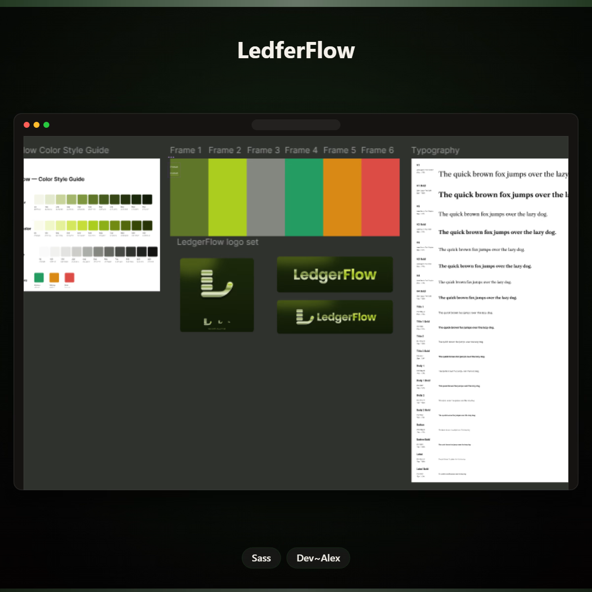
Today, I'm sharing a little more of the process: the style guide.
Here's a look at the visual foundation I'm putting together:
Logo: Giving the project a recognisable identity.
Colour palette: Establishing its visual direction.
Typography: Creating consistency and making the content easier to read.
But why start with a style guide?
Because as a product grows, its design shouldn't become a collection of random decisions.
A clear style guide helps keep the experience consistent, makes future design decisions easier, and gives developers and anyone working on the product a shared visual reference.
Good design isn't just making one screen look good. It's building a system that makes the whole product feel connected.
That's the thinking behind Lego Flow.
I'm curious: When you start a new product, what do you establish first, the brand identity, design system, or user experience?
Founders and designers, I'd love to hear your thoughts.


Founders, designers, and developers, what's currently on your workbench?
A new product, a client project, a side project, or something you've been meaning to build?
Share it below. Let's see what everyone's working on!