The network for creativity
Join 1.25M professional creatives like you
Connect with clients, get discovered, and run your business 100% commission-free
Creatives on Contra have earned over $150M and we are just getting started
Back to feedPost

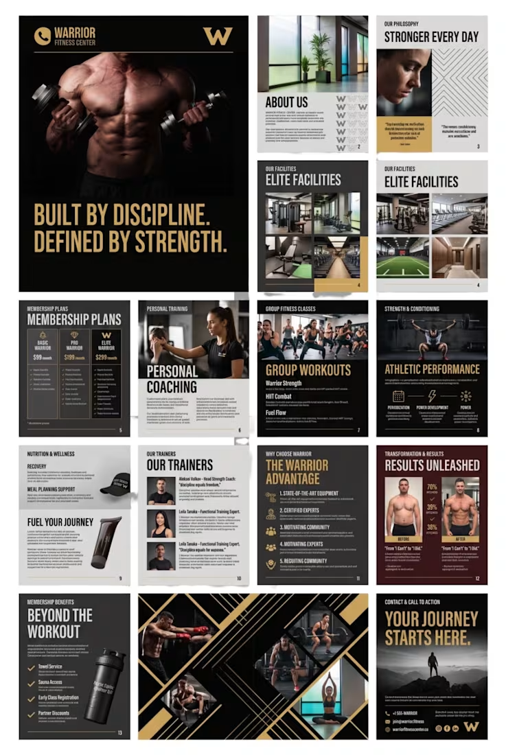
Warrior Fitness Center – Branding & Multi-Page Catalog Design
A complete creative branding and editorial design concept for Warrior Fitness Center, featuring a bold, premium visual identity inspired by strength, discipline, and performance.
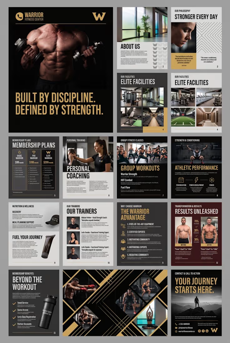
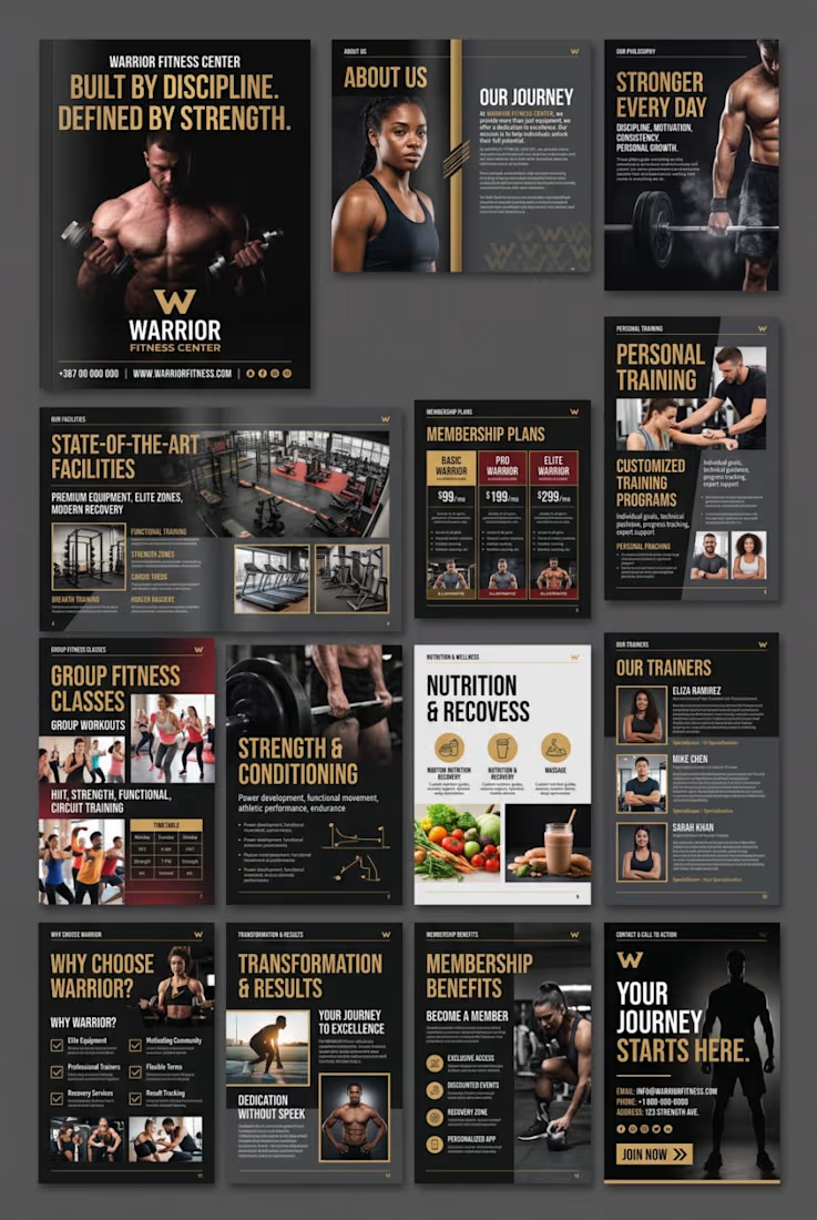
The project includes a professionally designed multi-page fitness catalog showcasing the brand's philosophy, facilities, membership plans, personal training programs, group workouts, trainers, nutrition services, and membership benefits.
Design Highlights:
Premium black, gold, and charcoal visual identity
Modern typography and editorial layouts
Fitness promotional imagery and visual storytelling
Membership packages and pricing presentation
Personal training and group fitness service layouts
Trainer profiles and facility showcases
Consistent branding across all pages
Professional promotional and marketing materials.
This project demonstrates my approach to creating cohesive brand experiences through strategic visual communication, strong typography, and professional editorial design.
Note: Warrior Fitness Center is a conceptual branding and catalog design project created as a design portfolio example.

The network for creativity
Join 1.25M professional creatives like you
Connect with clients, get discovered, and run your business 100% commission-free
Creatives on Contra have earned over $150M and we are just getting started


Related posts

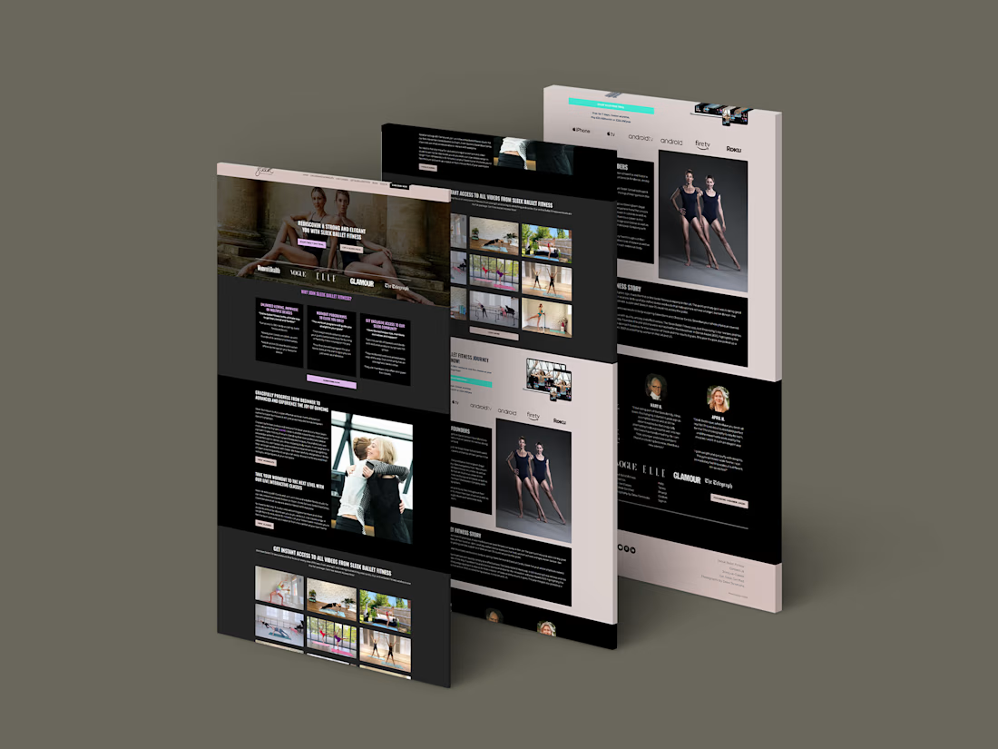
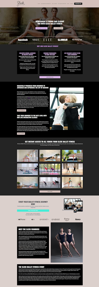
For Sleek Ballet Fitness, I worked on the Kajabi website, membership setup and onboarding emails.
The design gives the workouts room to speak for themselves. Dark backgrounds, soft pink accents and a visual workout grid help people see what they can join. The trial button is easy to find, with separate paths for workouts and live classes.
First image: my original project mockup. Second: a public website preview captured on October 5. The site has changed since the original project; the case explains what I worked on.
#Kajabi #WebDesign #MembershipWebsite


Separating on-demand workouts from live classes gives trial members a clearer choice. I’d carry that distinction into the welcome email too: one link to start a workout, and another to check the live schedule. It makes the first step after joining easier to follow.

two brands, one tiny taste test.
would you rather look through an Oriel or answer a Calling?
winner gets the full brand. reply with your pick.
35 voted
85%
6 voted
15%
41 votes
Closed

The biggest misconception about branding is thinking it's just a logo. What actually saves founders time and money later is a compact system a focused 2–3 color palette and clear sub-brand rules so every new deck, social post, or product launch looks cohesive without starting from scratch.

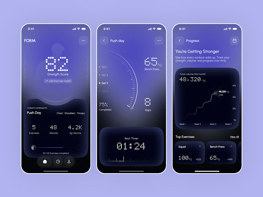
Designed a modern Strength Training Mobile App.
A deep indigo and violet gradient with dotted display numbers, fine tick marks, and dark curved panels for a bold and focused first impression.
A glowing strength score with today's workout, a live set tracker with weight, reps, and a rest timer, and a progress screen with monthly volume and top lifts make every training session easy to follow and every gain easy to see. Consistent dotted numbers and a floating tab bar keep the whole app sleek and easy to use.

It looks super clean and modern. Everything from the rest timer to the workout progress is really easy to read at a glance without feeling messy.