The network for creativity
Join 1.25M professional creatives like you
Connect with clients, get discovered, and run your business 100% commission-free
Creatives on Contra have earned over $150M and we are just getting started
Back to feedPost


The network for creativity
Join 1.25M professional creatives like you
Connect with clients, get discovered, and run your business 100% commission-free
Creatives on Contra have earned over $150M and we are just getting started



Related posts


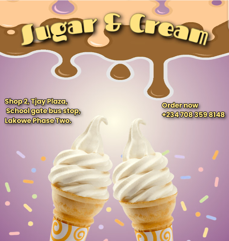

The chocolate drip header and the two cones make you want ice cream right away. The yellow address text on the purple is a bit thin, a darker outline would help it read on a phone.



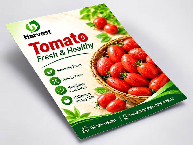
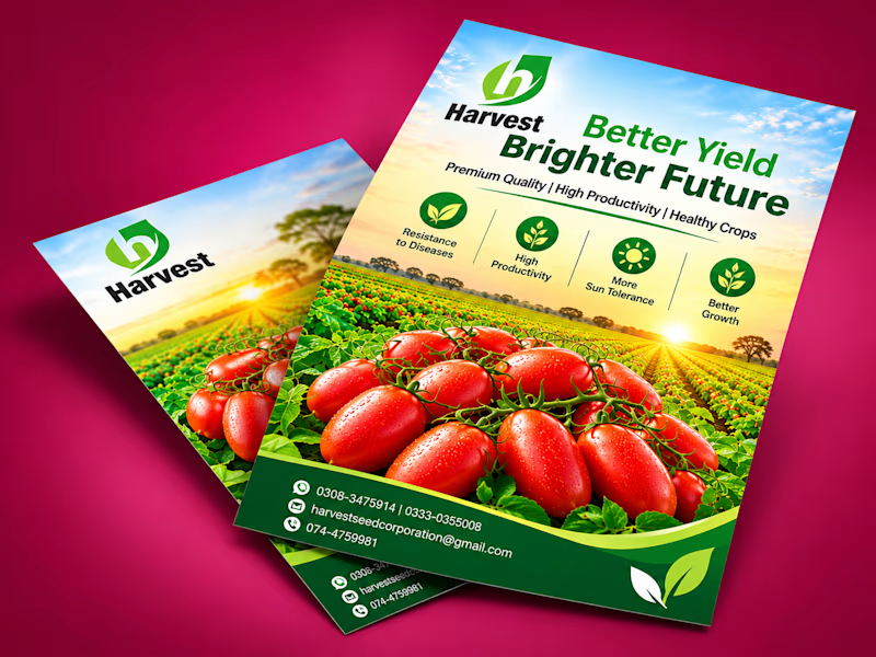
Which agricultural flyer design do you prefer for Harvest:
"Fresh & Healthy Product Focus"
"Better Yield & Brighter Future Field View"
Let me know your thoughts!
#GraphicDesign #FlyerDesign #Branding #PrintDesign #AgriculturalDesign
1 voted
50%
1 voted
50%
2 votes
Closed
I'd go with Option 1. The tomato basket on a clean background reads in one second, Option 2 is prettier but the headline fights the field. Is the flyer aimed at buyers or at farmers?