The network for creativity
Join 1.25M professional creatives like you
Connect with clients, get discovered, and run your business 100% commission-free
Creatives on Contra have earned over $150M and we are just getting started
Back to feedPost
I’ve been working on Pickverra, a storefront concept for everyday home equipment.
The part I spent the most time on was finding a balance between an expressive visual identity and a product discovery flow that feels easy to use. Warm colors, oversized type and subtle motion give it personality; filters, saved finds and comparison tools help people make a choice.
Sharing a few screens and a short UI showcase here. I’d really appreciate a fresh pair of eyes: what feels clear, what feels busy, and what would you change about the UI?
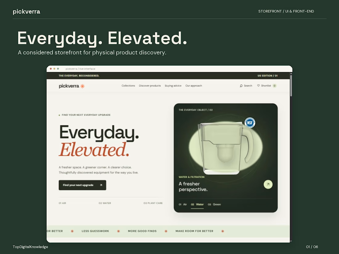
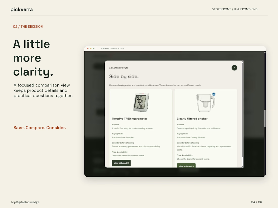
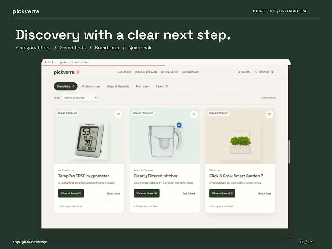
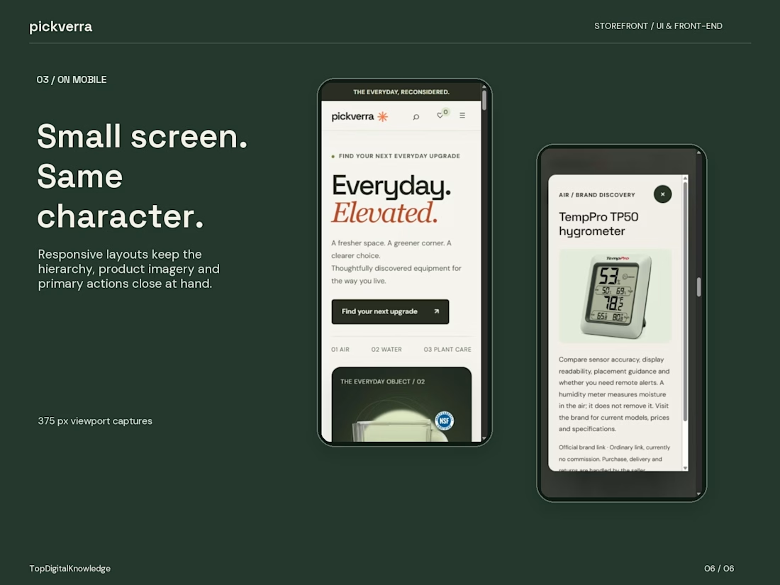

Everyday, Elevated as the hero statement against the warm dark backdrop does a lot of lifting for home equipment. The mobile views keeping the same character is the detail that shows real design discipline.

Thank you for noticing those details! “Everyday, Elevated” really shaped the visual direction—I wanted everyday home equipment to feel considered and inviting. Keeping that same personality on mobile, while giving everything enough room to breathe, took some careful balancing. I’m glad it came through.

Strong look. I'd maybe add a bit more spacing between the product cards.
The network for creativity
Join 1.25M professional creatives like you
Connect with clients, get discovered, and run your business 100% commission-free
Creatives on Contra have earned over $150M and we are just getting started











Related posts


This UI was really great nice job Piotr🔥🔥🔥

The brief was simple. Show a new personalized news feature.
The obvious solution was to show a few clicks in the UI as you choose your topics. Clear, but not very interesting.
So I pulled that moment out of the interface first and turned it into a cloud of topics. You get the idea before you even see the product, then the video drops you back into the real UI and shows where it lives.
I really like these tiny decisions. The feature stays the same, but it feels easier to get and a lot more fun to watch.


Pulling the topic cloud outside the UI makes the feature instantly clearer.


