The network for creativity
Join 1.25M professional creatives like you
Connect with clients, get discovered, and run your business 100% commission-free
Creatives on Contra have earned over $150M and we are just getting started
Back to feedPost
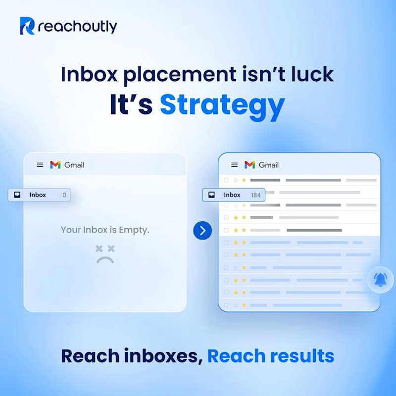
Inbox placement isn’t luck. It’s strategy.
→ Proper email setup
→ Strong deliverability
→ Better targeting
→ Consistent outreach
Build the system right. Get more emails into the inbox.


The network for creativity
Join 1.25M professional creatives like you
Connect with clients, get discovered, and run your business 100% commission-free
Creatives on Contra have earned over $150M and we are just getting started

Challenges
View all


Related posts

A brilliant SaaS tool needs a landing page that instantly builds trust and drives action.
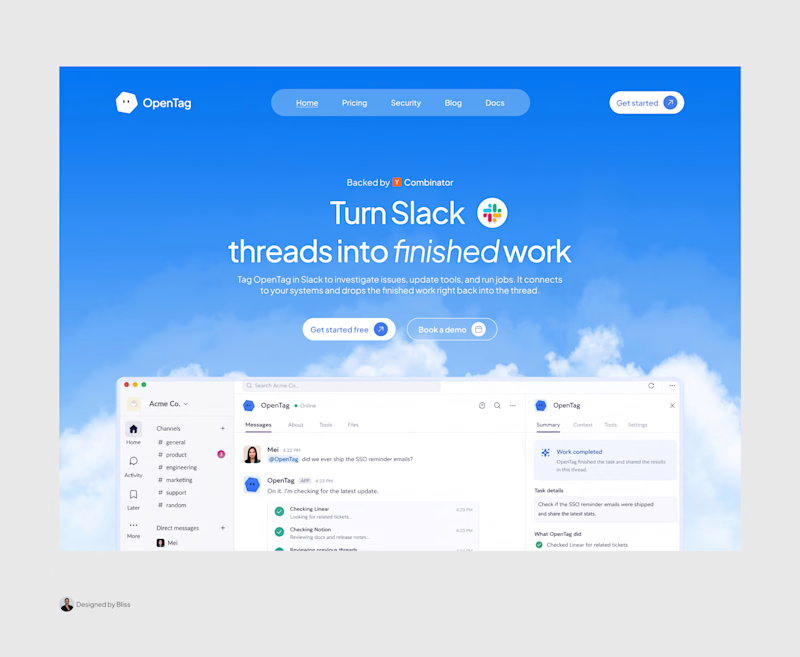
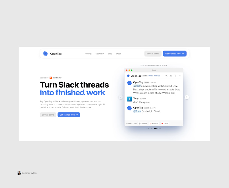
I recently put together this visual upgrade for OpenTag to explore how tightening the layout could elevate their first impression.
Option A (The Original): Strong product copy, but the split layout and floating elements create competing focal points that divide the user's attention.
Option B (The Redesign): Centered messaging, a much clearer visual hierarchy, and a dynamic, breathable layout. The goal was to remove distractions and let the product interface take center stage.
Which direction do you think communicates the value better and creates a stronger first impression?
Let me know your pick!

8 voted
100%
0 voted
0%
8 votes
Closed

Great work, Emmanuel!


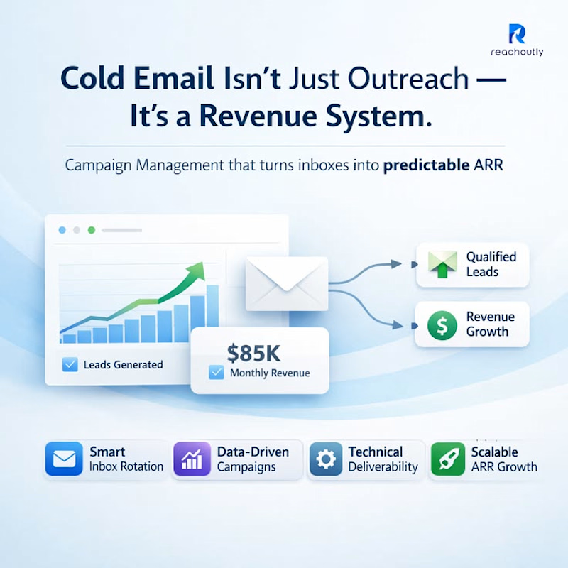
Cold email isn’t just outreach.
It’s a revenue system.
→ Smart Inbox Rotation
→ Data-Driven Campaigns
→ Technical Deliverability
→ Scalable Lead Generation
Better systems.
Better leads.
Better revenue.
#ColdEmail #LeadGeneration #B2B #EmailDeliverability #Outreach


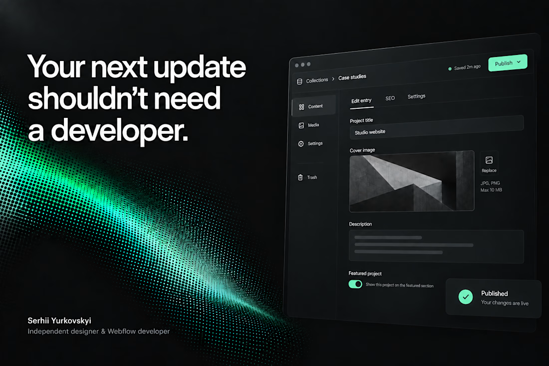
A client shouldn’t have to learn Webflow just to publish their next case study.
On a recent build, I spent a lot of time on the CMS: setting up reusable blocks and the logic that lets the team update content without rebuilding pages.
The tricky part is deciding how much control to give them. Too little, and every update becomes a request. Too much, and they’re suddenly responsible for the layout.
I want them to open the CMS, know what to do, and get on with their day. There’s a fair amount of work behind making that feel simple.



The CMS thinking here is spot on: the best handoff is the one that gives a client confidence without exposing all the complexity underneath.