The network for creativity
Join 1.25M professional creatives like you
Connect with clients, get discovered, and run your business 100% commission-free
Creatives on Contra have earned over $150M and we are just getting started
Back to feedPost


Just shipped a new Framer template, preview it here and let me know what you think. https://brightstd.framer.website/

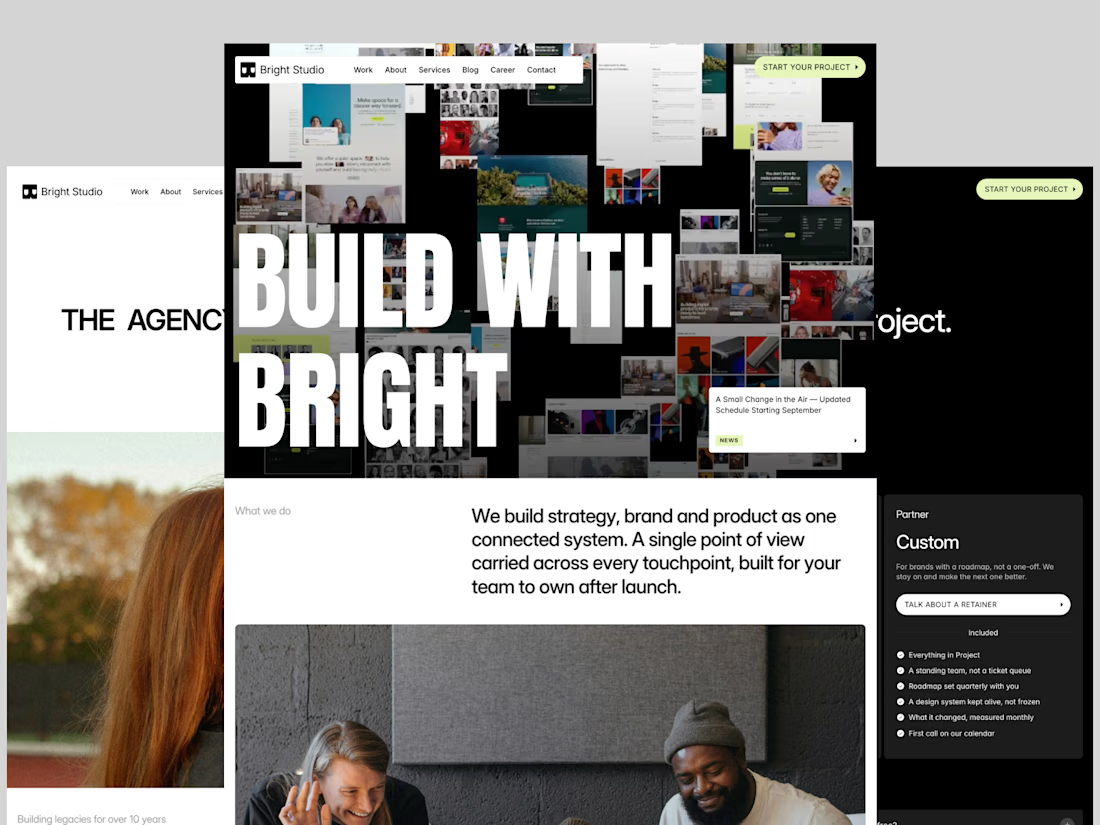

The layered screenshot collage behind the BUILD WITH BRIGHT headline gives it real depth without feeling cluttered. Nice way to show range in one hero.


Excellent !

Looks amazing 😍
Thanks, Celia
The network for creativity
Join 1.25M professional creatives like you
Connect with clients, get discovered, and run your business 100% commission-free
Creatives on Contra have earned over $150M and we are just getting started





Related posts

Just published another Framer code component to show your work!
Best part: it's connected to your CMS, so no need to manually update the content.
It has drag and scroll to stir the arc, plus an infinite project list 🔥
Check it here

Svg filters ?

Client testimonial cards from a recent Framer project.

The slight card rotations give this an editorial feel, and the orange card creates a clear focal point. Do they straighten on hover for easier reading?

Which hero visual feels right for this brand?
While working on the homepage for Halfspace, a website design and SEO agency, I explored two different hero visuals for the same headline and layout. Same message, same structure, just a different visual metaphor and mood.
Option 1 - Rocket Launch. Bold, literal, and energetic, visually reinforcing the "launch your business" message with motion and fire.
Option 2 - Glass Cube. Abstract, sleek, and premium, giving a more refined, tech-forward feel without relying on a literal metaphor.
Would love your honest UX/UI take, which direction feels more impactful, memorable, and aligned with a web design/SEO brand, and why?
11 voted
41%
16 voted
59%
27 votes
Closed

Both design are great; it's hard to choose one