The network for creativity
Join 1.25M professional creatives like you
Connect with clients, get discovered, and run your business 100% commission-free
Creatives on Contra have earned over $150M and we are just getting started
Back to feedPost
Taste Test

Light or Dark?
1 voted
33%
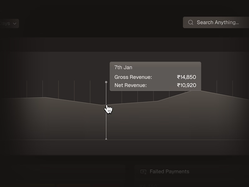
2 voted
67%
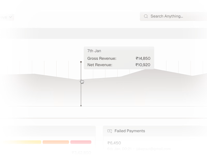
3 votes
Closed

Dark ftw
The network for creativity
Join 1.25M professional creatives like you
Connect with clients, get discovered, and run your business 100% commission-free
Creatives on Contra have earned over $150M and we are just getting started





Related posts

Light or dark, which one wins? ☀️🌙
Same site, two moods. Warm stone and lacquer red, or the same build after dark.
Both are hand-built with a 3D paper crumple, real physics, a stick-figure film drawn in code, and a receipt that gets a bicycle kick. 🔊 Sound on.
Tell me which you'd ship: light or dark? 👇
32 votes
Ends in 18h

I really like how the light version looks, but it has some legibility issues. Since readability is more important for users than visual appeal, I think the dark version is the better option.
BTW, I initially voted for the light version, but after analyzing both options more closely, I changed my mind 😄

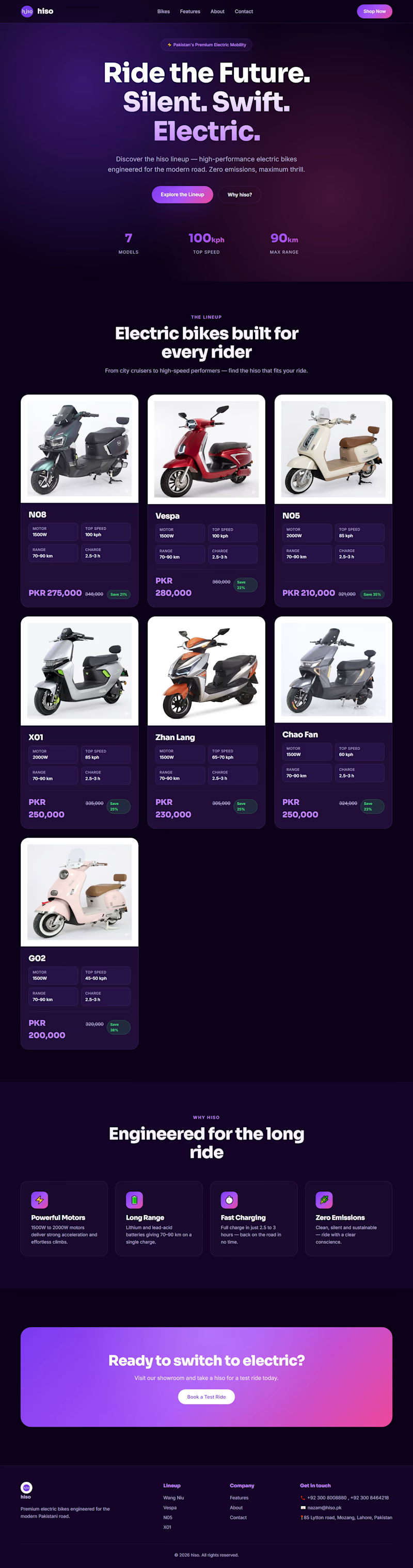
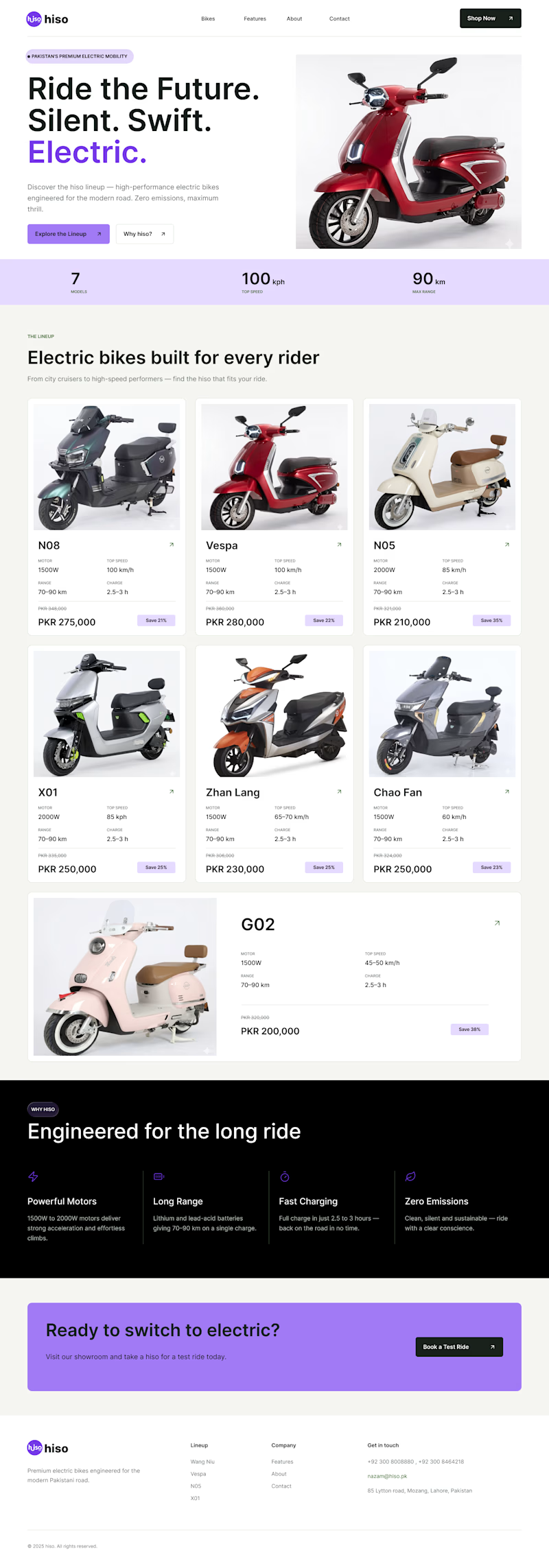
Which one is better ? Old or New
CASE STUDY Time !
I just noticed their website and saw that their color combination is hiding main information and disturbing users to focus on one thing
The theme was too dark with dark text which is making user to focus too much on text and clear price mention makes user things that it's too expensive
MY SOLUTION:
firstly I changed the color scheme
secondly I changed the text color and size
then I change cards style too make it much easier to focus o what user want to see
Then I added a %off tag which makes user to think It's an offer and it could end at any time soo buying right now is a golden oppurtunity.
1 vote
Ends in 1d


backgrounds 😶🌫️