The network for creativity
Join 1.25M professional creatives like you
Connect with clients, get discovered, and run your business 100% commission-free
Creatives on Contra have earned over $150M and we are just getting started
Back to feedPost
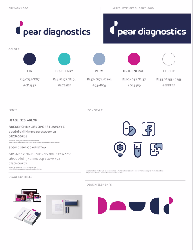
Designing for healthcare means every color, typeface, and shape carries more weight than usual.
The wrong shade of blue feels sterile. The wrong stock photo feels exploitative.
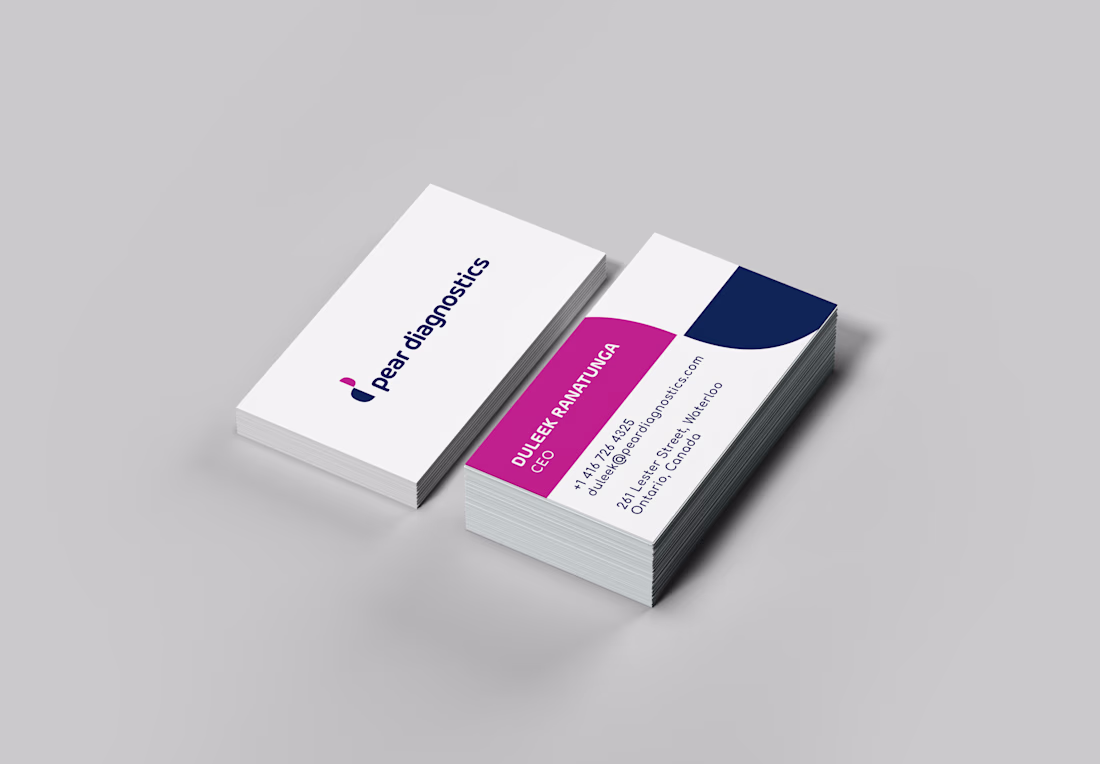
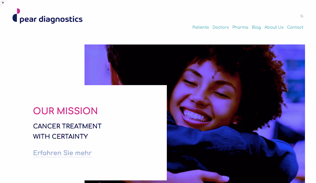
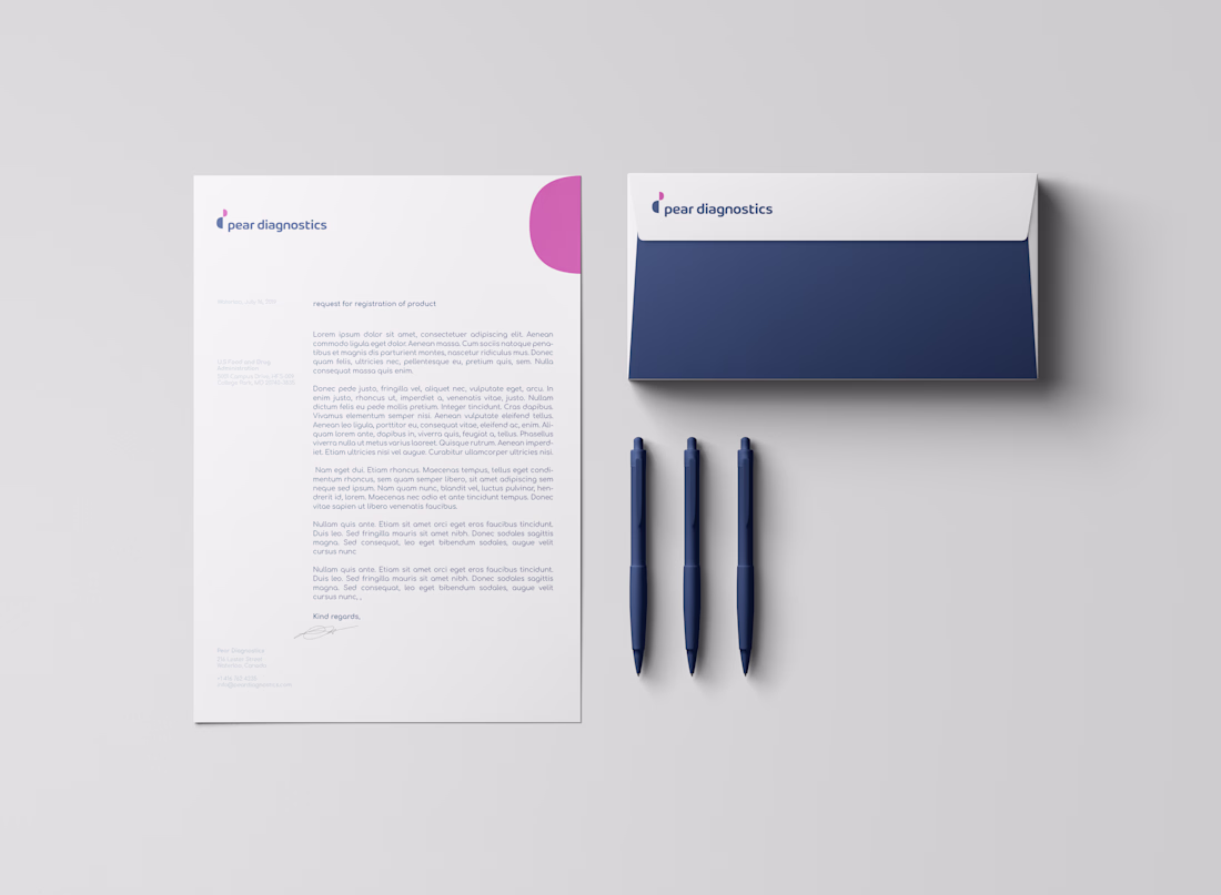
For Pear Diagnostics — a cancer diagnostics startup I worked with through a Merck Group collaboration — the challenge was bridging clinical precision with human warmth. Their tech is complex (simulated human body devices, biomarker analysis), but the people it serves are going through one of the hardest moments of their lives.
The brand identity needed to work for investors, pharmaceutical partners, and patients — all from a single visual system.
Here’s what I landed on: a deconstructed “p” logo built from two semicircles, a color palette named after fruits (Fig, Blueberry, Dragonfruit), and a type pairing that balances authority with approachability.
Healthcare branding isn’t about making things look “medical.” It’s about making science feel trustworthy.
The network for creativity
Join 1.25M professional creatives like you
Connect with clients, get discovered, and run your business 100% commission-free
Creatives on Contra have earned over $150M and we are just getting started
Related posts
Rich & Detailed all day!
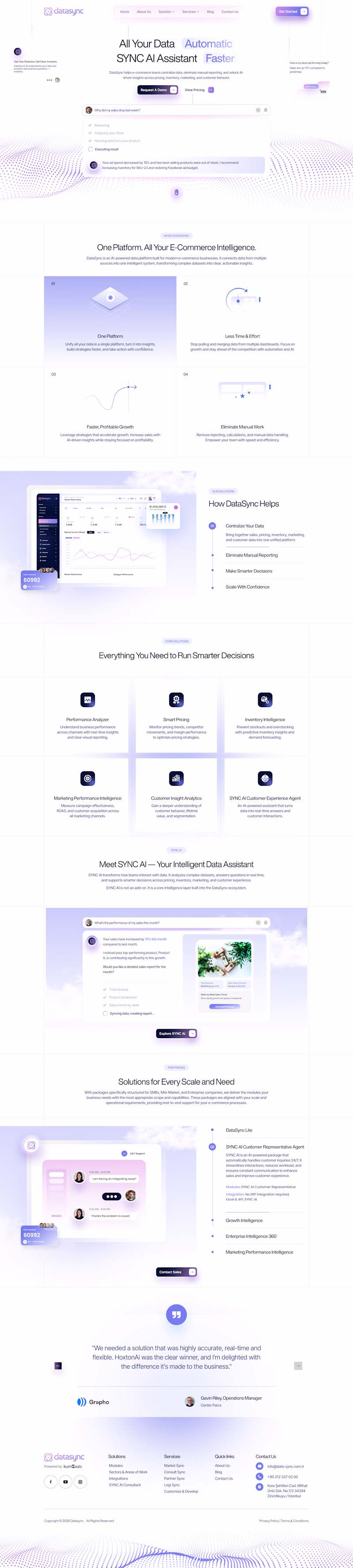
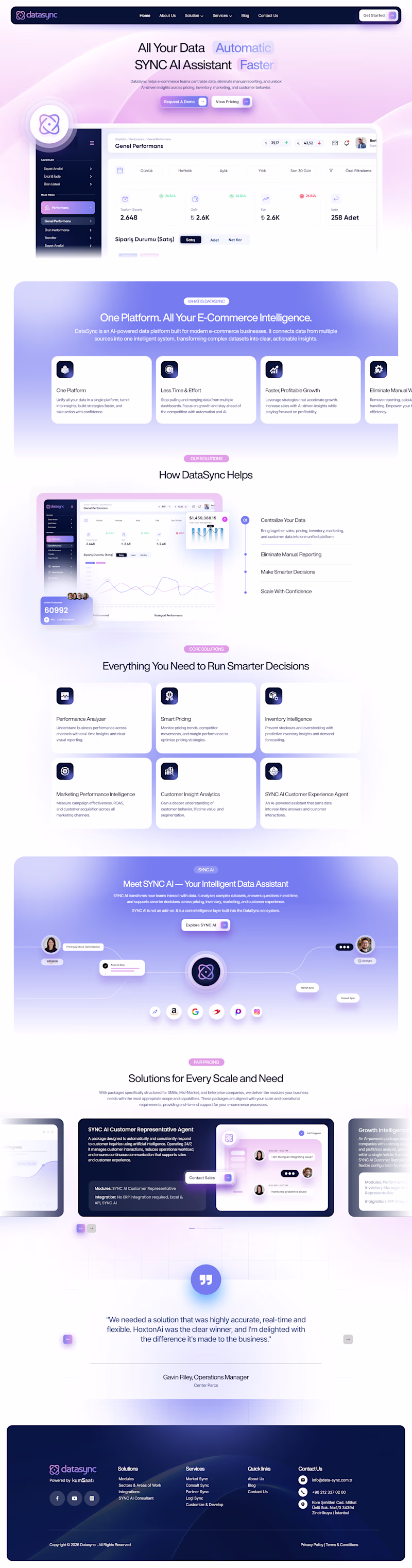
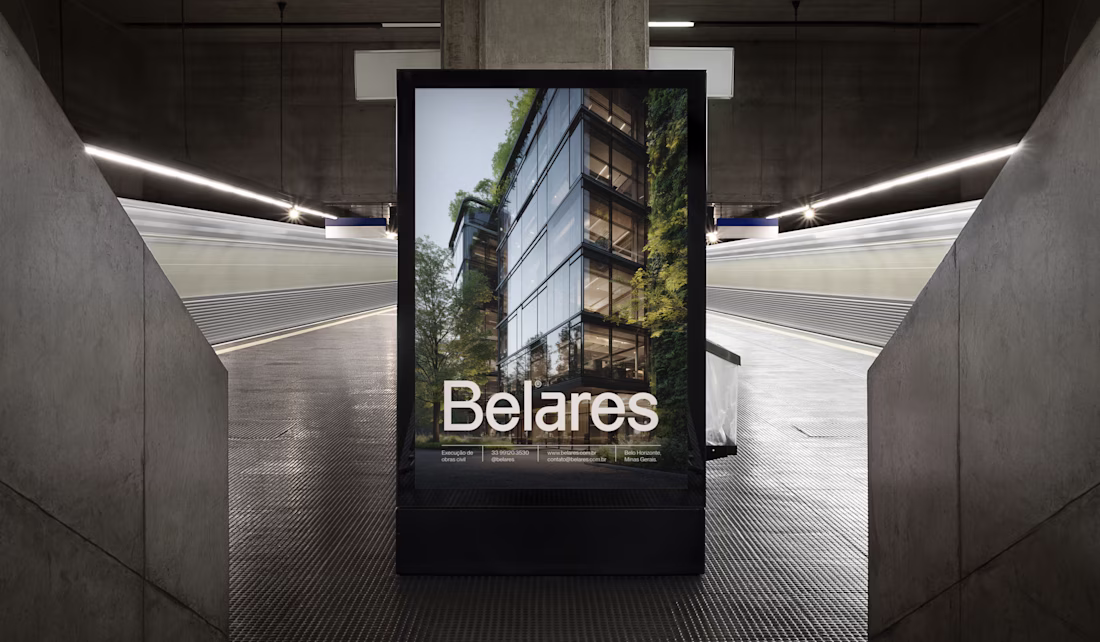
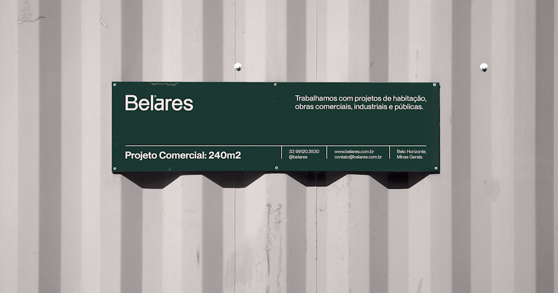
Belares: one identity built to hold from the boardroom to the construction site.
Belares is a civil engineering company spanning residential, commercial, industrial and public works. The brief was a single identity for the full operation: technical authority, safety and durability, communicated with precision.
Three decisions shaped the system. First, a restrained green-and-bone palette that signals institutional weight without going cold. Second, a wordmark engineered to read at distance, on a helmet, a site banner, a shipping container. Third, a documented set of rules so the brand stays consistent across field and corporate contexts, applied by teams the studio never meets.
The result is an identity that fits both a stakeholder deck and a worksite fence, without compromising either.
Full case study on the Griffo™ profile. System engagements start at $3,500.
This deserves way more Liking it
Most AI products show you results.
I wanted to show you the process.
So I built MIRROR — a cinematic AI surveillance interface designed entirely in Figma Make.
Instead of static sections and generic cards, every interaction reveals how the system thinks:
• Real-time identity analysis
• Object detection overlays
• Behavioral tracking
• Detection systems and capabilities
• Live subject profiling
• Technical specifications
• Interactive data visualizations
• Hover states, reveals, and system reactions
The goal wasn't to design another dashboard.
The goal was to create an experience that feels like you're inside a classified intelligence system.
Every screen was designed to feel alive.
Every section responds.
Every interaction reveals something new.
Built with Figma Make as part of the Config Makeathon.
Would love to hear what feature or interaction you'd add next.
The level of detail in this is insane. Every section feels like it belongs to the same universe.
Trending
Claude
Claude has entered the design space. How are you using Claude Design?
Contra University
Learn from expert creatives how to earn more using next-gen AI tools.
MagicPath
The canvas is infinite, and exploration is becoming the workflow. How are you using MagicPath?
creativeaiflow
Creative AI workflows are evolving. What tools do you use, and what are their strengths and weaknesses?
freelancerlife
Freelancer life is wins, pivots, and everything in between. What’s yours right now?