The network for creativity
Join 1.25M professional creatives like you
Connect with clients, get discovered, and run your business 100% commission-free
Creatives on Contra have earned over $150M and we are just getting started
Back to feedPost

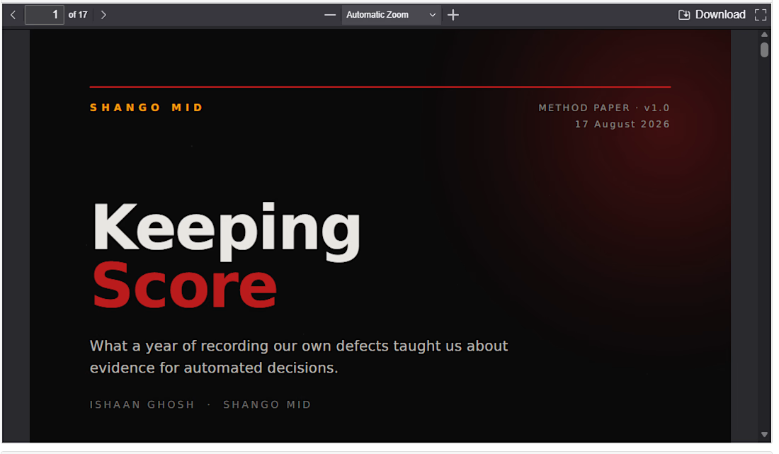
Keeping Score — on measuring which of your own claims turned out to be wrong,
and who found them. Published as a range and a floor rather than a single
figure, because the classification underneath it will not carry a point
estimate. DOI 10.5281/zenodo.21977571


The network for creativity
Join 1.25M professional creatives like you
Connect with clients, get discovered, and run your business 100% commission-free
Creatives on Contra have earned over $150M and we are just getting started

Challenges
View all


Related posts


Congrats

After a short hiatus, I’m gradually getting back to posting.
During this time, a few changes have come up that I’d like to share.
First and foremost, I’ve started updating my website. I’ve long wanted to give it a new visual design—one that more accurately reflects my approach to design, my taste, and my vision of modern digital design.
At the same time, I’m working on a more traditional business project that isn’t related to design. It’s taking up quite a bit of my time and energy right now, but I’m excited to try my hand at something different and go through the entire process from an entrepreneur’s perspective.
That said, I haven’t forgotten about my client projects and am continuing to work on them.
So there will gradually be more posts here: about the website update, current projects, design, and perhaps a little about this new business venture.
I’m glad to be back.



Great work

YOUR DASHBOARD MIGHT BE LYING TO YOU.
Not because Power BI is wrong.
Because the data underneath it is.
A beautiful dashboard built on messy data doesn't create better decisions.
It creates confident mistakes.
Duplicates.
Missing values.
Inconsistent names.
Broken formats.
Multiple Excel files.
Numbers that don't agree.
Then someone adds a few colorful charts, calls it "analytics," and moves on.
I don't work that way.
I take the mess first.
RAW DATA → CLEAN → TRANSFORM → MODEL → ANALYZE → POWER BI → INSIGHTS
I work with Excel, CSV and business datasets to:
→ Clean and validate messy data
→ Transform data using Power Query
→ Combine multiple files and sources
→ Build data models and DAX measures
→ Create interactive Power BI dashboards
→ Identify trends, KPIs and business insights
→ Build reporting workflows that are easier to refresh and maintain
Because a dashboard shouldn't just look impressive.
Every KPI should answer a question.
Every visual should have a purpose.
And every number should be trustworthy.
That's the service I'm offering.
If your business data is sitting across messy Excel files, CSVs or scattered spreadsheets, I can turn it into:
Clean Data → Clear Analysis → Interactive Power BI → Better Decisions
You bring the data.
I'll find what it's trying to say.
📊 Power BI Dashboard & Data Analytics
Now available for freelance projects on Contra.


I actually 99.99% agree,
Furthermore Outliers removal is part of cleaning datasets we choose to begin a project, Descriptive statistics is a key for detection