The network for creativity
Join 1.25M professional creatives like you
Connect with clients, get discovered, and run your business 100% commission-free
Creatives on Contra have earned over $150M and we are just getting started
Back to feedPost
Taste Test
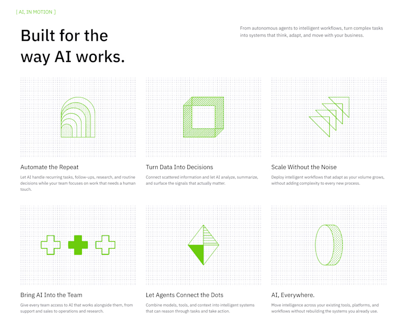
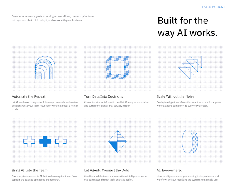

Great exploration Girum! I'd lean towards B - the left-aligned heading with green accents feels more editorial and breathable, the layout hierarchy reads stronger with that small [ AI, IN MOTION ] label on top. A is solid too with blue system but B has more contrast and that...

Love your reasoning Sagar! you see in detail I appreciate that
The network for creativity
Join 1.25M professional creatives like you
Connect with clients, get discovered, and run your business 100% commission-free
Creatives on Contra have earned over $150M and we are just getting started



Related posts

People don’t just want a banking app. They want to feel in control of their money.
Great fintech design doesn’t just look premium. It makes money feel simpler, safer, and easier to control.
Meet Ziko, a mobile banking concept where every interaction is designed to reduce friction and build trust.
What wins your trust first: 🔒 Security, ✨ Simplicity, or ⚡ Speed?


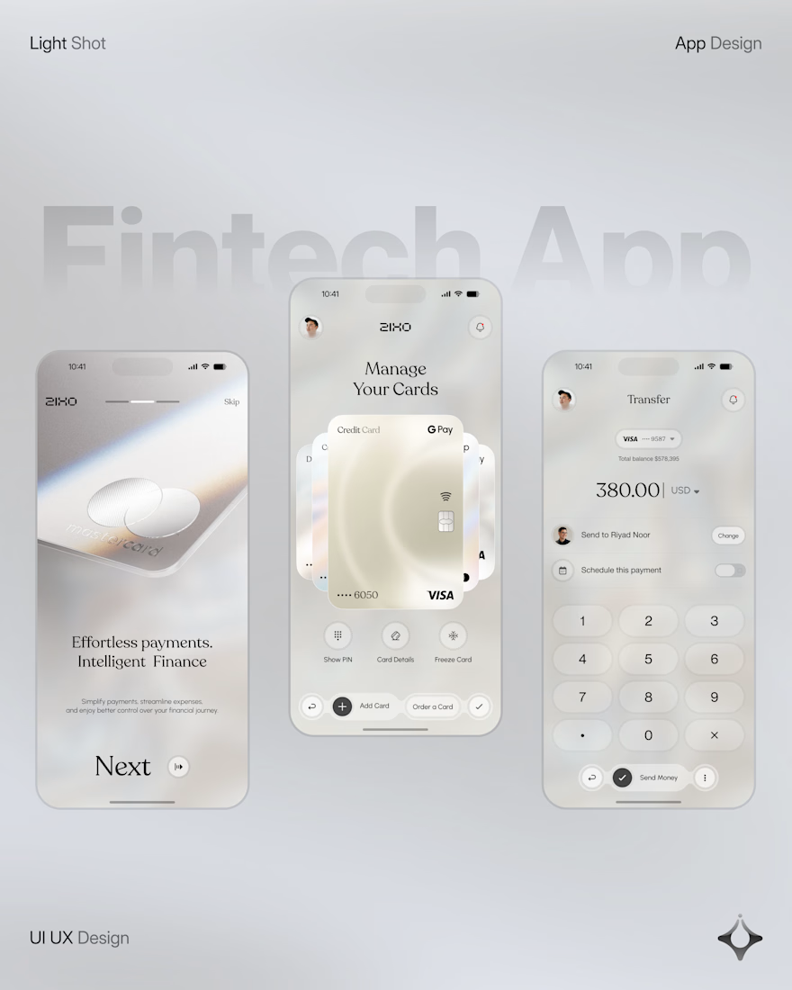
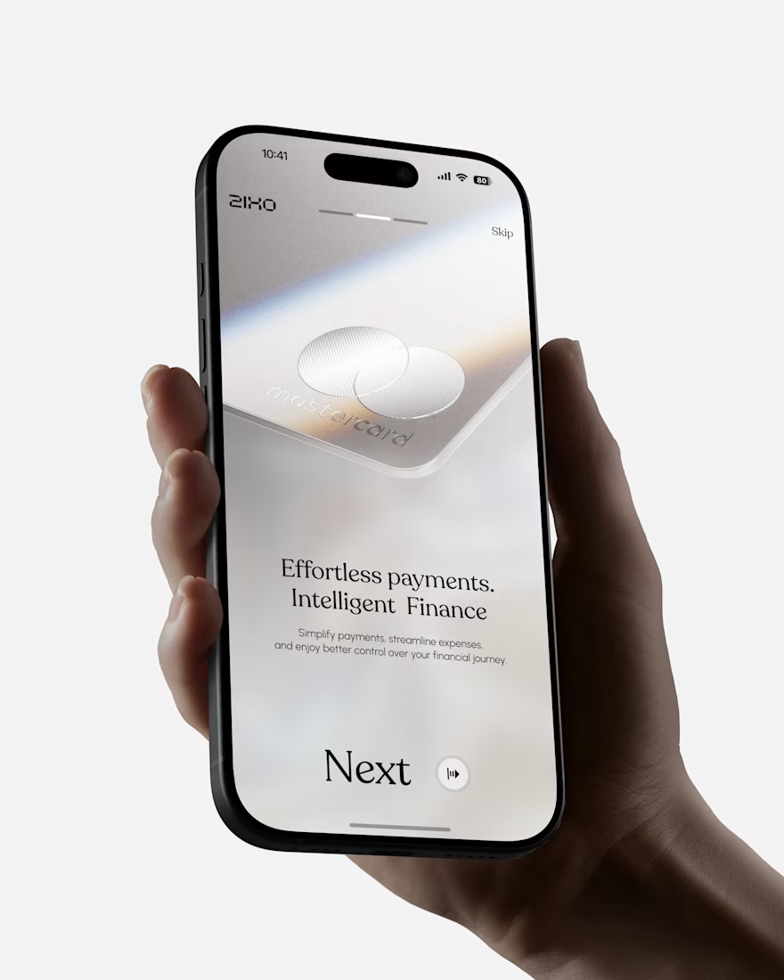
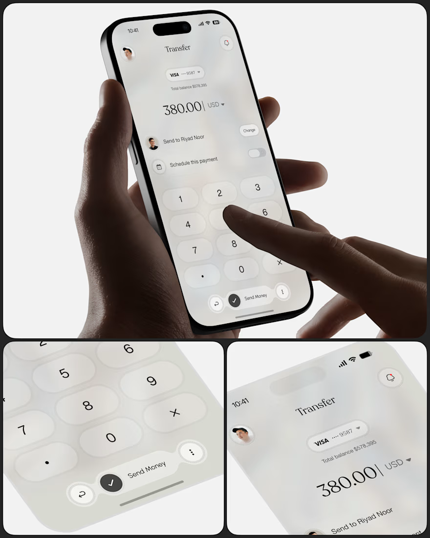
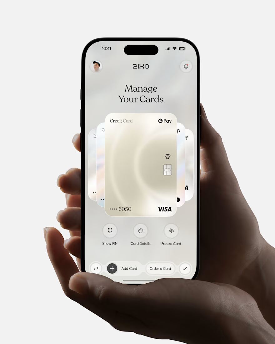
Absolutely love this Fintech App design! The minimal soft 3D elements with the clean UI is such a premium combo — feels very Apple-like and trustworthy. The interaction "designed to reduce" cognitive load really shows in the execution. Super polished work, that "Effortless payments. Intelligent Finance." screen is my fav!

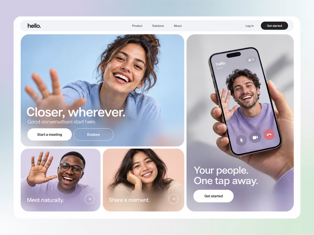
cool


Which packaging color catches your eye first?
6 voted
46%
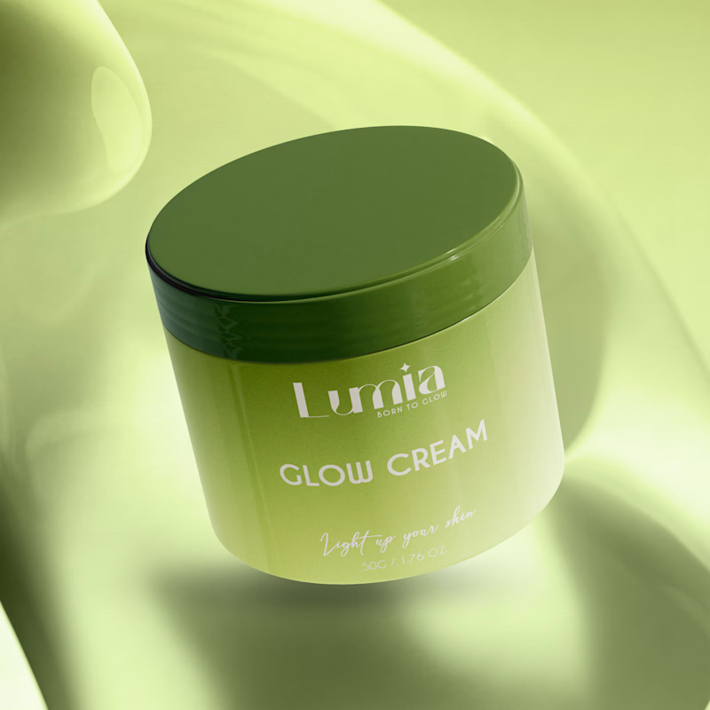
7 voted
54%
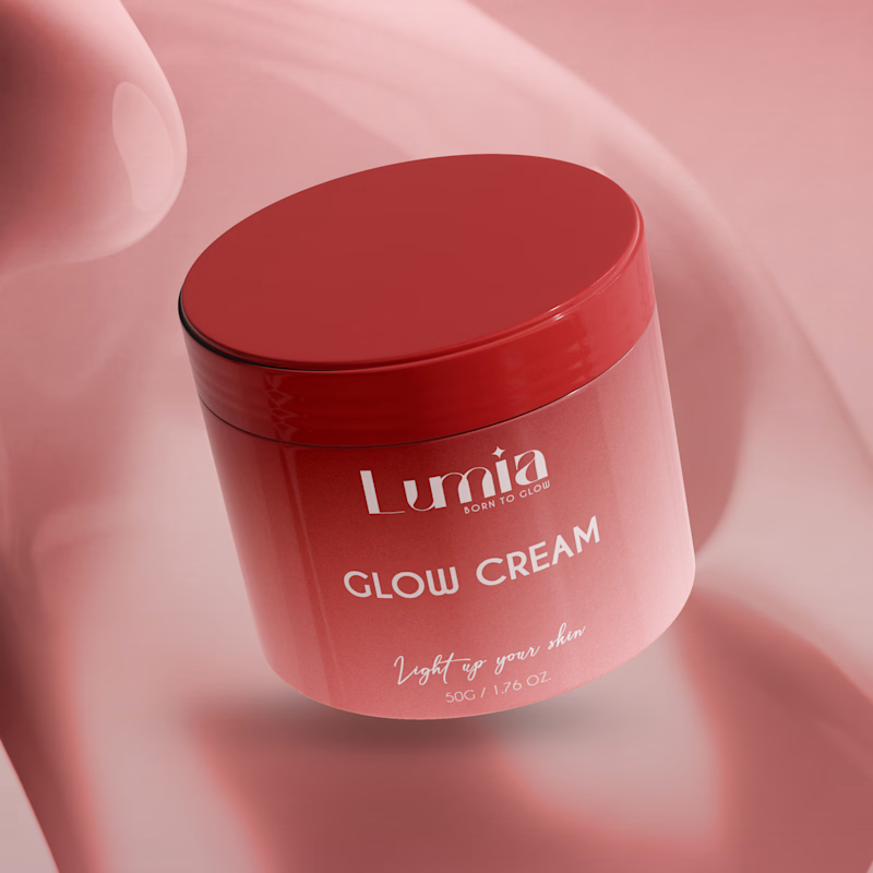
13 votes
Closed

The green version catches my eye first: the dark olive lid gives the lighter jar a clear focal point. I would also test the small white label text at thumbnail size, since the soft lighting reduces its contrast in both versions.