The network for creativity
Join 1.25M professional creatives like you
Connect with clients, get discovered, and run your business 100% commission-free
Creatives on Contra have earned over $150M and we are just getting started



The network for creativity
Join 1.25M professional creatives like you
Connect with clients, get discovered, and run your business 100% commission-free
Creatives on Contra have earned over $150M and we are just getting started





Related posts


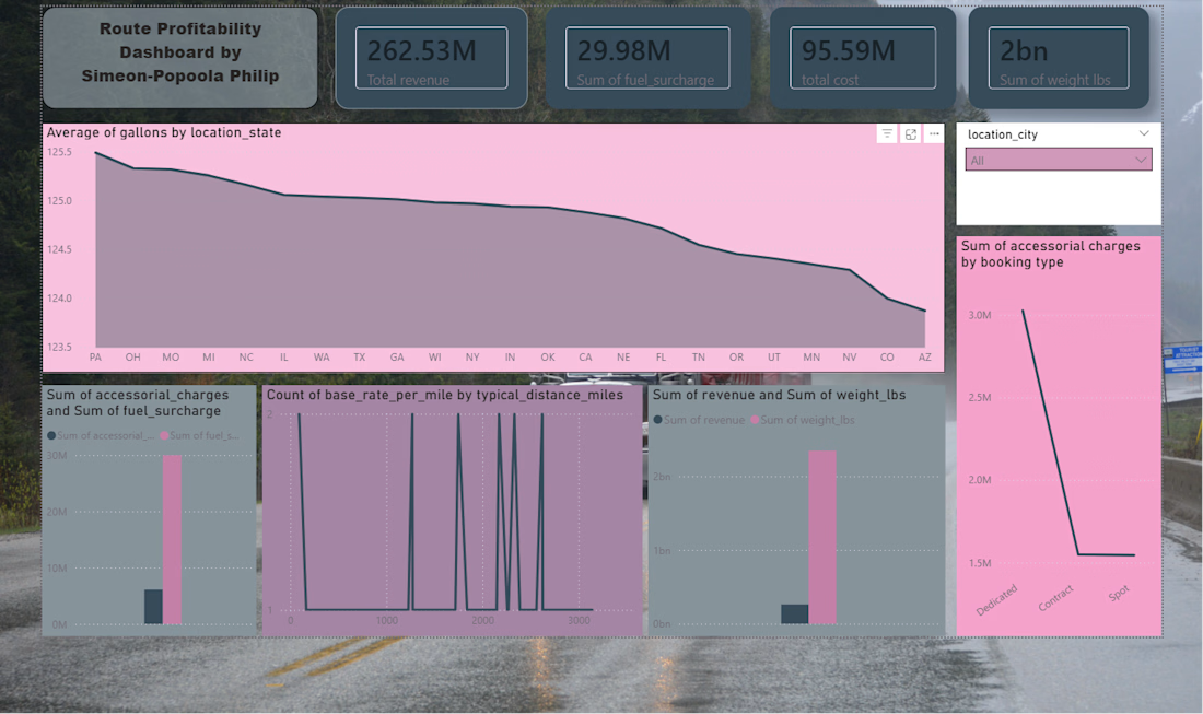
This project presents an interactive Route Profitability Dashboard built to analyze revenue, cost, fuel surcharge, and weight trends across different locations and booking types. It provides a clear visual summary of key logistics performance indicators to support better business decisions.
Project Overview
The dashboard gives an at-a-glance view of route performance by combining multiple metrics into one visual interface. It helps identify which locations, booking types, and distance ranges are contributing most to profitability and operational cost.
Key Insights
Total revenue: 262.53M. Total cost: 95.59M. Fuel surcharge: 29.98M. Total weight: 2bn lbs. Average gallons vary slightly by state, showing regional differences in route consumption. Booking type impacts accessory charges significantly, with dedicated routes appearing higher than contract and spot.
Dashboard Features
KPI cards for revenue, cost, fuel surcharge, and weight. Trend analysis by location state. Accessorial charge comparison by booking type. Distance-based analysis of base rate per mile. Interactive filter by city.
Tools Used
Microsoft Power BI.
Data visualization and business intelligence techniques. Route and logistics performance analysis.



Built a plumber website allowing incoming users to request an emergency fix or schedule a plumber's visit in a few clicks.
Everything is connected to a back-office for the Plumber, who can see and update the schedule.
My submission:
Name: SOS Plombier
Location: Toulouse, France
Build: https://sos-plombier.lovable.app/
Demo Video in comment.
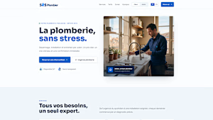
sos-plombier.lovable.app
SOS Plomberie Toulouse — Fast, reliable plumbing
Premium plumbing services with transparent pricing and immediate online booking.

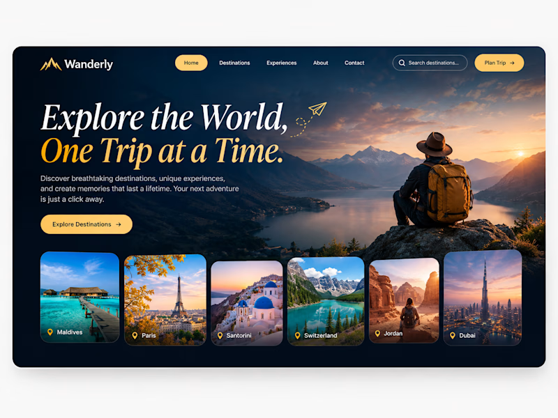
Same hiker, same destinations completely different travel mood.
Which one makes you want to book a trip faster?


4 votes
Ends in 7h