The network for creativity
Join 1.25M professional creatives like you
Connect with clients, get discovered, and run your business 100% commission-free
Creatives on Contra have earned over $150M and we are just getting started
Back to feedPost

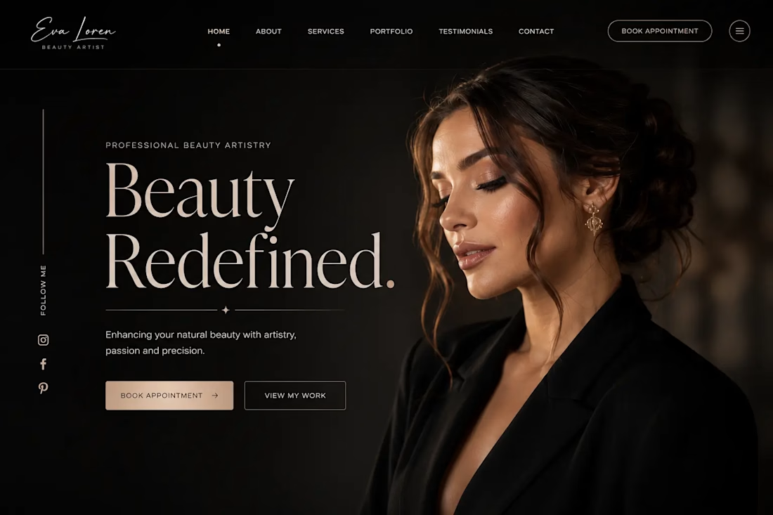
I wanted to see how far I could push a simple idea:
a beauty website that feels as elegant as the work behind the brand.
So I went with a dark, editorial direction — soft photography, oversized typography, subtle gold details, and plenty of breathing room.
The hero section is intentionally simple.
No overwhelming animations. No unnecessary elements.
Just a strong visual, a clear message, and one obvious next step: Book an Appointment.
I’d probably build this in Framer with subtle image reveals, smooth scrolling, and a few micro-interactions to bring it to life.
Still experimenting with the direction, but I really like how the minimal approach came together.
Would you go for this kind of look for a beauty brand?

The network for creativity
Join 1.25M professional creatives like you
Connect with clients, get discovered, and run your business 100% commission-free
Creatives on Contra have earned over $150M and we are just getting started




Related posts

For Sienna Rhodes, I designed the homepage around one idea: the portfolio should come first.
Photography clients usually want to know one thing before they read about your process, your packages, or even who you are: Do I connect with your work?
So instead of opening with a traditional introduction, the homepage leads directly into the portfolio and lets the imagery make the first impression. The supporting copy and details come later, once the work has already created that initial connection.
I’m curious where other designers and photographers land on this. Do you prefer a portfolio-first homepage, or do you think the photographer’s story should come first?


Portfolio first, every time for photography. Nobody hires off a process paragraph, they hire because one image stopped them scrolling. The story matters, but it lands harder after the work has already made the case. That start here slider does the pitch by itself.

After a long time finally
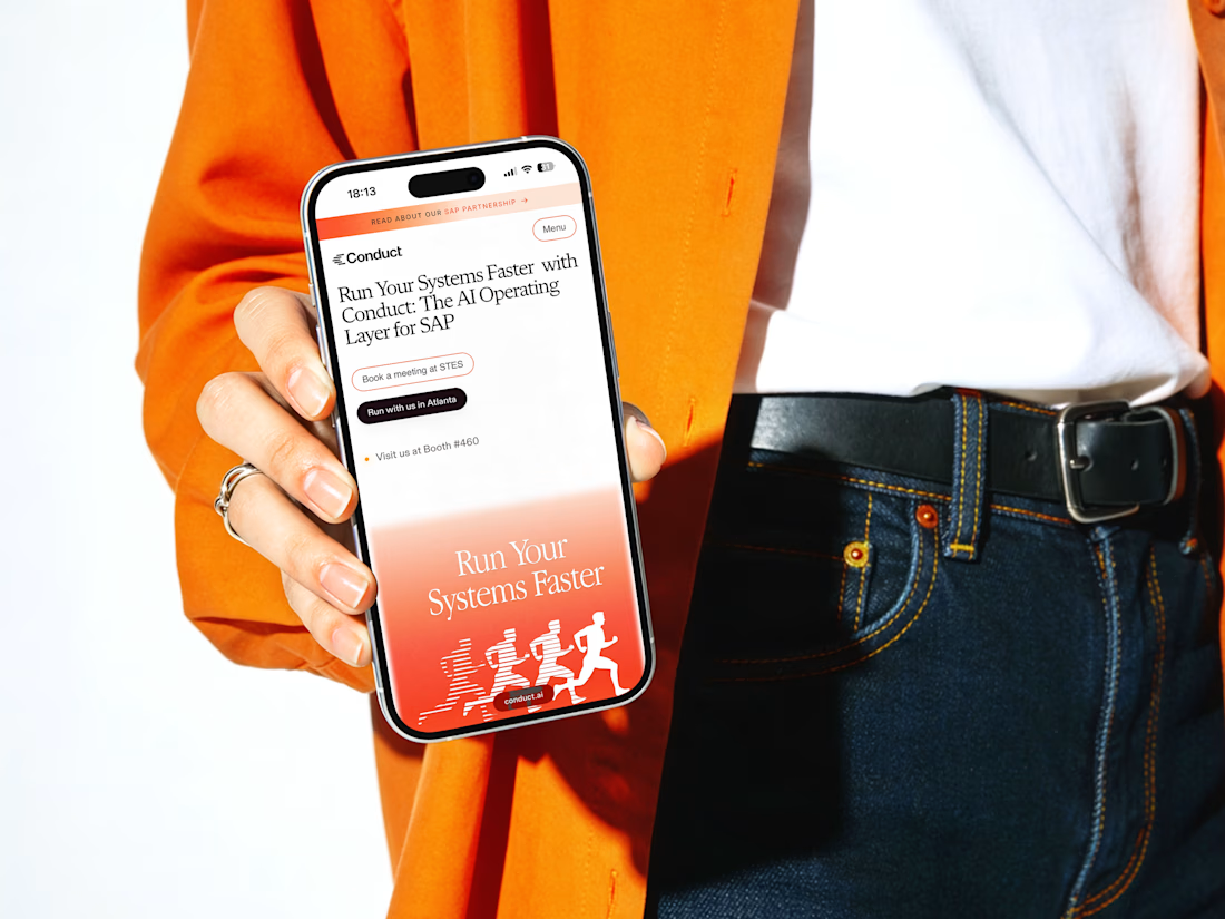
New case study: Conduct AI 🖥️
Designed and built in Framer.
Take a look 👇


Love the clean layout.


What can you add to your portfolio to make it a little more personal?
I love to write, and I've always kept a journal (often several on the go at once). I thought it'd be nice to add a work journal to my website so that my clients and colleagues can explore my processes and the messy inner-workings of my brain.
Have a look at: https://www.onyourtiptoes.com/journal and have a click through my highlights below.
It only took a couple of hours to build in Figma and Framer, but now the real challenge is keeping the entries going!
In spirit of building in public being more popular than ever, I'd love to see what you're making at the moment too. Let me know in the comments and we can share notes 💌


This is so cool @Cara Ellis. What is everyone else making?