The network for creativity
Join 1.25M professional creatives like you
Connect with clients, get discovered, and run your business 100% commission-free
Creatives on Contra have earned over $150M and we are just getting started
Back to feedPost

Twisters Pops — Candy Brand Storefront Concept
Self-initiated · Shopify · Confectionery / CPG · Conversion-focused
The problem with candy online
Candy sells on impulse at the till. Online it has none of that — no checkout aisle, no pocket change, no kid pulling at a sleeve. A $9.99 bag has to survive shipping costs and a deliberate buying decision, which means the site has to replace the impulse rather than just list the SKUs. We built the whole page as a sugar rush: colour-blocked, loud, fast, with the products never more than one scroll away.
What we built
A hero made of product. Oversized condensed display type — “Swirled, Twisted & Poppin’ Candies” — on mint, with real lollipops and twists scattered across the whole viewport in a loose float. The product is the background. One CTA, “Shop Now”, and a scroll cue. No hero image to art-direct, no stock photography — the candy does the work.
A staggered product grid, not a tidy one. Six bags laid out on an intentionally offset rhythm, each tilted a few degrees, each with its flavour tag (Cherry, Rainbow, Grape, Blue Razz, Sour, Spicy), weight, price and a one-tap cart button on the card itself. The “POPULAR” headline runs behind them at full bleed with a counter badge. The staggering is deliberate — a clean grid reads as a catalogue, an offset one reads as a sweet shop, and it keeps the eye travelling down the page.
Flavour marquees as navigation. Three scrolling rows — Cherry, Sour, Blue Razz — each in its own flavour colour, with product bags sliding through the type. It converts a boring category nav into the fastest-reading section on the page, and it gives someone who already knows what they want a one-click route in.
Why Twisters: hover-to-explore circles. A colour-blocked orange section where benefit claims — real fruit flavour, two-tone twist — sit inside overlapping circular photo masks that reveal on hover. Product claims that would die as a bullet list become something you want to poke at.
The ingredient flex. “100% real fruit flavours” set in rotated display type over a field of 3D fruit icons — cherry, apple, mango, grape, watermelon, chili. It’s the trust claim doing double duty as decoration, which is the only way a claim survives in a page this loud.
A stacked-card product carousel. Six cards that stack and advance with a 1/6 counter, each pairing the bag with its flavour name and detail — a second route to the same products for the visitor who scrolled past the grid.
The process story. “Here’s how the swirly, poppin’ candy gets twisted” — step cards as stacked colour circles, each a full colour change: cook the sugar, pull & twist, shape & pop. Craft storytelling is what justifies the price gap against supermarket candy, so it earns the real estate.
A footer that returns you to the hero. The page closes on the same mint field and headline it opened on, with email capture and social. Nobody reaches the bottom and finds a dead end.
Art direction
One heavy condensed grotesque, used at every size, carrying the whole page. Six-colour palette pulled off the packaging — mint, pink, orange, blue, yellow, deep purple — applied as full-bleed colour blocks so each section feels like a different flavour. Rounded section edges and shaped dividers so the page reads as stacked candy wrappers rather than stacked rectangles. Motion is constant but cheap: floating product, marquees, hover reveals, stacked-card transitions — all of it decorative, none of it blocking a click.
Build
Shopify custom theme sections — floating hero, staggered product grid with quick-add, flavour marquees, hover-reveal benefits, ingredient block, stacked carousel, process steps, newsletter footer. Merchant-editable throughout: flavours, prices, colours, copy and imagery all swap from the theme editor without touching code.
How we’d measure it
No performance data — this was never deployed. If it were, we’d test it against the live store and watch quick-add rate from the grid (the single highest-leverage metric on an impulse product), scroll depth past the hero, and average order value, since candy lives or dies on multi-bag carts.
What we can point to: these are the same patterns we build into live client stores, where we’ve measured conversion increases of up to 9-12%.


The network for creativity
Join 1.25M professional creatives like you
Connect with clients, get discovered, and run your business 100% commission-free
Creatives on Contra have earned over $150M and we are just getting started



Related posts

Your body is ready for sleep. But is your mind ready to switch off?
That’s the moment Elivara is designed for.
Instead of another endless scroll, imagine opening an experience that makes slowing down feel natural.
Because better rest starts with how you end your day.
Would you trade 20 more minutes of scrolling for 20 minutes of peace?
#SleepApp #UIUXDesign #ProductDesign #WebDesign #MotionDesign


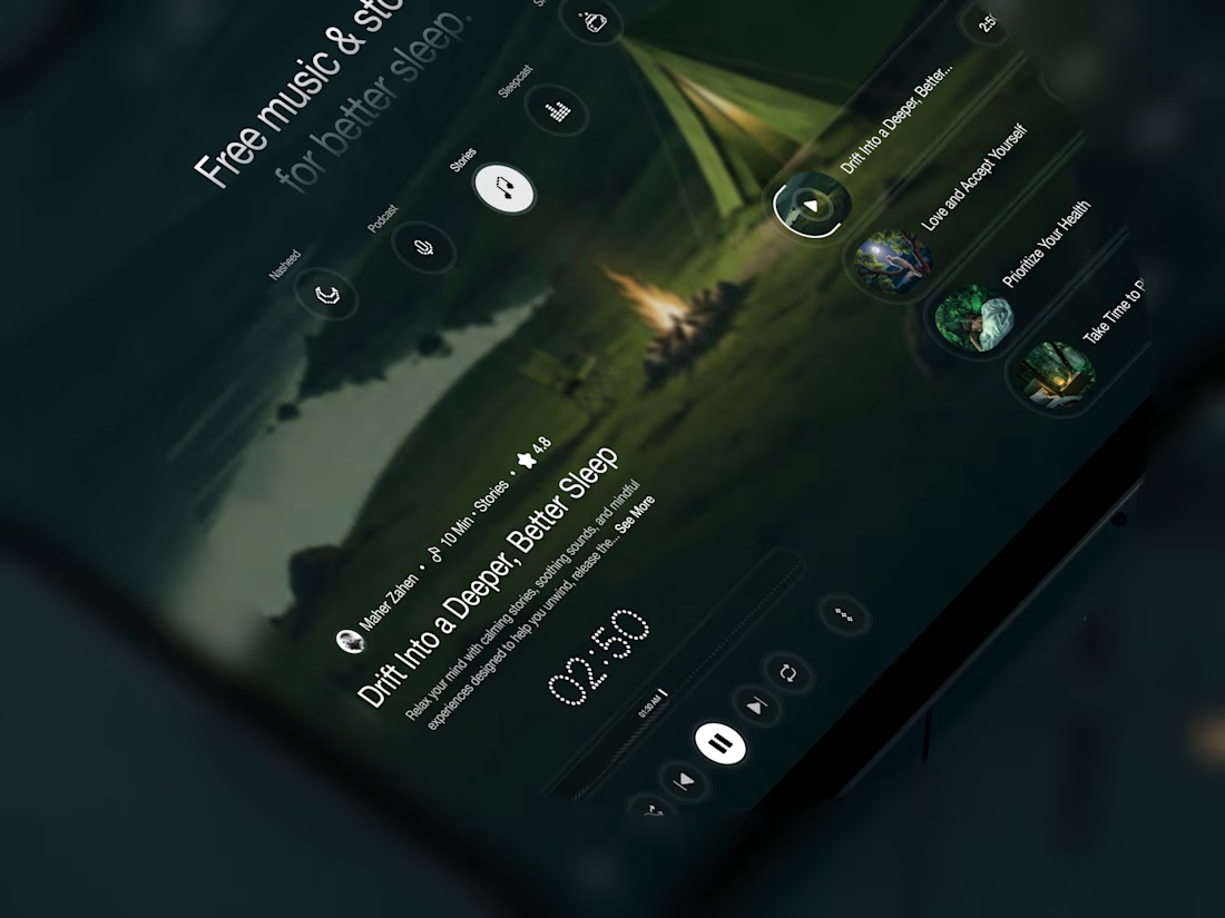
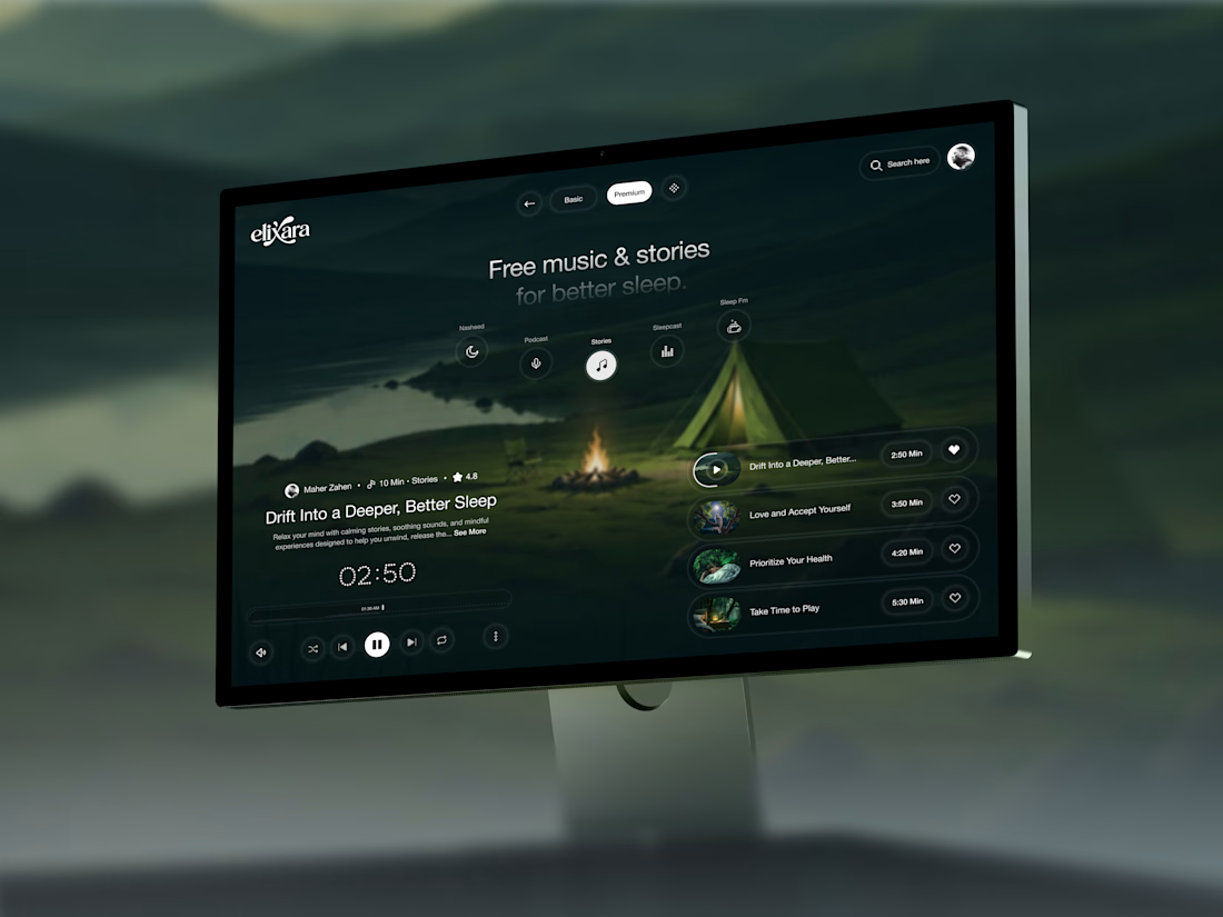

Great UX understands the user's state of mind, not just what they want to click.

Tendee - Dating App UI UX Design
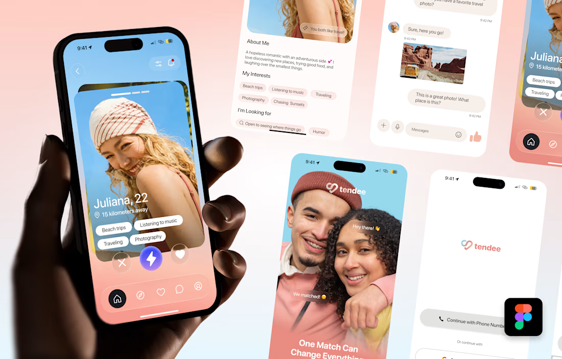
A mobile app UI design showcase focused on discovery, profiles, matching and conversation.
The visual challenge was to bring profile content, interest tags, primary actions and messaging into a consistent mobile experience. The design uses a soft lavender and coral palette, clear typography, rounded cards and recognizable navigation.
The selected mockup presents a profile discovery screen, detailed profile information, chat, onboarding and sign-in views. These screens demonstrate visual hierarchy, consistent interface styling and attention to mobile interactions.
Personal portfolio showcase. Project cost is an illustrative quote for comparable design work, not a past client payment. The date marks this showcase's preparation in October 2026; duration is an estimated production timeframe.

Love the colors!

EchoMind is live on the Framer Marketplace.
It’s a calm, editorial shop template for brands that make physical things: hardware, objects, small product lines. I designed the brand, generated the product photography and built every page in Framer.
What’s inside:
20 pages, each designed for desktop, tablet and phone
CMS-driven shop with working price sort
Product pages with gallery, specs and FAQs
A build-your-own configurator with live pricing
A bag with quantities and discount codes
Journal with hover image previews
Launch, studio, support and gift card pages
The product itself is fictional: a modular mixing desk where one core listens to your mix and suggests one fix at a time. I wanted the template to feel like a real brand from day one, so it’s been built and photographed like one.
Get the template: https://www.framer.com/marketplace/templates/echomind/


Congrats on the launch, Jonathan. Designing the brand, the photography and every page yourself gives it a clear voice. What was the hardest part of building a shop template in Framer?