The network for creativity
Join 1.25M professional creatives like you
Connect with clients, get discovered, and run your business 100% commission-free
Creatives on Contra have earned over $150M and we are just getting started
Back to feedPost

https://share.google/TXtUrZdyS6Tri3Fqb this is my article ranking on first page


The network for creativity
Join 1.25M professional creatives like you
Connect with clients, get discovered, and run your business 100% commission-free
Creatives on Contra have earned over $150M and we are just getting started


Related posts

Just dropped my second UX & Conversion Copywriting concept on Contra! 📊
Pricing pages are where most SaaS and FinTech sign-ups stall. When tiers are packed with accounting jargon or hidden-fee anxiety, solo founders bounce instead of starting a trial.
For this self-initiated VeloceLedger concept, I focused on turning hesitation into clarity:
• Identity-Driven Tiers: Replaced vague labels like "Basic" with "Best for..." taglines so freelancers self-identify their plan in seconds.
• Zero-Risk Trial Microcopy: Explicitly reassured users they’ll auto-downgrade to the free tier when the 14-day trial ends ("zero surprise charges").
• Interactive Plan Helper: Built a 1-question prompt to eliminate choice paralysis right on the page.
Check out the full case study on my profile, what’s the #1 thing that makes you hesitate on a SaaS pricing page? 👇

Most small-business sites don't need five pages. Fight me.
Hot take: Home, About, Services, Gallery, Contact is a habit, not a plan. Each page ends up thin, and visitors have to guess which one to click.
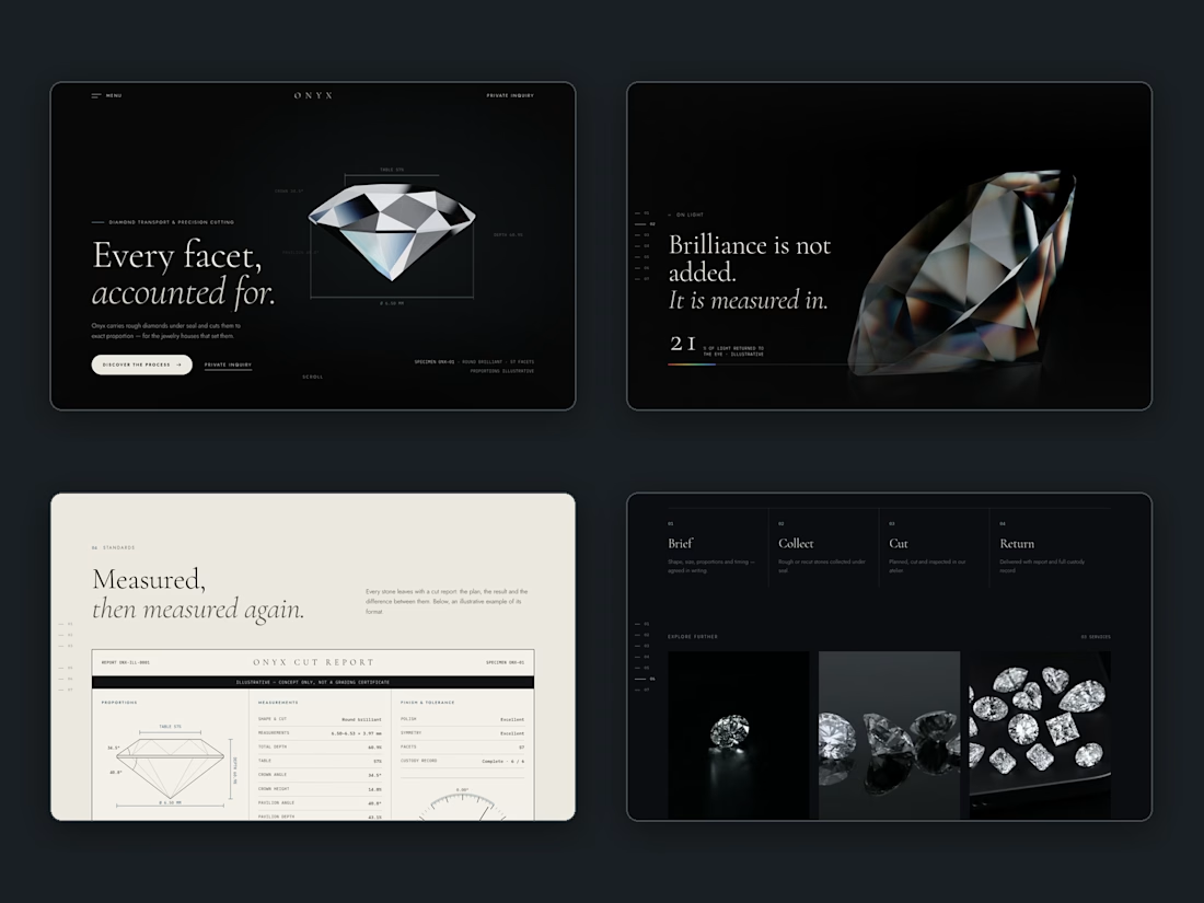
We'd rather build one page that tells the story in order. Here's our Onyx concept, a fictional diamond cutter: the promise, the proof, the standards, then the process, all in one scroll. Nobody has to hunt through a menu.
There are real exceptions, like restaurants with menus or shops with a catalog. But for most service businesses, one strong page beats five weak ones.
Agree or disagree? Drop your site and we'll tell you which page we'd merge first. 🔥
Just published a new UX & Conversion Copywriting concept on my profile! 🚀
Most habit-tracking apps lose users in two places: vague landing pages that don't explain how the app fits real life, and overwhelming onboarding flows that ask for too much before delivering a quick win.
For this self-initiated PulseHabit concept, I mapped out the full user journey:
• SEO Landing Page: Built to turn high-intent search traffic into free trials using zero-friction microcopy.
• 4-Screen Onboarding Flow: Focused on single-habit selection to eliminate decision fatigue and get users to Day 1 activation faster.
Check out the full breakdown on my profile and let me know which screen you’d test first! 👇