The network for creativity
Join 1.25M professional creatives like you
Connect with clients, get discovered, and run your business 100% commission-free
Creatives on Contra have earned over $150M and we are just getting started
Back to feedPost


The network for creativity
Join 1.25M professional creatives like you
Connect with clients, get discovered, and run your business 100% commission-free
Creatives on Contra have earned over $150M and we are just getting started

Challenges
View all


Related posts


We've joined the Lovable Partner Program as a Certified Partner. 🎉
We use Lovable to turn complex ideas into production-ready software, from internal operating systems to customer-facing applications.
As a certified Lovable partner, MessyOrg can help businesses move from idea to secure, production-ready software faster—without sacrificing the structure, security and scalability needed for real-world use.
Have a messy workflow or software idea? Let’s build it!
http://messyorg.com


Enterprise RAG AI: Private Doc Intelligence
A fast-growing B2B software firm needed a secure, enterprise-grade Retrieval-Augmented Generation (RAG) system to query thousands of confidential internal documents (legal contracts, technical architecture specs, Notion pages, and employee SOPs) in real time without third-party data leakage.
Key Challenges:
High hallucination risk and irrelevant context retrieval using standard keyword search.
Managing multi-format files (scanned PDFs, tables, markdown) with strict access control based on user hierarchy.
Technical Implementation & Solution:
• Engineered an automated ingestion pipeline in Python with LlamaIndex and LangChain for semantic chunking and metadata preservation.
• Integrated a hybrid vector search architecture pairing dense embeddings (OpenAI text-embedding-3) with sparse BM25 indexing in Qdrant.
• Added a cross-encoder re-ranking layer (Cohere Re-ranker) to prune low-relevance chunks, reducing API token costs by 40%.
• Built robust Role-Based Access Control (RBAC) via FastAPI endpoints, ensuring departmental data isolation.
Results & Impact:
• Dropped internal information retrieval time from 20 minutes to under 4 seconds.
• Attained 98% factual precision with traceable in-line page citations.
• Full on-prem Docker deployment ensuring 100% private data security.



I'd test revoking a user's document access mid-conversation. In your RBAC flow, do cached retrieval results get rechecked against current permissions before they're sent to the reranker or model?

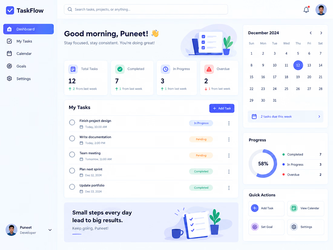
This week I worked on a widget library for a new SaaS product.
On complex products, a widget library can pass 100 widgets fast. Every one needs multiple sizes, empty and error states, permission rules, and has to handle real data that never looks like the mockup. Without a system, each new widget becomes a one off and the product slowly starts to feel stitched together.


