The network for creativity
Join 1.25M professional creatives like you
Connect with clients, get discovered, and run your business 100% commission-free
Creatives on Contra have earned over $150M and we are just getting started
Back to feedPost

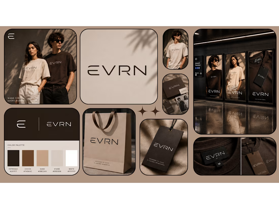
EVRN (Concept Design) — A premium, minimalist visual identity system created for a contemporary apparel brand. This project explores the balance between architectural typography, organic textures, and editorial grids to establish a sense of quiet luxury.
A visual harmony of architectural typography, soft shadow play, and warm earth tones. Created as a sanctuary for minimal design, this concept explores the profound beauty found in quiet luxury, open space, and deliberate, thoughtful details.

The network for creativity
Join 1.25M professional creatives like you
Connect with clients, get discovered, and run your business 100% commission-free
Creatives on Contra have earned over $150M and we are just getting started





Related posts

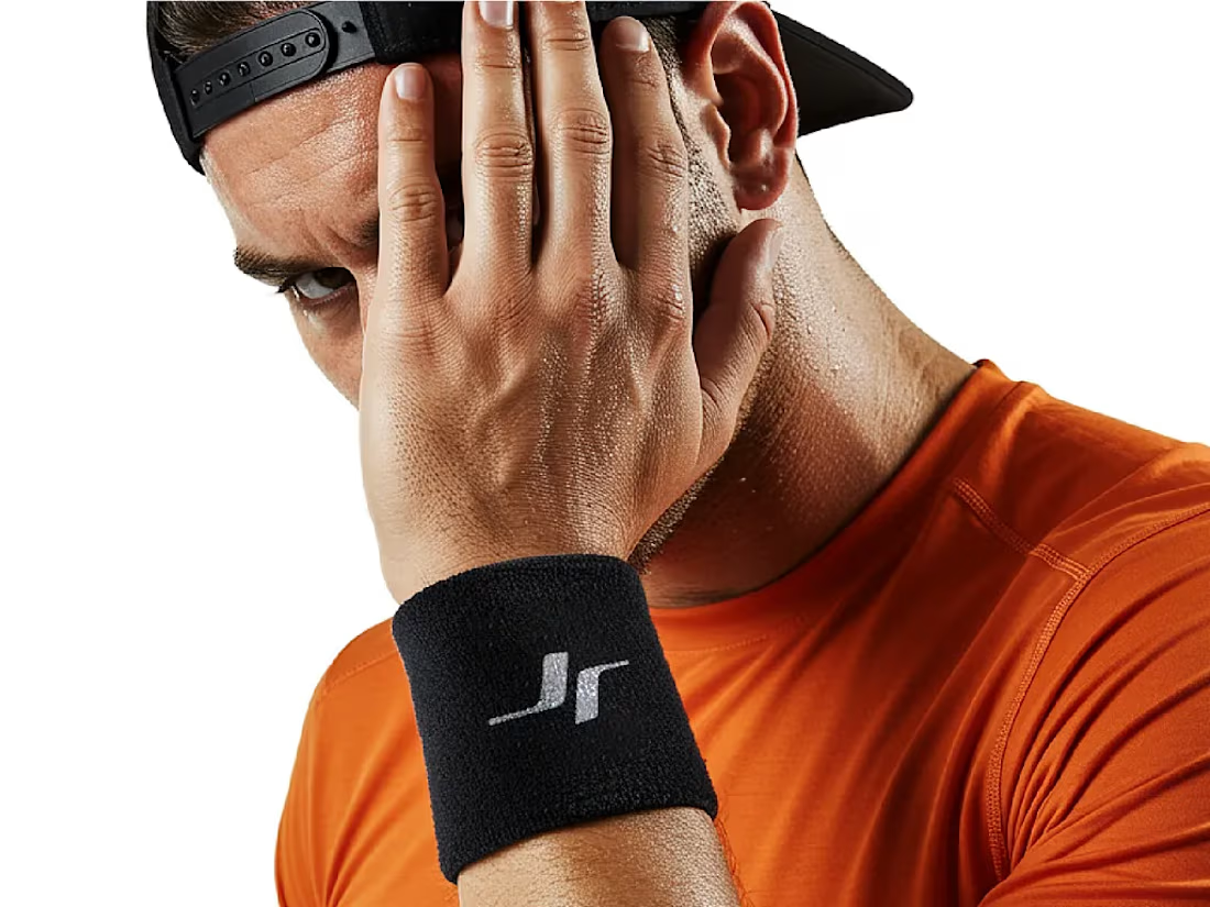
Jordan Reid - Sportswear Brand Identity






Like the logo direction

Puresip — a fresh identity taking shape.
Built around one idea: make a fruit brand feel refreshing, natural and full of personality without falling into the usual “healthy juice” look.
From Spain, direct to you.
A little preview of the identity and digital direction before the full case study.
Impressive work man

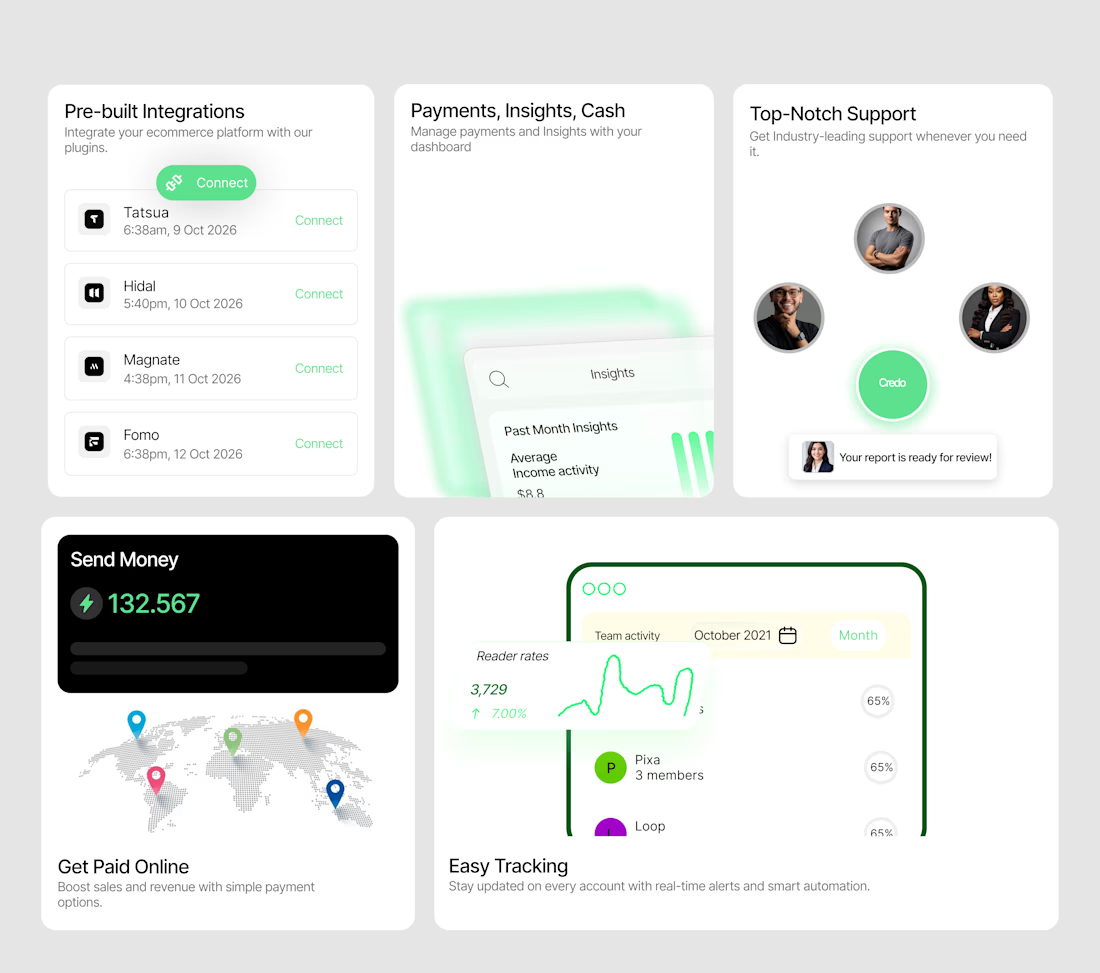
A bento system designed to make a SaaS product feel tangible.
I wanted each card to do more than display a feature — it needed to show the experience.
So I designed a collection of interactive-looking product cards around:
→ Integrations
→ Payments & insights
→ Customer support
→ Global payments
→ Real-time tracking
The visual direction combines minimal layouts, soft green accents, dashboard UI, subtle gradients and strong typography to create a modern fintech/SaaS feel.
The goal was simple:
Make the product feel useful before the user even clicks anything.
I'm currently open to UI/UX, Product Design and freelance opportunities.
If you're building a SaaS, fintech, Web3 or Web2 product and need a designer who can turn ideas into polished interfaces, let's work.
Available for new projects →
#UIDesign #ProductDesign #SaaS #Fintech #UXDesign #Figma #WebDesign #FreelanceDesigner

Love the vibe of this!