The network for creativity
Join 1.25M professional creatives like you
Connect with clients, get discovered, and run your business 100% commission-free
Creatives on Contra have earned over $150M and we are just getting started
Back to feedPost
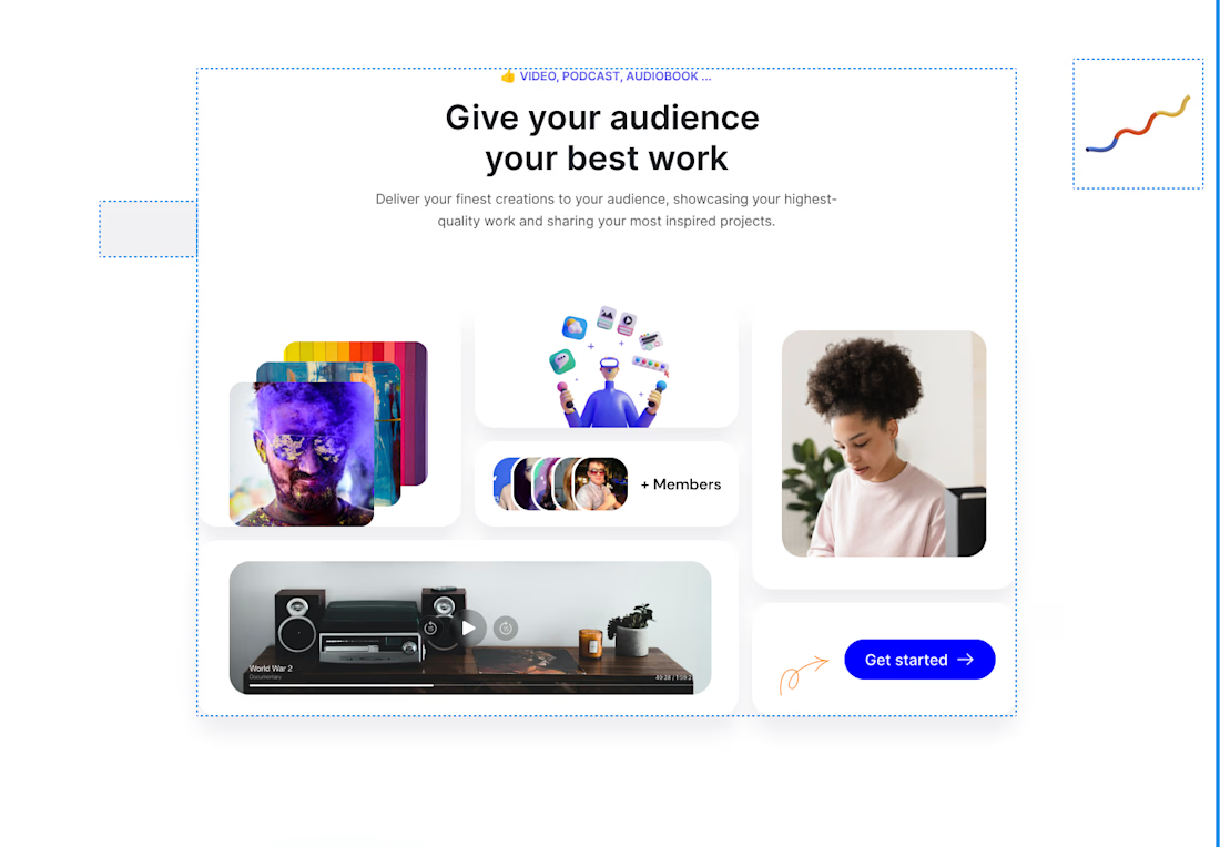
Beautiful UI shouldn't require messy code. ✨
A while ago, I built this feature section for TipMi. Looking at the varied card sizes, you might think it requires complex positioning or endless Flexbox containers. The secret weapon? CSS Grid with grid-template-areas.
Using Grid for this specific architecture is the easiest, most scalable approach. You get complete two-dimensional control, allowing you to span items across multiple columns and rows seamlessly while keeping the underlying HTML structure incredibly clean and readable.
Take a look at the live build here: https://tipmi-dev.vercel.app/



Great design 👍

Thank You


Nice Layout 🔥
Thank you @Eniola Adeleke
The network for creativity
Join 1.25M professional creatives like you
Connect with clients, get discovered, and run your business 100% commission-free
Creatives on Contra have earned over $150M and we are just getting started











Related posts


🌲 Nordhaus | Prefab Timber Homes Website (Framer)
Homes that grow quietly with the forest, now on the web. 🏡
Nordhaus is a website for a Latvian builder of prefabricated timber homes, created in Figma and built in Framer as a responsive site for desktop, tablet and mobile. It brings the brand's calm Nordic character through full-screen photography, a scroll-driven process story, a horizontal model gallery and interactive testimonials.
✨ Template coming soon to Framer.


Wonderful design man

An interaction study for Mare’s collection feed, exploring how to make groups legible within a dense, mixed-format archive.
The layout preserves image proportions and integrates collection labels into the packing system. On hover, image-derived gradients establish the collection boundary, while subtle displacement creates space around the active group without changing its position or scale.
The motion studies isolate assembly, packing, colour and proximity, using real collection content to examine timing, spatial continuity and hover behaviour.


Two visual directions for the same brief. Which do you prefer?
2 voted
29%
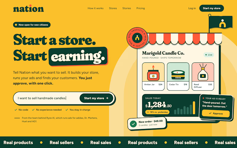
5 voted
71%
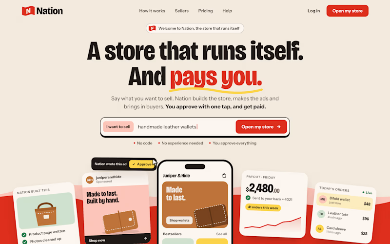
7 votes
Closed

Direction A is more better to me it feels modern professional cartoony style that's impressive ❤️❤️
Great job Ayoub🔥🔥