The network for creativity
Join 1.25M professional creatives like you
Connect with clients, get discovered, and run your business 100% commission-free
Creatives on Contra have earned over $150M and we are just getting started
Back to feedPost

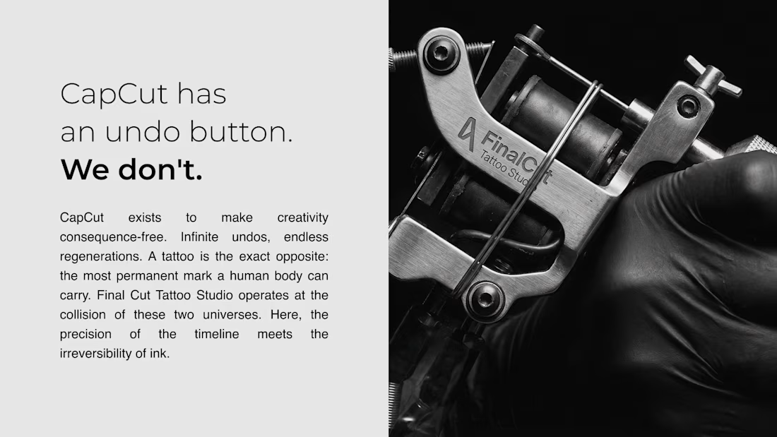
What if CapCut was a tattoo studio?
CapCut exists to make creativity consequence-free: infinite undos,
endless regenerations, nothing permanent.
The tagline wrote itself:
"CapCut has an undo button. We don't."
─
FINAL CUT TATTOO STUDIO
Direction A — CapCut as a Different Industry
Every service speaks the editing vocabulary:
→ Custom Layer — every piece unique, non-duplicable
→ Trace & Import — from reference file to skin
→ Color Grade — palette applied with intention
→ Grayscale Export — no color, only contrast
→ Overwrite — rewriting what was there before
→ Stock Library — ready to apply flash collection
Every aftercare product extends the metaphor:
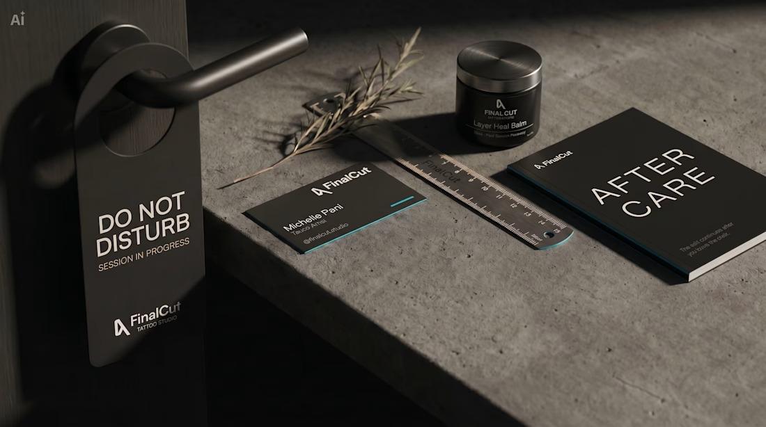
→ Layer Heal Balm — post-session recovery
→ Preserve Filter SPF 50 — protect the work, stop the fade
→ Quick Render Mist — instant hydration for fresh cuts
→ Raw Clean Wash — remove everything artificial
─
THE BRAND KIT INCLUDES:
→ Full visual identity system (color, typography, logo architecture)
→ Campaign posters
→ Aftercare product line with packaging
→ Client release form — built manually in the canvas
→ Business cards
→ Cybersigilism flash sheet — Stock Library Session I
→ Aftercare manual
→ Studio collateral (DO NOT DISTURB hanger, ruler, booklet)
─
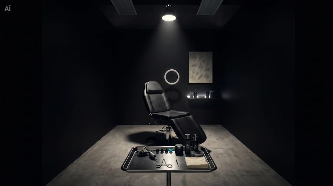
BUILT ENTIRELY IN CAPCUT DESIGN STUDIO:
AI generation (Seedream 5.0 + GPT Image 2) → manual canvas
refinement → full brand kit. Every asset generated, refined,
and composed inside Design Studio.
─
#CapCutDesignStudio
The network for creativity
Join 1.25M professional creatives like you
Connect with clients, get discovered, and run your business 100% commission-free
Creatives on Contra have earned over $150M and we are just getting started





Related posts

Title: Electrolux PerfectCare 600 — AI Commercial Concept
An unofficial AI-generated commercial concept for Electrolux PerfectCare 600.
I created a premium visual story where water, soft blue fabric, and delicate flowers transform an everyday laundry moment into an ocean-inspired experience of freshness, movement, and gentle care.
The project combines AI image generation, art direction, product storytelling, and visual editing to create a short vertical campaign for social media.
Role: AI Creative Director · AI Video Creator
Tools: AI Image Generation · AI Video · Visual Storytelling · Editing
Format: Vertical social media commercial

PerfectCare 600 as an ocean-inspired laundry moment is a bold metaphor — water + fabric + flowers can easily feel stock, so keeping it premium/unofficial concept is the interesting constraint.

Bring your content to life with engaging TikToks, Reels, and YouTube Shorts — professionally edited in CapCut and ready to post within 24 hours.


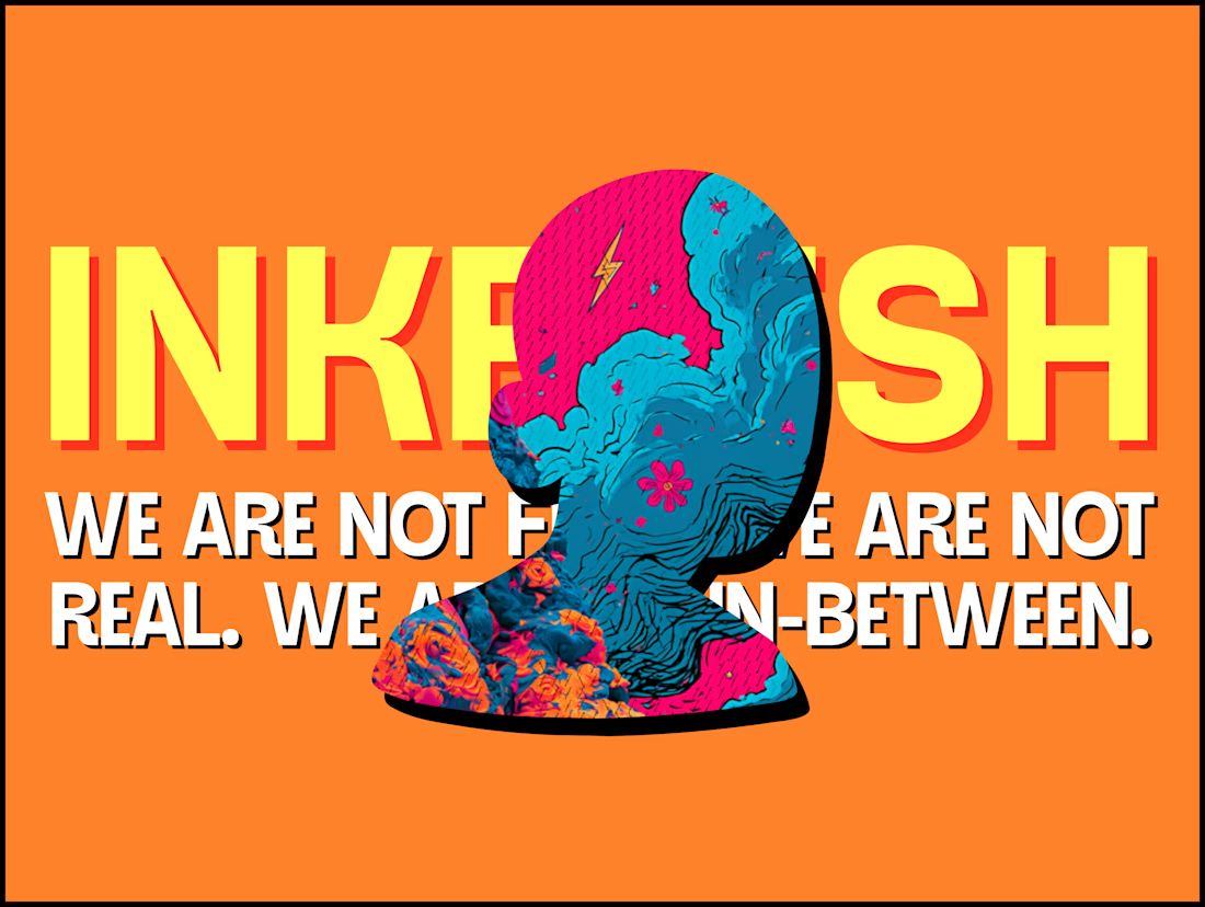
The INKFLESH mark I designed starts with an empty profile avatar. A deliberately plain shape for an identity full of strange characters.
The characters needed room to change. The identity also had to work on a woven label or an app icon, where a detailed illustrated face has very little space to do its job.
I kept the silhouette and palette constant, then let the artwork change around them. The mark can hold an illustration, appear as a solid stamp, or sit on its own at a small size. Each version still has the same shape underneath.
That was the useful constraint: decide what someone should recognise when the most expressive part of the design disappears.
If your identity depends on a detailed illustration, try its smallest application before approving the whole world around it.


Super bold and creative! Love the vibrant colors. 🔥