The network for creativity
Join 1.25M professional creatives like you
Connect with clients, get discovered, and run your business 100% commission-free
Creatives on Contra have earned over $150M and we are just getting started
Back to feedPost

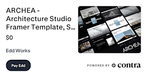
I’m giving away ARCHEA, my $129 Framer template, for free until November 1.
Built for architecture and interior design studios, with bold typography, cinematic project layouts, light and dark themes, and CMS for projects and articles.
I wanted to create a website that gives the work room to speak. Excited to finally share it.
#Framer #FramerTemplate #WebDesign
contra.com
ARCHEA - Architecture Studio Framer Template (SINGLE SITE) by Edd Works
Purchase ARCHEA - Architecture Studio Framer Template, SINGLE SITE by Edd Works on Contra.
The network for creativity
Join 1.25M professional creatives like you
Connect with clients, get discovered, and run your business 100% commission-free
Creatives on Contra have earned over $150M and we are just getting started






Related posts

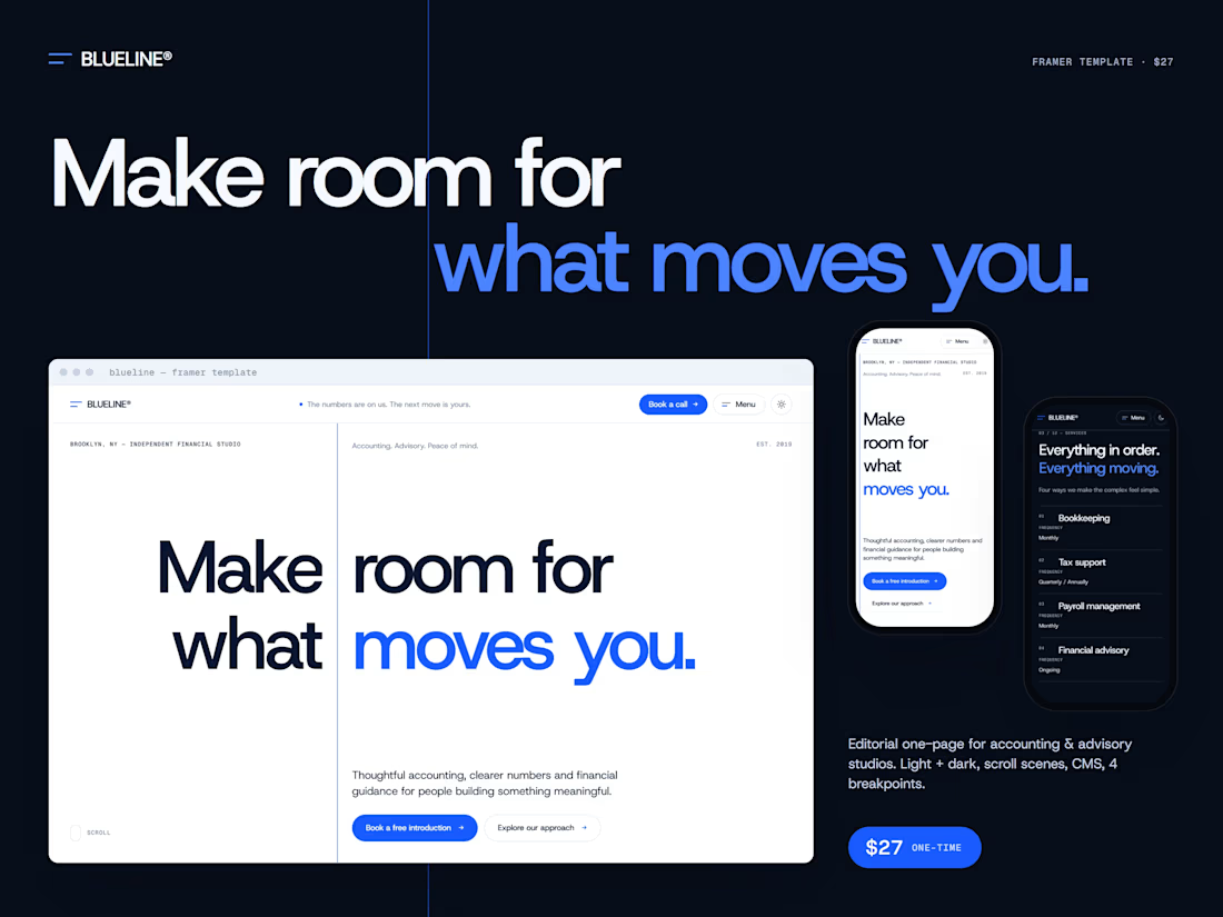
BLUELINE® is a one-page Framer template for accounting, bookkeeping and advisory studios — built to show that a finance website can feel calm, precise and alive at the same time.
The concept
Everything is organized around a single blue structural line, a Swiss-editorial grid that runs through every section and turns into the brand’s main motion device.
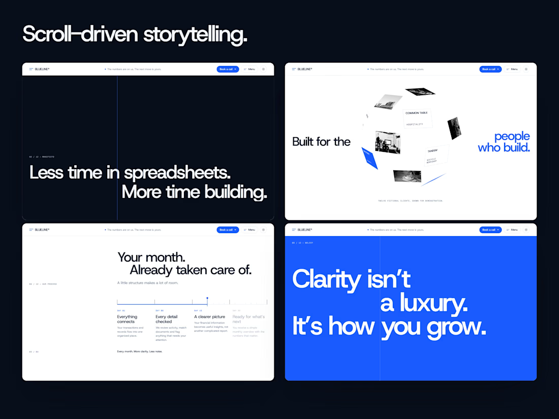
Motion
• A dark chapter that opens from the line like a slit
• A pinned month timeline that follows your scroll
• A 3D sphere of client cards that rotates as you move
• A big statement where each line gains weight as you scroll
• Stacked testimonial sheets and team cards that fan out
Built for real use
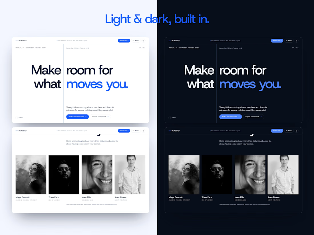
• Real light and dark themes on semantic color styles
• Native Framer components, text styles and a CMS team collection
• Framer Forms contact with loading, success and error states
• Recomposed for 1440, 1024, 768 and 390 px
• 13 sections + Privacy and 404 pages
Get it on the Framer Marketplace — $27
https://www.framer.com/marketplace/templates/blueline-studio/
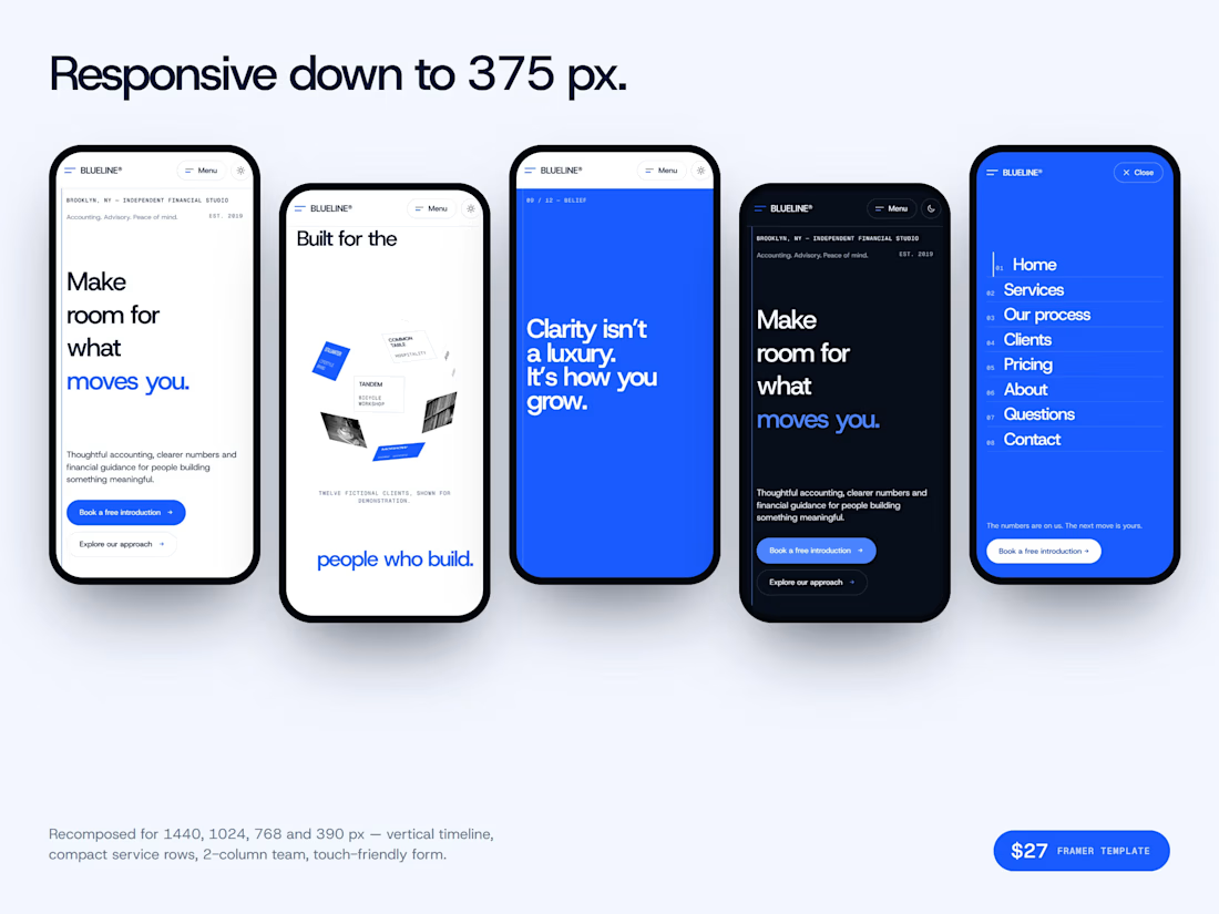

Using one blue structural line as both the grid and the main motion device is a smart way to keep a one-page site cohesive. Finance sites rarely get to feel this calm.

yesterday I applied to a job on Contra that felt like a perfect match for my profile
I really need this job, so I thought: they're gonna get tons of applications, I want to go the extra mile
so I designed their website hero in Framer as a creative direction idea and emailed it to them for free, just to make my application stand out
honestly showing my work is the best way I can sell myself right now, since my English isn't perfect

I think that's a great initiative. Showing how you approach a project can communicate so much more than simply describing your skills in an application. And creating a concept specifically for their brand shows you've put real thought into it. Just make sure you don't feel...

A portfolio template should feel finished on day one, and still have room to grow.
I made two editions of Arkiv, my index-style Framer portfolio. A is Lite, one clean index list with a square cursor preview. B is Pro, with a large preview, dark mode, and Grid and Sheet views.
Which one would you pick for your portfolio? Vote below 👇
0 voted
0%
3 voted
100%
3 votes
Closed