The network for creativity
Join 1.25M professional creatives like you
Connect with clients, get discovered, and run your business 100% commission-free
Creatives on Contra have earned over $150M and we are just getting started
Back to feedPost


Just Published my very first digital product on Contra. Super excited to share it with you guys, more to come!
Check out Fitgoa l Fitness Studio Tamplate Built with Bricks
The network for creativity
Join 1.25M professional creatives like you
Connect with clients, get discovered, and run your business 100% commission-free
Creatives on Contra have earned over $150M and we are just getting started



Related posts

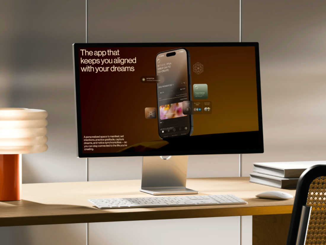
Promo video for a manifestation and wellness app. 48 seconds of kinetic type, UI motion and warm footage that show what the app does.


A few months ago I got to work with Coderhouse, one of the leading education brands in Argentina, and the place where I took several courses myself.
So this one feels like a full circle. A brand that shaped my career and helped me grow as a designer, and now I got to design for it.
The funny part is Chris had no idea I was a former student when he reached out. I was really happy when that message came in.
I built a visual system for their 60+ course covers, made so their team can keep producing them on their own. Today it lives across their app, website and Meta ads.
Thanks Chris for trusting my work and for the opportunity 🧡 And thanks @Contra HQ for making connections like this one possible.


Felicitaciones Jere! muy bueno el proceso y el resultado final


The Powermatic case study is now on Contra.
It's the full story in six chapters: the challenge, the home page, the brand, Careers, the grid and the build. This time with the motion too: the home page scroll, the menu drum and the logo animation.
One detail I didn't mention last time. The preloader fills the logo with the page's real loading progress, fonts and the hero photo included. When it's full, the page is ready.
Everything is designed and hand-coded by me, no framework.
If you have a minute, a like or a comment helps the work reach more people.

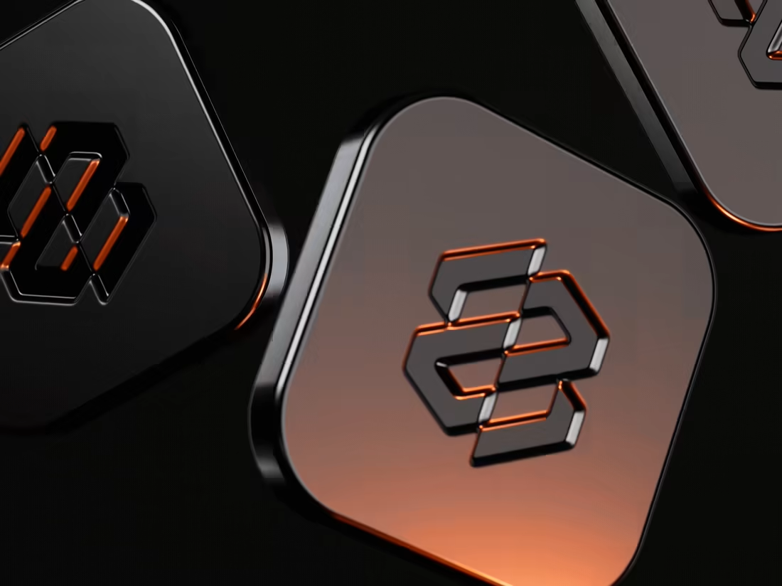
The orange light catching the edges of the Powermatic mark on the dark tiles looks tactile and premium. Which of the six chapters took the longest, the grid or the build?