The network for creativity
Join 1.25M professional creatives like you
Connect with clients, get discovered, and run your business 100% commission-free
Creatives on Contra have earned over $150M and we are just getting started
Back to feedPost
Links:
Stitch project
Within - live app
What it is
Kitchen is the renovation people regret most, and the reason is money, not taste: nearly three in four homeowners who remodel report regrets, and almost eight in ten go over budget. The ones who stay happy aren’t the ones who spent less, they’re the ones whose result matched the plan they started with.
Within is built for the moment before the spending starts. It never invents a dollar total. You give it a budget and a kitchen size; it splits the money into shares (cabinets, labor, appliances, countertops, and the rest), reserves a contingency buffer off the top first (the one most people skip and later need), and shows each element as a proportion of what you have, not a price tag. When the money tightens, the lowest-priority work crosses a visible line into a “cut at this budget” zone, each cut carrying a plain reason. The one number it commits to is a conservative floor: below a realistic minimum for your square footage (about $75/ft² for a basic build), it tells you that minimum instead of drawing a broken plan. Everything else is proportions and ranges, calibrated to typical 2025–2026 US kitchens, the kind of thing you bring to a contractor to price. Per-element dollar ranges live inside an expanded card, framed as your allocation of your own budget and never a market quote, so the card faces stay proportion-only and the list can’t be summed into a fake total.
Scope for v1: kitchen, US market, tablet and mobile, responsive. The element-and-weight model is room-agnostic underneath, so other rooms are an additive step later, not a rebuild.
What makes it feel alive
There’s no submit button. Move one constraint and the whole plan answers. Two moments carry it. The budget total counts up as you drag, in tabular figures so the digits don’t jitter while they climb. And when an element no longer fits, it travels across the fits line and settles, dimmed, into the cut zone, so you watch the threshold get crossed instead of a row blinking out. The change you just made is the visible cause: affected cards animate with a short stagger and a one-line reason, like “Premium cabinets pushed Backsplash below the line.” The honesty reaches the motion, too: turn on prefers-reduced-motion and every transition drops to an instant state change, no travel, same outcome. Calm, not flashy, is the point.
How I used Stitch
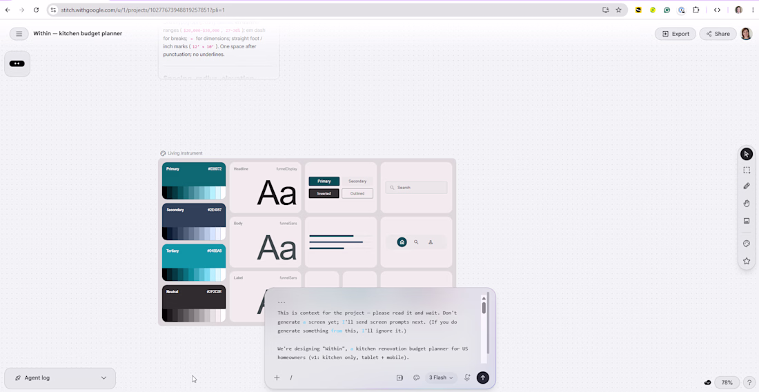
I started by importing our design doc as a Markdown file, and Stitch built a whole design system from it, which it auto-named “Living Instrument.” It read the color roles, the Funnel Display / Funnel Sans pairing, the 4px spacing scale, the radii and shadows, and wrote an accurate one-line brand summary. The custom Google Fonts survived the import, which surprised me, since Funnel isn’t in Stitch’s built-in picker.
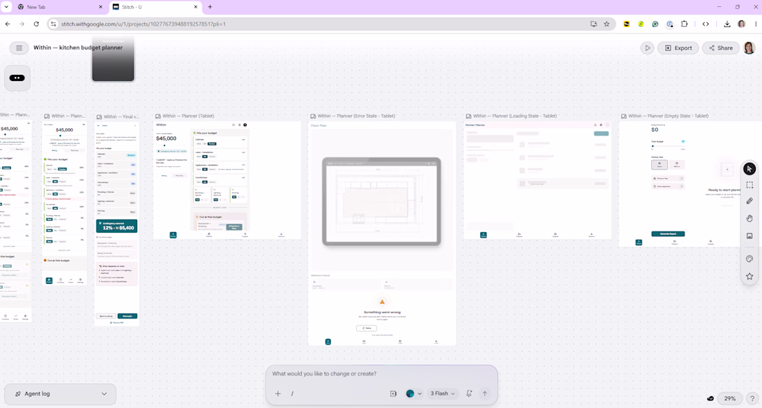
Then the screens. The Planner is the heart of the product, so I generated it with streaming on and watched it build live on the canvas. I used multi-screen generation for the Entry and Review screens, added a separate tablet device at 834px so that layout was designed for the size rather than stretched into it, and used in-place edits for the close work: a tier toggle came back as a flat text label, and one point-and-click edit turned it into a proper segmented control without re-rolling the screen. I also prototyped the signature motion right on Stitch’s native canvas: the hover lifts, the count-up, and the fits-to-cut crossing. Five features doing real work: design-system import, streaming generation, multi-screen generation, in-place edits, and native-canvas motion.
Worth being honest about why this went well, because it’s the actual reason and not luck: the prep did the work. I came in with a finished PRD and a contrast-verified design system built first, and I’d researched how Stitch behaves and what gets the best out of it, so the prompts were deliberate. Finalized copy handed over with a “don’t change the text” guard, each screen described against the real system rather than typed into a blank page. Stitch generated against something solid, the drift between its draft and the shipped result was small, and the result held up: axe-core reported 0 WCAG 2.1 A/AA violations across nine rendered states, on both mobile (390px) and tablet.
Honest Stitch feedback
Not everything was frictionless, and I logged it because honest feedback is part of the brief. A Material theme layer kept fighting our intent: it tinted our pure-white canvas with a warm off-white (#fef8f9), swapped a few exact tokens for Material roles, and collapsed our 8 / 12 / 16px radius scale to a single value. Despite a “use exact text” instruction it added boilerplate I had to remove, including a relabeled total (“TOTAL INVESTMENT,” which quietly undercuts the no-fake-total framing) and a stock kitchen photo labeled “Typical Layout Reference,” which contradicts a product non-goal, since Within deliberately doesn’t do layouts. A few accessibility defaults needed a pass too: sub-AA gray text, user-scalable=no, and labels not tied to their inputs. None of it was hard to fix; it just meant a short verification pass after each generation. For this project that division of labor is exactly right.
Workflow & tech
PRD first, then the visual in Stitch, then finished in code: Vite 6, React 18, TypeScript, Tailwind v4, Framer Motion (motion/react), shipped static through GitHub → Vercel (auto-deploys on push to main). The boundary is deliberate. Stitch owns the look: the design system, the layouts, and a motion proof-of-concept on its canvas. Code owns the logic: the relative-allocation engine, the live recalculation, real responsive breakpoints (Stitch frames are fixed devices; the shipped product is fluid), and full state encoded in the URL, so a plan is shareable with a link, no account and no backend. Accessibility was a baseline, not a final polish pass: status is never carried by color alone (an icon, a label, and position relative to the fits line all carry it), the slider and the disclosure cards are fully keyboard-operable with the right ARIA roles, and accent colors are used as fills with dark text on them, never as small colored text on white.
Every time I look at this I notice something new to appreciate.
The network for creativity
Join 1.25M professional creatives like you
Connect with clients, get discovered, and run your business 100% commission-free
Creatives on Contra have earned over $150M and we are just getting started
Related posts
🚀 Project is now live!
Excited to share the redesigned website for IA Design an architecture and interior design consultancy focused on creating exceptional workplace and commercial environments.
The goal was to modernize the digital experience while reflecting the sophistication, creativity, and professionalism of the brand. From information architecture and user flows to high-fidelity UI design, every element was crafted to showcase their work through a clean, premium, and visually engaging experience.
A rewarding project that challenged me to balance aesthetics, storytelling, and usability while staying true to the brand's architectural identity.
Take a look and let me know what you think ❤️https://www.behance.net/gallery/250934799/IA-Design-Experience-Redesign
This deserve more than just liking
Building the best personal project I’ve ever made, from start to finish.
Step 1 — The Hook
No client, no meetings, no deadlines.
Just a blank canvas and one question:
What happens when I build something with zero compromise?
Over the next steps, I’ll document everything:
Strategy, Branding, Design, Development, and launch.
If you were starting from zero today, what would be the first thing you’d do?
Comment below with your answer.
Like this post and follow to keep up with the project.
Amazing design 😍, very outstanding and professional
CommonZone: Transform vacant commercial buildings into vibrant, affordable communities with an interactive platform that visualizes potential renovations and engages users.
The US is short more than 4 million homes, while empty malls and offices sit idle across the country. The space already exists. We just tear it down instead of rethinking it.
Pick a real vacant building, like Lakeside Mall or the Free Press building, design a community on its actual footprint, and watch the impact add up live: homes, jobs, emissions cut, cost.
Upload your own building and an AI render engine I built in Figma Weave reimagines it: green roofs, solar, community space.
Built in Figma Make, with a Supabase backend, an MCP-generated design system, and a Weave render pipeline. It took real iteration (Version 60).
Turning vacant into vital.
Made for the @contra x @figma Makeathon #ConfigMakeathon #FigmaMakeathon
Community (Supabase disconnected): https://www.figma.com/community/file/1648327485457067784
Trending
Claude
Claude has entered the design space. How are you using Claude Design?
Contra University
Learn from expert creatives how to earn more using next-gen AI tools.
MagicPath
The canvas is infinite, and exploration is becoming the workflow. How are you using MagicPath?
creativeaiflow
Creative AI workflows are evolving. What tools do you use, and what are their strengths and weaknesses?
freelancerlife
Freelancer life is wins, pivots, and everything in between. What’s yours right now?