The network for creativity
Join 1.25M professional creatives like you
Connect with clients, get discovered, and run your business 100% commission-free
Creatives on Contra have earned over $150M and we are just getting started
Back to feedPost

I helped a SaaS client go from 0.3% to 3.9% conversion without changing their product.
I fixed the homepage.
Most SaaS homepages fail at one thing: clarity.
Visitors land and can't immediately tell what the product does, who it's for, or what to do next.
In this video, I break down the exact homepage structure I use with my clients:
→ A headline that communicates who, what, and the benefit in one line
→ One focused CTA because more options = more friction
→ Copy and layout that builds trust fast
If your SaaS homepage isn't converting, the problem usually isn't your product it's your first impression.
I'm available for SaaS website design and UX audits. Let's work together.
The network for creativity
Join 1.25M professional creatives like you
Connect with clients, get discovered, and run your business 100% commission-free
Creatives on Contra have earned over $150M and we are just getting started







Related posts

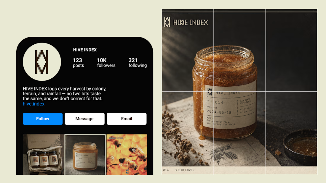
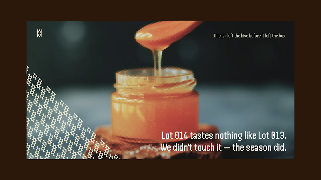
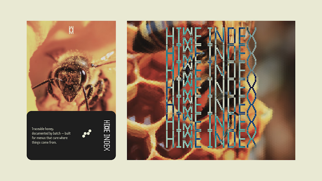
Most honey brands hide how much a jar changes harvest to harvest. I built HIVE INDEX to document it instead: specimen numbers, harvest dates, tasting notes logged like lab evidence, not marketing copy.
Case study's up.



Nice work, Miguel!!

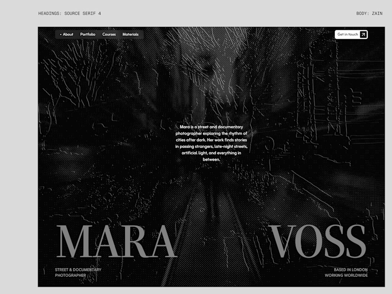
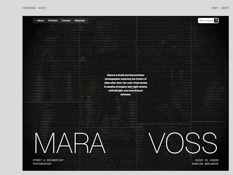
I tried experimenting a little with my previous design. I changed the fonts and background a bit. Which version do you like better?
22 voted
73%
8 voted
27%
30 votes
Closed

New design for sure. The distressed texture in the type makes it feel like actual street photography lives inside the letters. The previous version is clean but this one has grit.