The network for creativity
Join 1.25M professional creatives like you
Connect with clients, get discovered, and run your business 100% commission-free
Creatives on Contra have earned over $150M and we are just getting started
Back to feedPost

What happens when Neoclassical design meets Apple Vision Pro?
A concept exploring the intersection of classical art and spatial vision.
The idea was to reimagine what Apple's website might feel like if it had been designed in the 1990s. borrowing timeless editorial aesthetics while embracing the future of immersive technology.
A study in contrast:
Ancient × Modern
Marble × Glass
Heritage × Innovation
Vision-Odyva — imagining.


The network for creativity
Join 1.25M professional creatives like you
Connect with clients, get discovered, and run your business 100% commission-free
Creatives on Contra have earned over $150M and we are just getting started



Related posts

These designs were made by the AI in my upcoming design tool for designers.
I don't know which is better, help me decide.
For those wondering where the remaining designs are, I'll drop it in my next post.
2 voted
40%
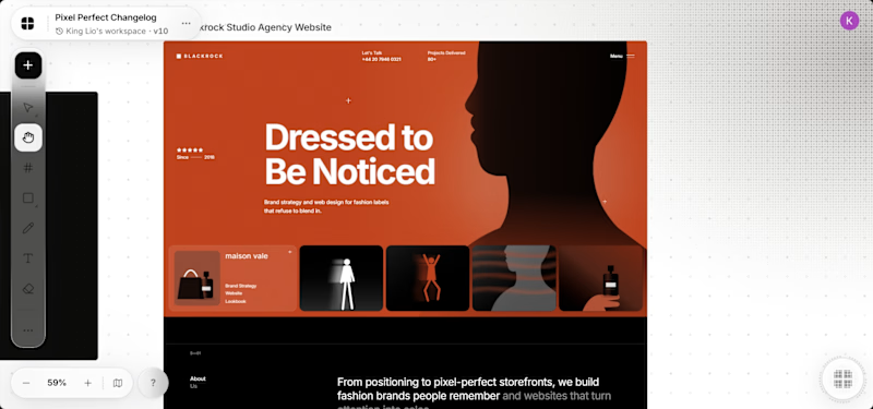
3 voted
60%
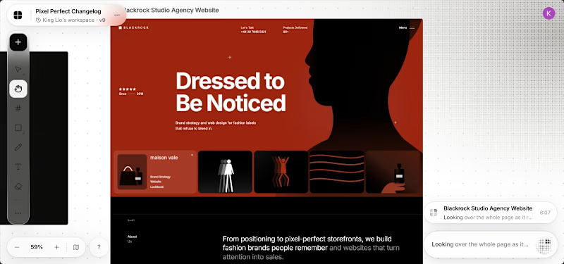
5 votes
Closed

It's the red one for me... Passed the message a lot better than the Orange




Looks 100% real


Which homepage would make you more likely to explore the platform?
HackStack features bold typography, teal gradients, and a centered layout focused on AI tools and automation. DataVistaHQ uses purple accents, a split layout, and a prominent dashboard preview to introduce its business intelligence platform.
I would like your perspective on the visual design, clarity, and first impression. Which approach communicates its value more effectively and makes you want to take the next step?
Vote for your preferred design and share what influenced your choice: the colors, headline, layout, dashboard preview, or overall presentation.
#WebDesign #AIWebsites #UIUXDesign #SaaSDesign #TransformedDesign


2 voted
17%

10 voted
83%

12 votes
Closed

Visually, I lean toward DataVistaHQ, but the cognitive load is really high. The value proposition and the stats feel like they're competing for attention.
On the other hand, HackStack has a much better visual hierarchy. The value proposition and CTA group immediately give me a...