
E-commerce Website Development with a Competitive EdgeRomzanul I Sabbir

Greetings Welcome to my eCommerce website solution!
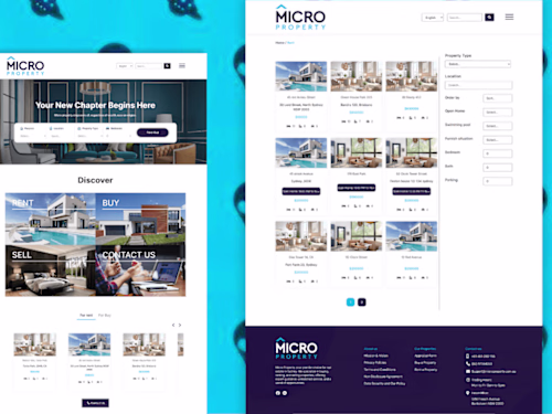
If you need a robust and responsive WordPress website that is seamlessly integrated with WooCommerce, the leading e-commerce solution, then you have landed on the right page! I am here to assist you in creating a visually appealing online business that will attract more customers and boost your sales.
**What You'll Get:**
Fully Responsive and Dynamic eCommerce Website
Responsive, Aesthetic Design & user friendly for all devices
SEO optimization for better search engine visibility
Speed and Performance Optimization
Website Security enhancement
Add all necessary e-commerce functionality
Setup Different Shipping Methods as per requirement
Add attractive elements like pop-ups for offers discounts and coupons to boost sales.
Secure Payment Integration with different payment methods
Live chat feature for customer support
Order Tracking system and easy customer management
>> Figma/Adobe XD to eCommerce Website <<
Ready to take your online presence to the next level? Let's talk! Contact me for a personalized consultation and let's create a winning strategy together.
All the services that I mentioned on this services will apply to the Shopify website. If you want to build your webshop with Shopify
What's included
Fully Responsive and Dynamic eCommerce Website
a fully responsive and dynamic eCommerce website ensures seamless device usability while providing real-time information and interactive features. It helps customers to find their needs easily and it will satisfy customers with a good browsing experience.
Responsive, Aesthetic Design & user friendly for all devices
A responsive WordPress website adjusts its design to fit different devices and screen sizes, providing a consistent user experience. It ensures a consistent and user-friendly experience, whether viewed on a desktop, tablet, or mobile device, by automatically adapting to different screen dimensions.
Add all necessary e-commerce functionality
adding all essential functionality that will help to grab visitors into customers.
Different payment methods as per requarment
adding different and secure payment methods to your e-commerce website.
Setup Different Shipping Methods as per requirement.
That helps to grab more customers on your web store.
Add attractive elements like to boost sales.
like pop-ups for offers discounts and coupons many more
Live chat feature for customer support
It's essential to early respond and help customers find their needs.
Order Tracking system and easy customer management
.
FAQs
Example work
Romzanul I's other services

Starting at$199
Duration6 days
Tags
Elementor
Figma
Shopify
WooCommerce
WordPress
Framer Shopify Developer
Web Designer
Web Developer
Service provided by
Romzanul I Sabbir Dhaka, Bangladesh
- 4
- Followers
E-commerce Website Development with a Competitive EdgeRomzanul I Sabbir
Starting at$199
Duration6 days
Tags
Elementor
Figma
Shopify
WooCommerce
WordPress
Framer Shopify Developer
Web Designer
Web Developer
Greetings Welcome to my eCommerce website solution!
If you need a robust and responsive WordPress website that is seamlessly integrated with WooCommerce, the leading e-commerce solution, then you have landed on the right page! I am here to assist you in creating a visually appealing online business that will attract more customers and boost your sales.
**What You'll Get:**
Fully Responsive and Dynamic eCommerce Website
Responsive, Aesthetic Design & user friendly for all devices
SEO optimization for better search engine visibility
Speed and Performance Optimization
Website Security enhancement
Add all necessary e-commerce functionality
Setup Different Shipping Methods as per requirement
Add attractive elements like pop-ups for offers discounts and coupons to boost sales.
Secure Payment Integration with different payment methods
Live chat feature for customer support
Order Tracking system and easy customer management
>> Figma/Adobe XD to eCommerce Website <<
Ready to take your online presence to the next level? Let's talk! Contact me for a personalized consultation and let's create a winning strategy together.
All the services that I mentioned on this services will apply to the Shopify website. If you want to build your webshop with Shopify
What's included
Fully Responsive and Dynamic eCommerce Website
a fully responsive and dynamic eCommerce website ensures seamless device usability while providing real-time information and interactive features. It helps customers to find their needs easily and it will satisfy customers with a good browsing experience.
Responsive, Aesthetic Design & user friendly for all devices
A responsive WordPress website adjusts its design to fit different devices and screen sizes, providing a consistent user experience. It ensures a consistent and user-friendly experience, whether viewed on a desktop, tablet, or mobile device, by automatically adapting to different screen dimensions.
Add all necessary e-commerce functionality
adding all essential functionality that will help to grab visitors into customers.
Different payment methods as per requarment
adding different and secure payment methods to your e-commerce website.
Setup Different Shipping Methods as per requirement.
That helps to grab more customers on your web store.
Add attractive elements like to boost sales.
like pop-ups for offers discounts and coupons many more
Live chat feature for customer support
It's essential to early respond and help customers find their needs.
Order Tracking system and easy customer management
.
FAQs
Example work
Romzanul I's other services
$199