
Full Web App UX/UI Design – Clean, Scalable, and Dev-Readykingsley ezechukwu
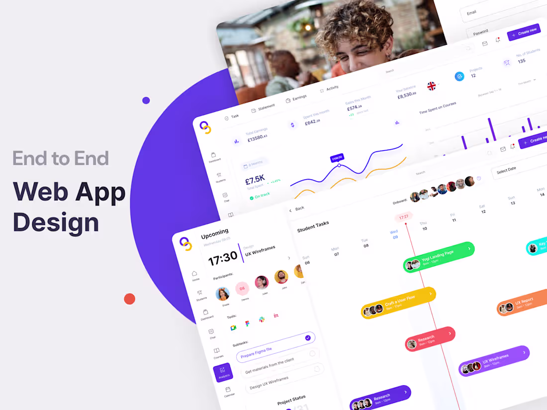
I offer end-to-end web app design from initial user flows and wireframes to high-fidelity, responsive UI designs that are ready for development. What makes me unique is my ability to balance clean, modern design with usability and business goals, while working closely with product and engineering teams to deliver solutions that are both beautiful and practical.
What's included
Deliverables – End-to-End Web App Design
User Flow Maps – Structured user journeys tailored to key actions
Low-Fidelity Wireframes – Layout concepts for validating structure and flow
High-Fidelity UI Screens – Fully designed, responsive desktop and mobile screens in Figma
Interactive Prototypes – Clickable mockups for stakeholder demos and usability testing
Component Library – Reusable UI elements for consistency and scalability
Design Documentation – Clear specs for developers: spacing, colors, typography, interactions
Responsive Layouts – Designs optimized for different screen sizes and breakpoints
Organized Figma File – Developer-friendly files ready for smooth handoff
kingsley's other services
Starting at$15,000 /mo
Tags
Adobe Photoshop
Figma
Hotjar
Miro
Slack
UX Designer
UX Engineer
Service provided by
kingsley ezechukwu Toronto, Canada
- 2
- Followers
Full Web App UX/UI Design – Clean, Scalable, and Dev-Readykingsley ezechukwu
Starting at$15,000 /mo
Tags
Adobe Photoshop
Figma
Hotjar
Miro
Slack
UX Designer
UX Engineer
I offer end-to-end web app design from initial user flows and wireframes to high-fidelity, responsive UI designs that are ready for development. What makes me unique is my ability to balance clean, modern design with usability and business goals, while working closely with product and engineering teams to deliver solutions that are both beautiful and practical.
What's included
Deliverables – End-to-End Web App Design
User Flow Maps – Structured user journeys tailored to key actions
Low-Fidelity Wireframes – Layout concepts for validating structure and flow
High-Fidelity UI Screens – Fully designed, responsive desktop and mobile screens in Figma
Interactive Prototypes – Clickable mockups for stakeholder demos and usability testing
Component Library – Reusable UI elements for consistency and scalability
Design Documentation – Clear specs for developers: spacing, colors, typography, interactions
Responsive Layouts – Designs optimized for different screen sizes and breakpoints
Organized Figma File – Developer-friendly files ready for smooth handoff
kingsley's other services
$15,000 /mo