
Let's create stunning websites and get real results.Ronak Shukla
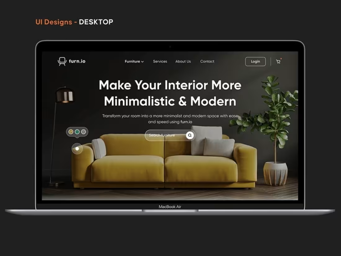
Offering a Website Design & Development Service:
Client-focused, customer-centric, creating website solutions that deliver tangible business results, I help brands navigate the ever-changing digital landscape.
What's included
Design Phase:
UI Style Guide / Design System:
A comprehensive document detailing all reusable UI components (buttons, forms, navigation), visual styles (colors, fonts), iconography, and design principles to ensure consistency.
Wireframes (Low to Mid-Fidelity):
Basic, grayscale layouts of key website pages, focusing on content placement, structural hierarchy, and functional elements. Often provided for desktop, tablet, and mobile views.
Prototypes (Mid to High-Fidelity):
Interactive versions of the wireframes or mockups, allowing clients to click through the site and experience the flow and basic interactions.
Mockups (High-Fidelity Designs): Static, pixel-perfect visual designs of key website pages, showing all colors, typography, imagery, and branding elements. Typically provided for desktop, tablet, and mobile views.
Figma File: Ownership of the Figma file.
Development Phase
HTML/CSS/JavaScript Files:
The actual code files that form the structure, styling, and interactivity of the website.
Website Templates / Themes: (If using a CMS like WordPress)
Custom-built or customized templates for various page types.
Content Management System (CMS) Setup:
Installation and configuration of the chosen CMS (e.g., WordPress, Webflow).
Database Setup:
Configuration of the database to store website content and user information.
Backend Functionality:
Code for server-side operations, integrations with third-party services, forms, etc.
Responsive Design Implementation:
Ensuring the website adapts seamlessly to different screen sizes (desktop, tablet, mobile).
Cross-Browser Compatibility:
Ensuring the website functions correctly across major web browsers.
Integrations:
Connecting the website with other tools like analytics, CRM, email marketing, payment gateways, etc.
Contact for pricing
Tags
Adobe XD

Elementor

Figma

Sketch

Webflow

Frontend Engineer
UX Designer
Web Developer
Service provided by
Ronak Shukla Surat, India
Let's create stunning websites and get real results.Ronak Shukla
Contact for pricing
Tags
Adobe XD
Elementor
Figma
Sketch
Webflow
Frontend Engineer
UX Designer
Web Developer
Offering a Website Design & Development Service:
Client-focused, customer-centric, creating website solutions that deliver tangible business results, I help brands navigate the ever-changing digital landscape.
What's included
Design Phase:
UI Style Guide / Design System:
A comprehensive document detailing all reusable UI components (buttons, forms, navigation), visual styles (colors, fonts), iconography, and design principles to ensure consistency.
Wireframes (Low to Mid-Fidelity):
Basic, grayscale layouts of key website pages, focusing on content placement, structural hierarchy, and functional elements. Often provided for desktop, tablet, and mobile views.
Prototypes (Mid to High-Fidelity):
Interactive versions of the wireframes or mockups, allowing clients to click through the site and experience the flow and basic interactions.
Mockups (High-Fidelity Designs): Static, pixel-perfect visual designs of key website pages, showing all colors, typography, imagery, and branding elements. Typically provided for desktop, tablet, and mobile views.
Figma File: Ownership of the Figma file.
Development Phase
HTML/CSS/JavaScript Files:
The actual code files that form the structure, styling, and interactivity of the website.
Website Templates / Themes: (If using a CMS like WordPress)
Custom-built or customized templates for various page types.
Content Management System (CMS) Setup:
Installation and configuration of the chosen CMS (e.g., WordPress, Webflow).
Database Setup:
Configuration of the database to store website content and user information.
Backend Functionality:
Code for server-side operations, integrations with third-party services, forms, etc.
Responsive Design Implementation:
Ensuring the website adapts seamlessly to different screen sizes (desktop, tablet, mobile).
Cross-Browser Compatibility:
Ensuring the website functions correctly across major web browsers.
Integrations:
Connecting the website with other tools like analytics, CRM, email marketing, payment gateways, etc.
Contact for pricing