
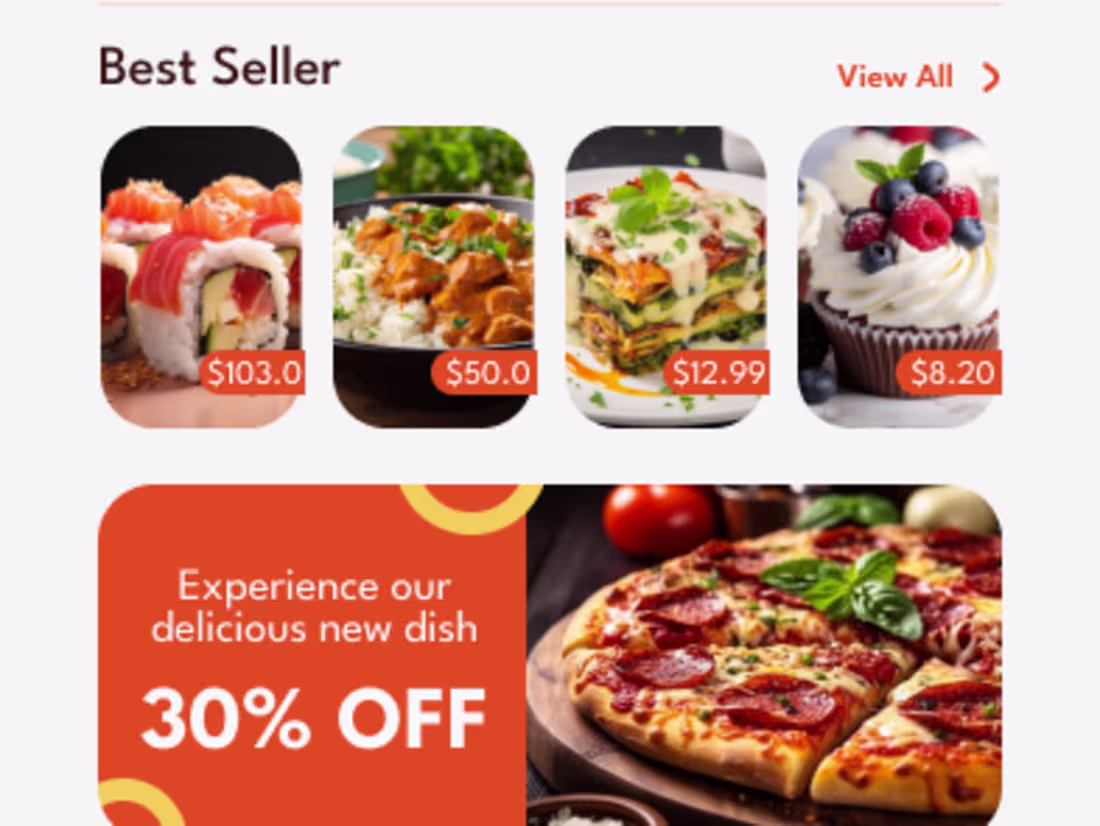
YUM QUICK, Food Delivery Mobile App DesignMuhammad Hamza Zahid
Responsive layouts ensure your app or website looks and works perfectly on any device, from mobiles to desktops.
They provide a smooth, consistent user experience and easy navigation everywhere.
This approach maximizes reach and user satisfaction without compromising design quality.
What's included
Responsive layouts for various mobile devices
Responsive layouts ensure that your app or website automatically adapts and looks excellent on any device, whether it’s a smartphone, tablet, or desktop. Designs are optimized for different screen sizes and orientations, so users get a smooth, consistent experience no matter where they access the platform.
Responsive Layouts That Feel Effortless
This includes scalable grids, flexible images, and touch-friendly elements, making navigation and interaction effortless. Responsive layouts boost usability, increase engagement, and help your brand reach more users without sacrificing quality or performance.
Muhammad Hamza's other services
Contact for pricing
Tags
Adobe XD
Figma
FlutterFlow
UX Designer
Web Developer
Service provided by
Muhammad Hamza Zahid maxDubai - United Arab Emirates
- $50k+
- Earned
- 17
- Paid projects
- 5.00
- Rating
- 135
- Followers
YUM QUICK, Food Delivery Mobile App DesignMuhammad Hamza Zahid
Responsive layouts ensure your app or website looks and works perfectly on any device, from mobiles to desktops.
They provide a smooth, consistent user experience and easy navigation everywhere.
This approach maximizes reach and user satisfaction without compromising design quality.
What's included
Responsive layouts for various mobile devices
Responsive layouts ensure that your app or website automatically adapts and looks excellent on any device, whether it’s a smartphone, tablet, or desktop. Designs are optimized for different screen sizes and orientations, so users get a smooth, consistent experience no matter where they access the platform.
Responsive Layouts That Feel Effortless
This includes scalable grids, flexible images, and touch-friendly elements, making navigation and interaction effortless. Responsive layouts boost usability, increase engagement, and help your brand reach more users without sacrificing quality or performance.
Muhammad Hamza's other services
Contact for pricing