
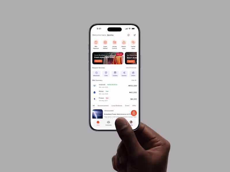
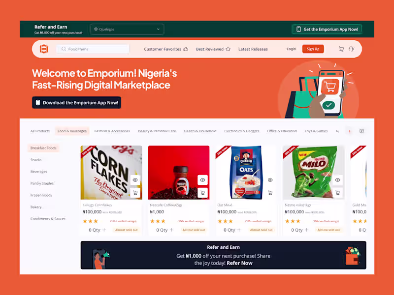
Elevate Your Brand with Expert UI/UX DesignIjeoma Obi
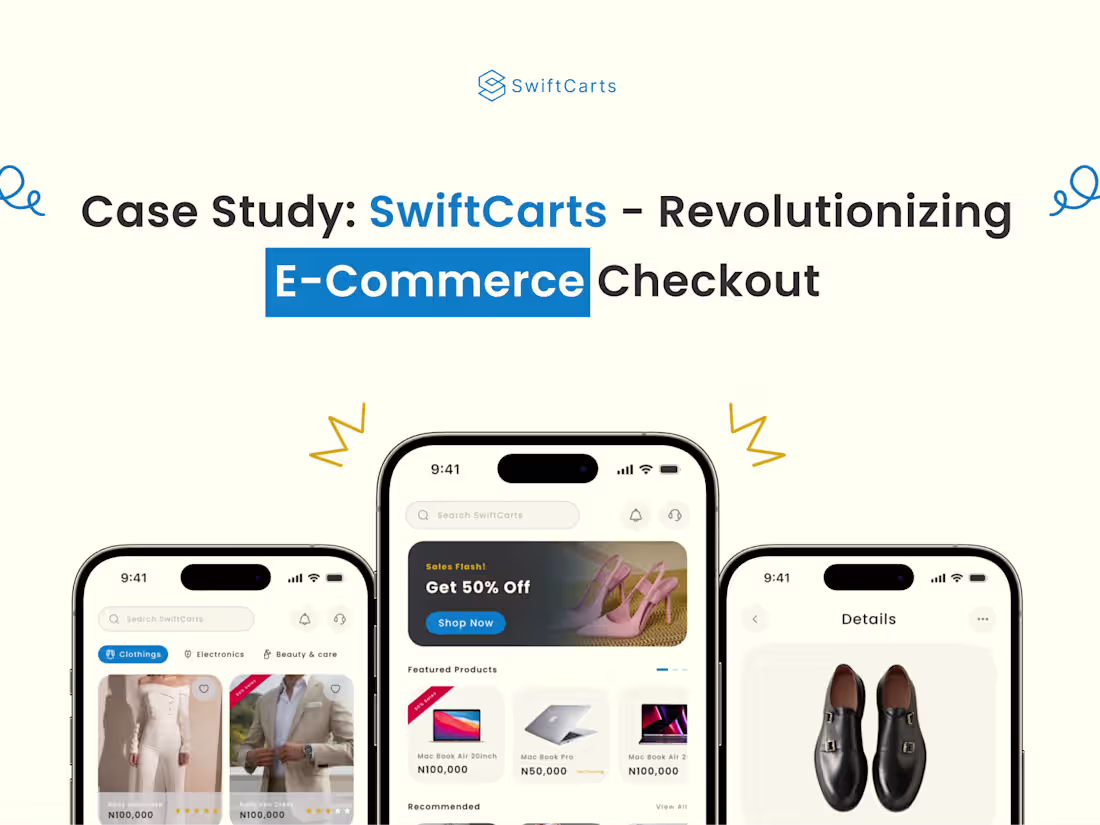
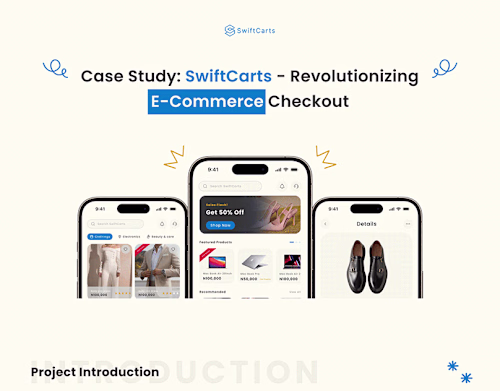
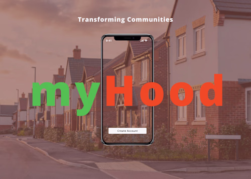
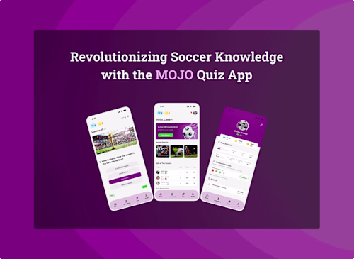
I’m offering Dynamic App Design: UI/UX Meets Vector Art & Motion, where I create intuitive, visually stunning app interfaces with custom vector illustrations and engaging motion graphics using tools like Figma and Illustrator. What sets me apart is my ability to blend user-centric design with playful, scalable vectors (like my standout watermelon illustration) and smooth animations, delivering a unique and memorable user experience. My portfolio showcases this expertise, making me a creative partner for innovative app projects in 2025.
What's included
Dynamic App Design: UI/UX Meets Vector Art & Motion
Wireframes and User Flow
Low-fidelity wireframes (e.g., grayscale sketches in Figma) for key screens (e.g., login, dashboard, workout tracker).
A user flow diagram mapping the navigation path from onboarding to core features.
High-Fidelity UI Mockups
Detailed design files (e.g., Figma or Adobe XD) for all app screens, optimized for target devices (e.g., 1320 x 3036px for iPhone 6.9-inch, 2048 x 2732px for iPad 12.9-inch).
Responsive layouts for portrait and landscape orientations.
Custom Vector Assets
A set of original vector illustrations (e.g., fitness icons like heart, steps, or a custom character) in SVG and PNG formats, scalable for UI and marketing.
Source files (e.g., Adobe Illustrator .ai) for client edits.
Animated Prototypes
Interactive prototype with motion graphics (e.g., button hover animations, transition effects) exported as a clickable file (e.g., Figma prototype) or video demo.
Micro-interactions (200-500ms) for enhanced user engagement (e.g., animated progress bars).
Design System
A comprehensive style guide including color palette (e.g., your purple-yellow scheme), typography (e.g., font sizes, weights), and component library (e.g., buttons, cards).
Reusable UI components in exportable formats (e.g., SVG, Sketch).
App Store-Ready Assets
Screenshots designed for App Store (1320 x 3036px for iPhone, 2048 x 2732px for iPad) and Google Play (1080 x 1920px for phones), showcasing key features.
A feature graphic (1024 x 500px) for Google Play prominence.
Developer Handover Documentation
A detailed spec sheet with layer names, export settings, and animation timings for developers.
A case study document outlining the design process (problem, research, iterations, solution).
FAQs
Example work
Starting at$550
Duration6 weeks
Tags
Adobe XD
Figma
Sketch
Webflow
Illustrator
UI Designer
UX Designer
Service provided by
Ijeoma Obi Lagos, Nigeria
- 5.00
- Rating
- 26
- Followers
Elevate Your Brand with Expert UI/UX DesignIjeoma Obi
Starting at$550
Duration6 weeks
Tags
Adobe XD
Figma
Sketch
Webflow
Illustrator
UI Designer
UX Designer
I’m offering Dynamic App Design: UI/UX Meets Vector Art & Motion, where I create intuitive, visually stunning app interfaces with custom vector illustrations and engaging motion graphics using tools like Figma and Illustrator. What sets me apart is my ability to blend user-centric design with playful, scalable vectors (like my standout watermelon illustration) and smooth animations, delivering a unique and memorable user experience. My portfolio showcases this expertise, making me a creative partner for innovative app projects in 2025.
What's included
Dynamic App Design: UI/UX Meets Vector Art & Motion
Wireframes and User Flow
Low-fidelity wireframes (e.g., grayscale sketches in Figma) for key screens (e.g., login, dashboard, workout tracker).
A user flow diagram mapping the navigation path from onboarding to core features.
High-Fidelity UI Mockups
Detailed design files (e.g., Figma or Adobe XD) for all app screens, optimized for target devices (e.g., 1320 x 3036px for iPhone 6.9-inch, 2048 x 2732px for iPad 12.9-inch).
Responsive layouts for portrait and landscape orientations.
Custom Vector Assets
A set of original vector illustrations (e.g., fitness icons like heart, steps, or a custom character) in SVG and PNG formats, scalable for UI and marketing.
Source files (e.g., Adobe Illustrator .ai) for client edits.
Animated Prototypes
Interactive prototype with motion graphics (e.g., button hover animations, transition effects) exported as a clickable file (e.g., Figma prototype) or video demo.
Micro-interactions (200-500ms) for enhanced user engagement (e.g., animated progress bars).
Design System
A comprehensive style guide including color palette (e.g., your purple-yellow scheme), typography (e.g., font sizes, weights), and component library (e.g., buttons, cards).
Reusable UI components in exportable formats (e.g., SVG, Sketch).
App Store-Ready Assets
Screenshots designed for App Store (1320 x 3036px for iPhone, 2048 x 2732px for iPad) and Google Play (1080 x 1920px for phones), showcasing key features.
A feature graphic (1024 x 500px) for Google Play prominence.
Developer Handover Documentation
A detailed spec sheet with layer names, export settings, and animation timings for developers.
A case study document outlining the design process (problem, research, iterations, solution).
FAQs
Example work
$550