
Figma | Design System UI Kit creationTheresa Lau
I create comprehensive Figma design systems featuring reusable components, complete typography and color frameworks, and developer-ready documentation that eliminates design inconsistencies across your product. You’ll receive a fully documented, implementation-ready design system that serves as a single source of truth for all your digital products.
What's included
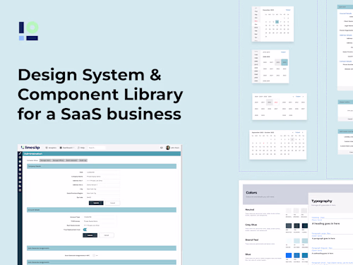
Complete Component Library
An organized and comprehensive Figma file featuring reusable UI components consisting of buttons, forms, cards, navigation elements, and modals built with variants, auto-layout, and component properties for maximum flexibility and scalability.
Typography & Color System
Text style hierarchy and semantic color palette with defined tokens, all aligned with the brand identity to ensure a consistent visual language across products and platforms.
Spacing & Layout Framework
A standardized grid system and spacing tokens that ensure visual harmony and consistency across all screens (desktop and mobile), enabling designers to build layouts efficiently and maintain a cohesive structure.
Icon & Asset Library
A curated library of custom icons and visual assets, designed with consistent styling, clear naming conventions, and export-ready formats for seamless implementation across digital products.
FAQs
Example work
Theresa's other services
Starting at$3,000
Duration4 weeks
Tags
Figma
Design Systems Specialist
Service provided by
Theresa Lau proAlicante, Spain
- 16
- Followers
Figma | Design System UI Kit creationTheresa Lau
I create comprehensive Figma design systems featuring reusable components, complete typography and color frameworks, and developer-ready documentation that eliminates design inconsistencies across your product. You’ll receive a fully documented, implementation-ready design system that serves as a single source of truth for all your digital products.
What's included
Complete Component Library
An organized and comprehensive Figma file featuring reusable UI components consisting of buttons, forms, cards, navigation elements, and modals built with variants, auto-layout, and component properties for maximum flexibility and scalability.
Typography & Color System
Text style hierarchy and semantic color palette with defined tokens, all aligned with the brand identity to ensure a consistent visual language across products and platforms.
Spacing & Layout Framework
A standardized grid system and spacing tokens that ensure visual harmony and consistency across all screens (desktop and mobile), enabling designers to build layouts efficiently and maintain a cohesive structure.
Icon & Asset Library
A curated library of custom icons and visual assets, designed with consistent styling, clear naming conventions, and export-ready formats for seamless implementation across digital products.
FAQs
Example work
Theresa's other services
$3,000