
Complete Mobile App Design Package10am Space
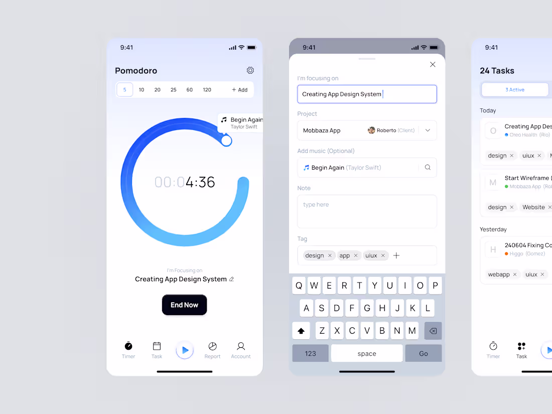
We design complete, high-quality mobile apps from wireframes to final visuals — ready for development.
Our process focuses on clean UX, strong visual identity, and consistent component systems to make every screen intuitive and delightful.
We don’t just design apps — we help shape digital products that people actually enjoy using.
What's included
1. App Flow & Wireframes
Low-fidelity wireframes to define navigation flow, content layout, and core user experience.
Includes: Up to 5 key modules + 1 revision.
Format: Figma.
2. High-Fidelity UI Design
Pixel-perfect visual design for all screens, based on approved wireframes.
Includes: Up to 25 screens + 2 revisions.
Format: Figma file with organized components.
3. Design System & Components
Reusable styles, typography, colors, and UI components for a consistent experience.
Includes: Buttons, forms, modals, icons, and color guide.
Format: Figma shared library.
4. Interaction & Prototype
Clickable Figma prototype to visualize app flow and transitions.
Includes: Basic motion and screen-to-screen animations.
Format: Interactive Figma prototype.
5. Handoff & Support
Final organized design files ready for developer handoff.
Includes: Figma link, annotations, and 1 post-handoff support session
FAQs
10am's other services
Starting at$3,250
Duration4 weeks
Tags
FigJam
Figma
Design Systems Specialist
Mobile Designer
User Researcher
Service provided by
10am Space proSouth Jakarta, Indonesia
- $5k+
- Earned
- 3
- Paid projects
- 5.00
- Rating
- 76
- Followers
Complete Mobile App Design Package10am Space
Starting at$3,250
Duration4 weeks
Tags
FigJam
Figma
Design Systems Specialist
Mobile Designer
User Researcher
We design complete, high-quality mobile apps from wireframes to final visuals — ready for development.
Our process focuses on clean UX, strong visual identity, and consistent component systems to make every screen intuitive and delightful.
We don’t just design apps — we help shape digital products that people actually enjoy using.
What's included
1. App Flow & Wireframes
Low-fidelity wireframes to define navigation flow, content layout, and core user experience.
Includes: Up to 5 key modules + 1 revision.
Format: Figma.
2. High-Fidelity UI Design
Pixel-perfect visual design for all screens, based on approved wireframes.
Includes: Up to 25 screens + 2 revisions.
Format: Figma file with organized components.
3. Design System & Components
Reusable styles, typography, colors, and UI components for a consistent experience.
Includes: Buttons, forms, modals, icons, and color guide.
Format: Figma shared library.
4. Interaction & Prototype
Clickable Figma prototype to visualize app flow and transitions.
Includes: Basic motion and screen-to-screen animations.
Format: Interactive Figma prototype.
5. Handoff & Support
Final organized design files ready for developer handoff.
Includes: Figma link, annotations, and 1 post-handoff support session
FAQs
10am's other services
$3,250