
Website Design and DevelopmentVasil Hodzhev
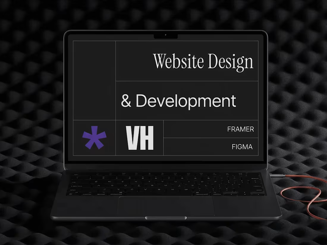
A complete website built with Framer that brings your brand online beautifully and functionally. We figure out what your site needs to accomplish, design something that works smoothly, and launch it ready to go with support along the way.
What's included
Strategy & Planning
This sets the foundation for everything else. The content strategy and sitemap shows all pages and their purpose in a visual document that makes your site structure clear. User journey maps for key conversion or engagement paths show flowcharts that illustrate how visitors move through your site and where the important decision points are.
Design
Responsive design mockups show your site on desktop, tablet, and mobile so you can see how it adapts to different screens. All key pages are designed across all breakpoints. Interaction and animation specifications are documented so you know what should happen when visitors interact with the site. The component library includes buttons, forms, cards, navigation, and other reusable elements that are set up for consistency across the whole site.
A brand application guide shows exactly how your brand guidelines translate to the website—where to use your colors, how to apply typography, what kind of imagery fits, and all those details that keep it cohesive.
Development
The fully functional Framer website is built from your approved designs with responsive layouts and interactive animations. CMS integration is included if you need it for a blog or content that updates regularly. Functional contact forms are set up with email delivery and confirmation flows so they actually work and send information where it needs to go.
Mobile optimisation ensures the site works smoothly on phones, tablets, and desktop screens.
Content & SEO
Professional copywriting is provided for all pages aligned to your brand voice. Everything is written and refined to actually convert visitors. SEO optimisation includes meta titles, descriptions, header tags, and structured data markup so search engines understand your site. All images are optimised and include alt text for both users and search engines. Open Graph tags and social media preview optimisation are set up so your content looks good when shared on social platforms.
FAQs
Vasil's other services
Starting at$6,000
Duration5 weeks
Tags
Figma
Figma Make
Framer
Shopify
Framer Developer
UI Designer
UX Designer
Service provided by
Vasil Hodzhev Sofia, Bulgaria
Website Design and DevelopmentVasil Hodzhev
Starting at$6,000
Duration5 weeks
Tags
Figma
Figma Make
Framer
Shopify
Framer Developer
UI Designer
UX Designer
A complete website built with Framer that brings your brand online beautifully and functionally. We figure out what your site needs to accomplish, design something that works smoothly, and launch it ready to go with support along the way.
What's included
Strategy & Planning
This sets the foundation for everything else. The content strategy and sitemap shows all pages and their purpose in a visual document that makes your site structure clear. User journey maps for key conversion or engagement paths show flowcharts that illustrate how visitors move through your site and where the important decision points are.
Design
Responsive design mockups show your site on desktop, tablet, and mobile so you can see how it adapts to different screens. All key pages are designed across all breakpoints. Interaction and animation specifications are documented so you know what should happen when visitors interact with the site. The component library includes buttons, forms, cards, navigation, and other reusable elements that are set up for consistency across the whole site.
A brand application guide shows exactly how your brand guidelines translate to the website—where to use your colors, how to apply typography, what kind of imagery fits, and all those details that keep it cohesive.
Development
The fully functional Framer website is built from your approved designs with responsive layouts and interactive animations. CMS integration is included if you need it for a blog or content that updates regularly. Functional contact forms are set up with email delivery and confirmation flows so they actually work and send information where it needs to go.
Mobile optimisation ensures the site works smoothly on phones, tablets, and desktop screens.
Content & SEO
Professional copywriting is provided for all pages aligned to your brand voice. Everything is written and refined to actually convert visitors. SEO optimisation includes meta titles, descriptions, header tags, and structured data markup so search engines understand your site. All images are optimised and include alt text for both users and search engines. Open Graph tags and social media preview optimisation are set up so your content looks good when shared on social platforms.
FAQs
Vasil's other services
$6,000