
Website DesignJyoti Lega
As a UI/UX design freelancer, I offer a distinctive blend of creativity and user-centric design principles to elevate your online presence. My unique approach involves crafting visually captivating interfaces with a strong focus on seamless user experiences, ensuring that your website not only stands out aesthetically but also engages and delights your target audience.
What's included
Wireframes:
Basic structural sketches or digital representations illustrating the layout and arrangement of elements on the website.
Mockups:
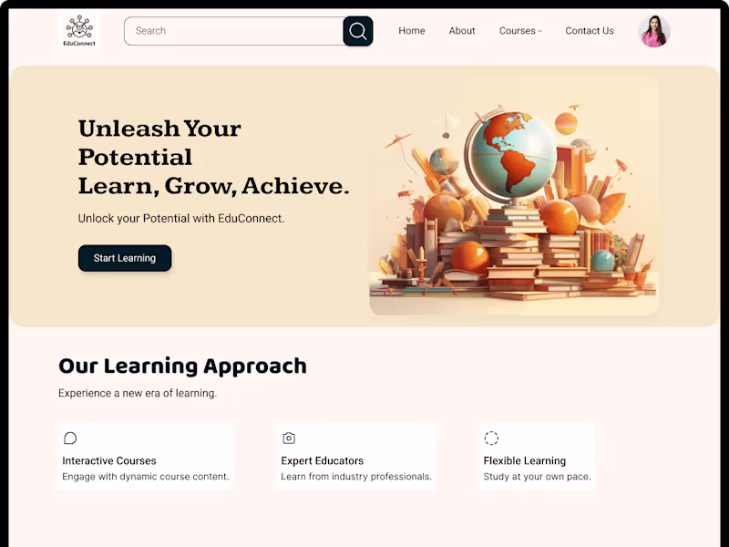
High-fidelity visual representations showcasing the finalized design, including color schemes, typography, and imagery.
Responsive Design:
Variations of the design optimized for different devices and screen sizes, ensuring a seamless user experience across desktop, tablet, and mobile platforms.
Interactive Elements:
If applicable, functional elements such as navigation menus, buttons, forms, and sliders, along with the corresponding code.
Typography Guidelines:
Specifications for font styles, sizes, and formatting to maintain consistent typography across the website.
Style Guide:
A comprehensive document outlining design elements, brand guidelines, and specifications for maintaining visual consistency.
Jyoti's other services
Contact for pricing
Tags
Adobe XD
Figma
UX Designer
Web Designer
Web Developer
Service provided by
Jyoti Lega Hisar, India
Website DesignJyoti Lega
Contact for pricing
Tags
Adobe XD
Figma
UX Designer
Web Designer
Web Developer
As a UI/UX design freelancer, I offer a distinctive blend of creativity and user-centric design principles to elevate your online presence. My unique approach involves crafting visually captivating interfaces with a strong focus on seamless user experiences, ensuring that your website not only stands out aesthetically but also engages and delights your target audience.
What's included
Wireframes:
Basic structural sketches or digital representations illustrating the layout and arrangement of elements on the website.
Mockups:
High-fidelity visual representations showcasing the finalized design, including color schemes, typography, and imagery.
Responsive Design:
Variations of the design optimized for different devices and screen sizes, ensuring a seamless user experience across desktop, tablet, and mobile platforms.
Interactive Elements:
If applicable, functional elements such as navigation menus, buttons, forms, and sliders, along with the corresponding code.
Typography Guidelines:
Specifications for font styles, sizes, and formatting to maintain consistent typography across the website.
Style Guide:
A comprehensive document outlining design elements, brand guidelines, and specifications for maintaining visual consistency.
Jyoti's other services
Contact for pricing