Scalable Design SystemAmos Cimpean
Develop a comprehensive Design System that serves as the foundational blueprint for your digital products. This system ensures consistency, efficiency, and scalability across your design and development efforts. By establishing a cohesive set of design guidelines, reusable UI components, and a robust documentation framework, we enable your team to deliver aesthetically pleasing and highly functional digital experiences with reduced time to market.
What's included
Style Guide
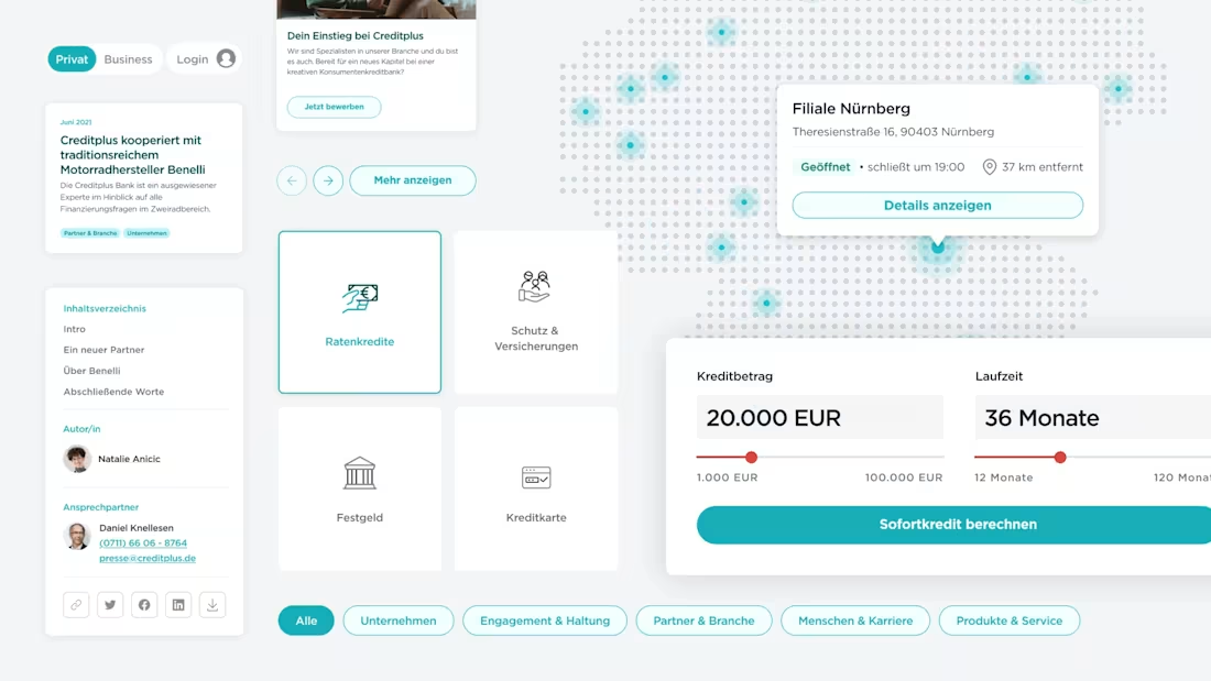
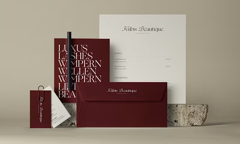
A detailed guide covering the brand’s color palette, typography, iconography, and other visual elements, ensuring consistency across all digital products.
UI Components Library
An extensive collection of reusable UI components, such as buttons, input fields, modals, and navigation bars, each with specifications for different states (e.g., hover, active, disabled) and guidelines for usage.
Responsive Grids and Layout Templates
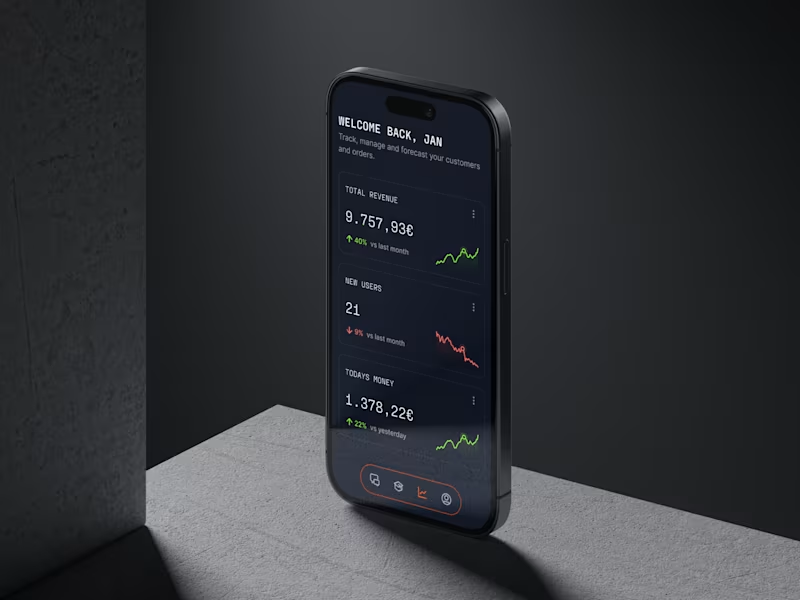
Templates and guidelines for creating responsive layouts that ensure your digital products look and function beautifully across all screen sizes, from mobile devices to large monitors.
Design Tokens
A set of design tokens that represent all the values needed to construct and maintain a design system across platforms, including colors, spacing, font sizes, and more, ensuring a single source of truth for your design values.
Accessibility Guidelines (optional)
Comprehensive guidelines to ensure your digital products meet accessibility standards, enhancing usability for all users, including those with disabilities.
Animation and Micro-interaction Library (optional)
A collection of animations and micro-interactions that can be used to enhance the user experience, adding elements of engagement and interactivity to your digital products.
Documentation and Best Practices (optional)
Detailed documentation covering the implementation and maintenance of the design system, along with best practices for designers and developers to effectively utilize the system in their projects.
Design System Manager (optional)
A tool or platform recommendation for managing and updating the design system, facilitating collaboration and sharing across the design and development teams.
Contact for pricing
Tags
Adobe XD
Figma
Framer
Notion
Slack
Design Systems Specialist
Product Designer
UI Designer
Service provided by
Amos Cimpean Barcelona, Spain
- $5k+
- Earned
- 1
- Paid projects
- 17
- Followers

Scalable Design SystemAmos Cimpean
Contact for pricing
Tags
Adobe XD
Figma
Framer
Notion
Slack
Design Systems Specialist
Product Designer
UI Designer
Develop a comprehensive Design System that serves as the foundational blueprint for your digital products. This system ensures consistency, efficiency, and scalability across your design and development efforts. By establishing a cohesive set of design guidelines, reusable UI components, and a robust documentation framework, we enable your team to deliver aesthetically pleasing and highly functional digital experiences with reduced time to market.
What's included
Style Guide
A detailed guide covering the brand’s color palette, typography, iconography, and other visual elements, ensuring consistency across all digital products.
UI Components Library
An extensive collection of reusable UI components, such as buttons, input fields, modals, and navigation bars, each with specifications for different states (e.g., hover, active, disabled) and guidelines for usage.
Responsive Grids and Layout Templates
Templates and guidelines for creating responsive layouts that ensure your digital products look and function beautifully across all screen sizes, from mobile devices to large monitors.
Design Tokens
A set of design tokens that represent all the values needed to construct and maintain a design system across platforms, including colors, spacing, font sizes, and more, ensuring a single source of truth for your design values.
Accessibility Guidelines (optional)
Comprehensive guidelines to ensure your digital products meet accessibility standards, enhancing usability for all users, including those with disabilities.
Animation and Micro-interaction Library (optional)
A collection of animations and micro-interactions that can be used to enhance the user experience, adding elements of engagement and interactivity to your digital products.
Documentation and Best Practices (optional)
Detailed documentation covering the implementation and maintenance of the design system, along with best practices for designers and developers to effectively utilize the system in their projects.
Design System Manager (optional)
A tool or platform recommendation for managing and updating the design system, facilitating collaboration and sharing across the design and development teams.
Contact for pricing


